Are you ready to give your website a fresh and modern touch? In this guide, you will learn how to create a Stylish Profile Card in HTML and CSS. Profile cards are a fantastic way to display user information such as name, role, followers, posts, and contact options. This tutorial will walk you through designing a sleek profile card perfect for portfolios, personal websites, or social media profiles.
What is a Stylish Profile Card?
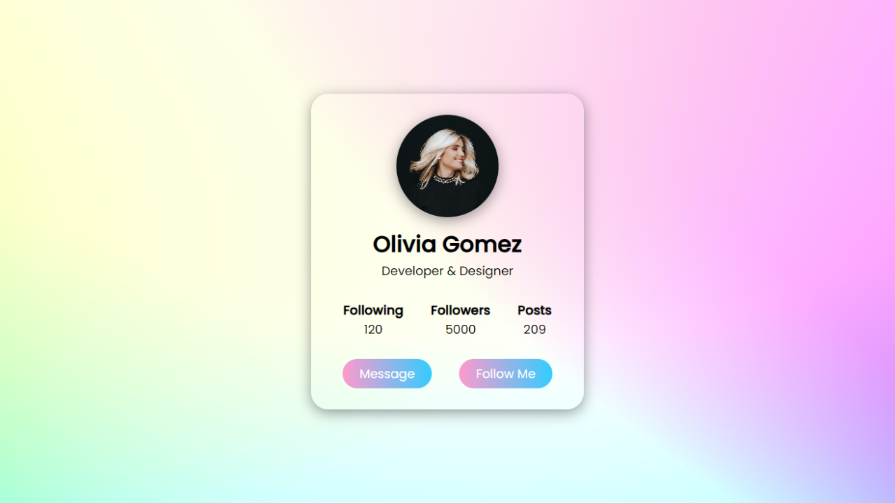
A Stylish Profile Card in HTML is not just a design element; it’s a compact and visually appealing way to present user information. Typically, these cards showcase a user’s image, name, profession, and relevant metrics like followers, posts, and following counts. By combining HTML for structure and CSS for design, we can craft a professional profile card that enhances user experience and engages visitors.
How to Create a Stylish Profile Card in HTML
Let’s dive into the steps of building your own Stylish Profile Card:
Step 1: HTML Structure
First, let’s set up the basic structure using HTML. We’ll define a section for the profile card and include an image, user name, user profession, and interactive buttons like “Message” and “Follow.”
<!DOCTYPE html><!---Coding By abhikesh---><html lang="en"><head><meta charset="UTF-8"><meta name="viewport" content="width=device-width, initial-scale=1.0"><meta http-equiv="X-UA-Compatible" content="ie=edge"><title> Profle Card UI Design | abhikesh </title><!---Custom Css File!---><link rel="stylesheet" href="style.css"></head><body><section class="main"><div class="profile-card"><div class="image"><img src="images/profile.jpg" alt="" class="profile-pic"></div><div class="data"><h2>Olivia Gomez</h2><span>Developer & Designer</span></div><div class="row"><div class="info"><h3>Following</h3><span>120</span></div><div class="info"><h3>Followers</h3><span>5000</span></div><div class="info"><h3>Posts</h3><span>209</span></div></div><div class="buttons"><a href="#" class="btn">Message</a><a href="#" class="btn">Follow Me</a></div></div></section></body></html>
@import url('https://fonts.googleapis.com/css2?family=Poppins:wght@200;300;400;500&display=swap');
*{
  margin: 0;
  padding: 0;
  box-sizing: border-box;
  font-family: 'Poppins', sans-serif;
}
.main{
  width: 100%;
  height: 100vh;
  display: flex;
  align-items: center;
  justify-content: center;
  background-image: url(images/back.jpg);
  background-position: center;
  background-size: cover;
}
.profile-card{
  display: flex;
  flex-direction: column;
  align-items: center;
  max-width: 400px;
  width: 100%;
  border-radius: 25px;
  padding: 30px;
  border: 1px solid #ffffff40;
  box-shadow: 0 5px 20px rgba(0,0,0,0.4);
}
.image{
  position: relative;
  height: 150px;
  width: 150px;
}
.image .profile-pic{
  width: 100%;
  height: 100%;
  object-fit: cover;
  border-radius: 50%;
  box-shadow: 0 5px 20px rgba(0,0,0,0.4);
}
.data{
  display: flex;
  flex-direction: column;
  align-items: center;
  margin-top: 15px;
}
.data h2{
  font-size: 33px;
  font-weight: 600;
}
span{
  font-size: 18px;
}
.row{
  display: flex;
  align-items: center;
  margin-top: 30px;
}
.row .info{
  text-align: center;
  padding: 0 20px;
}
.buttons{
  display: flex;
  align-items: center;
  margin-top: 30px;
}
.buttons .btn{
  color: #fff;
  text-decoration: none;
  margin: 0 20px;
  padding: 8px 25px;
  border-radius: 25px;
  font-size: 18px;
  white-space: nowrap;
  background: linear-gradient(to left, #33ccff 0%, #ff99cc 100%);
}
.buttons .btn:hover{
  box-shadow: inset 0 5px 20px rgba(0,0,0,0.4);
}
Key Elements of a Stylish Profile Card in HTML
- Profile Image: The user’s image is the focal point of any Stylish Profile Card. CSS is used to make it circular and add shadows for a polished look.
- User Information: Display the user’s name and profession prominently. This gives immediate context to who the person is.
- Metrics Section: Following, followers, and posts data is displayed in a neat row for quick user insights.
- Buttons: The “Message” and “Follow” buttons invite interaction, making the card functional and aesthetic.
Benefits of Using a Stylish Profile Card in HTML
- Visual Appeal: A well-designed profile card improves the overall visual experience on a website or app.
- User Interaction: By adding buttons for messaging and following, the profile card encourages user interaction.
- Responsive Design: This Stylish Profile Card is fully responsive, ensuring it looks great on both desktop and mobile devices.
Improving User Engagement with a Stylish Profile Card
User engagement can be significantly improved by integrating Stylish Profile Cards into your website. The combination of attractive visuals and useful user information encourages visitors to connect and explore more about the individual featured.
Read Also
- Glassmorphism Login Form in HTML and CSS
Explore the stylish world of glassmorphism as you create a modern login form using HTML and CSS. This guide breaks down the design process step by step. - Toggle Button using HTML, CSS, and JavaScript
Discover how to enhance user interaction by creating a sleek toggle button with HTML, CSS, and JavaScript. This tutorial covers everything from structure to styling. - Responsive Cards in HTML and CSS
Learn how to design eye-catching responsive cards that adapt seamlessly to any device. This guide offers practical tips for achieving stunning layouts. - Build a Google Gemini Chatbot Using HTML, CSS, and JS
Dive into chatbot development by creating a Google Gemini chatbot with HTML, CSS, and JavaScript. This tutorial will help you understand the basics of interactive forms.
Conclusion
Creating a Stylish Profile Card in HTML and CSS is a fantastic way to enhance the user interface of any website. The balance of aesthetic appeal and functionality makes these cards ideal for personal portfolios, social media platforms, and business profiles. Follow the steps outlined here to create your own custom Stylish Profile Card and elevate your web design game!
For further customization, feel free to download the source code below and start tweaking it to suit your needs!
Download Source Code
Click the button below to download the full source code for the Input Label Animation project: