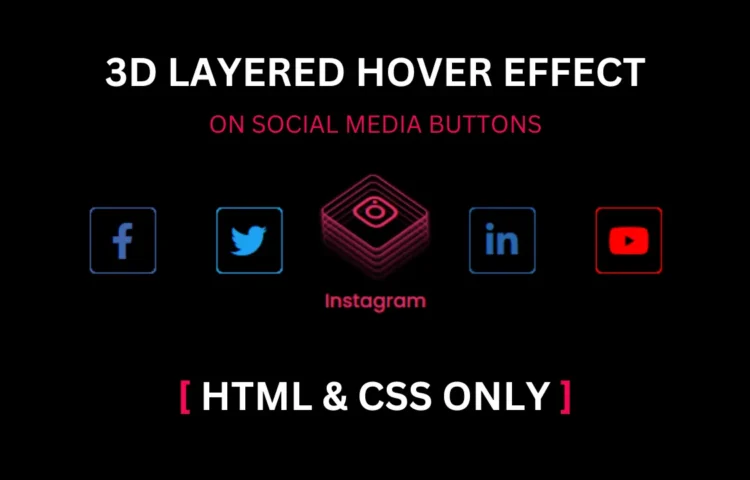
Social Media Buttons are crucial in modern web design, enabling seamless sharing and interaction across various platforms. In this guide, we’ll create Social Media Buttons with a 3D hover effect using HTML and CSS only. Adding 3D hover effects to these buttons enhances their visual appeal and boosts user engagement, leading to higher interaction rates and content sharing.
What Are Social Media Buttons?
Social Media Buttons are interactive elements on a website that provide visitors a quick way to share content. When designed effectively, these buttons encourage users to promote content, increasing reach and visibility on various social platforms. They’re a staple in modern web design, especially for content-driven sites and blogs, as they allow effortless content sharing.
Why Use 3D Hover Effects on Social Media Buttons?
The primary purpose of a 3D hover effect is to enhance the user experience by adding visual depth to the Social Media Buttons. Hover effects help capture the user’s attention and make buttons feel more interactive. This simple yet impactful design element is created using only HTML and CSS, keeping the code lightweight and easy to load.
Step-by-Step Guide to Creating Social Media Buttons with 3D Hover Effect
This guide will cover the HTML and CSS needed to create Social Media Buttons with a visually appealing 3D effect.
HTML Structure for Social Media Buttons
First, we’ll set up a simple HTML structure. This HTML file will hold the code for three social media buttons: Facebook, Twitter, and Instagram. Here’s the HTML code you’ll need:
<!DOCTYPE html><!-- Created By abhikesh.com --><html lang="en" dir="ltr"><head><meta charset="utf-8"><title>3D Layered Hover Effect | Abhikesh</title><link rel="stylesheet" href="style.css"><link rel="stylesheet" href="https://cdnjs.cloudflare.com/ajax/libs/font-awesome/5.15.3/css/all.min.css" /></head><body><div class="icons"><a href="#"><div class="layer"><span></span><span></span><span></span><span></span><span class="fab fa-facebook-f"></span></div><div class="text"></div></a><a href="#"><div class="layer"><span></span><span></span><span></span><span></span><span class="fab fa-twitter"></span></div><div class="text"></div></a><a href="#"><div class="layer"><span></span><span></span><span></span><span></span><span class="fab fa-instagram"></span></div><div class="text"></div></a><a href="#"><div class="layer"><span></span><span></span><span></span><span></span><span class="fab fa-linkedin-in"></span></div><div class="text"></div></a><a href="#"><div class="layer"><span></span><span></span><span></span><span></span><span class="fab fa-youtube"></span></div><div class="text">YouTube</div></a></div></body></html>
In this HTML, each button link has a unique class (e.g., Facebook, Twitter, Instagram) that we’ll style later in the CSS.
CSS Styling and 3D Effect Animation
Next, we’ll work on the CSS to style these Social Media Buttons. Start by adding styles to give each button a unique colour, background, and hover effect.
@import url('https://fonts.googleapis.com/css?family=Poppins:400,500,600,700&display=swap');* {margin: 0;padding: 0;box-sizing: border-box;font-family: 'Poppins', sans-serif;}html,body {display: grid;height: 100%;place-items: center;background: #000;}.icons {display: inline-flex;}.icons a {margin: 0 25px;text-decoration: none;color: #fff;display: block;position: relative;}.icons a .layer {width: 55px;height: 55px;transition: transform 0.3s;}.icons a:hover .layer {transform: rotate(-35deg) skew(20deg);}.icons a .layer span {position: absolute;top: 0;left: 0;height: 100%;width: 100%;border: 1px solid #fff;border-radius: 5px;transition: all 0.3s;}.icons a .layer span.fab {font-size: 30px;line-height: 55px;text-align: center;}.icons a:hover .layer span:nth-child(1) {opacity: 0.2;}.icons a:hover .layer span:nth-child(2) {opacity: 0.4;transform: translate(5px, -5px);}.icons a:hover .layer span:nth-child(3) {opacity: 0.6;transform: translate(10px, -10px);}.icons a:hover .layer span:nth-child(4) {opacity: 0.8;transform: translate(15px, -15px);}.icons a:hover .layer span:nth-child(5) {opacity: 1;transform: translate(20px, -20px);}.icons a:nth-child(1) .layer span,.icons a:nth-child(1) .text {color: #4267B2;border-color: #4267B2;}.icons a:nth-child(2) .layer span,.icons a:nth-child(2) .text {color: #1DA1F2;border-color: #1DA1F2;}.icons a:nth-child(3) .layer span,.icons a:nth-child(3) .text {color: #E1306C;border-color: #E1306C;}.icons a:nth-child(4) .layer span,.icons a:nth-child(4) .text {color: #2867B2;border-color: #2867B2;}.icons a:nth-child(5) .layer span,.icons a:nth-child(5) .text {color: #ff0000;border-color: #ff0000;}.icons a:hover:nth-child(1) .layer span {box-shadow: -1px 1px 3px #4267B2;}.icons a:hover:nth-child(2) .layer span {box-shadow: -1px 1px 3px #1DA1F2;}.icons a:hover:nth-child(3) .layer span {box-shadow: -1px 1px 3px #E1306C;}.icons a:hover:nth-child(4) .layer span {box-shadow: -1px 1px 3px #2867B2;}.icons a:hover:nth-child(5) .layer span {box-shadow: -1px 1px 3px #ff0000;}.icons a .text {position: absolute;left: 50%;bottom: -5px;opacity: 0;font-weight: 500;transform: translateX(-50%);transition: bottom 0.3s ease, opacity 0.3s ease;}.icons a:hover .text {bottom: -35px;opacity: 1;}
This CSS code styles the Social Media Buttons with colour and text formatting. The::before pseudo-element helps create the 3D hover layer.
Adding 3D Hover Effect Animation
To achieve the 3D layered look, let’s apply a hover effect on each button. When a user hovers over a button, it will appear to lift off the page slightly, adding a shadow for the 3D effect.
When hovering, the button’s background slightly enlarges, and a shadow appears, creating the desired 3D visual effect.
Best Practices for Social Media Buttons
- Placement: Keep your social media buttons prominent but not intrusive. They’re often most effective in header areas or at the end of posts, where users are likely to consider sharing.
- Consistency: Ensure that buttons match your site’s design. Use consistent colours and fonts that align with your branding.
- Encouragement: Use clear calls to action, like “Share this post!” to encourage users to click.
FAQs on Social Media Buttons and 3D Effects
- How do Social Media Buttons increase engagement?
- Can these effects be added without JavaScript?
- What is the benefit of using a 3D hover effect?
These buttons simplify sharing, which can help expand your audience reach.
This tutorial uses only HTML and CSS, making it fast and easy to implement.
The 3D effect captures attention and adds an interactive feel, making buttons more engaging.
Read Also
- Glassmorphism Login Form in HTML and CSS
Explore the stylish world of glassmorphism as you create a modern login form using HTML and CSS. This guide breaks down the design process step by step. - Toggle Button using HTML, CSS, and JavaScript
Discover how to enhance user interaction by creating a sleek toggle button with HTML, CSS, and JavaScript. This tutorial covers everything from structure to styling. - Responsive Cards in HTML and CSS
Learn how to design eye-catching responsive cards that adapt seamlessly to any device. This guide offers practical tips for achieving stunning layouts. - Build a Google Gemini Chatbot Using HTML, CSS, and JS
Dive into chatbot development by creating a Google Gemini chatbot with HTML, CSS, and JavaScript. This tutorial will help you understand the basics of interactive forms.
Download the Source Code
To see a live demo or download the complete source code, click the button below:

