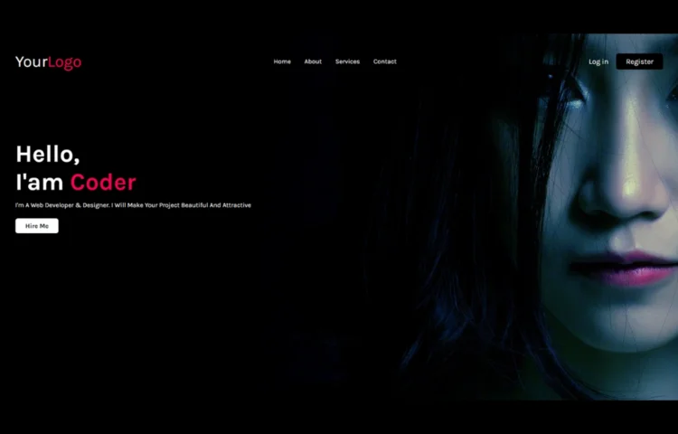
Creating a Simple Website in HTML & CSS is one of the best ways to start your web development journey. Whether you’re a beginner or looking to sharpen your skills, building a simple website using these core technologies is a must. In this tutorial, we’ll walk through the entire process step-by-step, and by the end, you’ll have a complete website and you can even download the source code to practice and improve further. So, let’s get started creating your first simple website in HTML & CSS.
What is a Simple Website in HTML & CSS?
A Simple Website in HTML & CSS refers to a basic web page design built using two primary web development languages: HTML (Hypertext Markup Language) and CSS (Cascading Style Sheets). These websites usually contain key components like headers, footers, buttons, and text.
HTML provides the structure or skeleton of the website, while CSS adds the style, such as colors, fonts, and layout designs. Even with this simplicity, you can still create an aesthetically pleasing and fully functional website that loads quickly and delivers a smooth user experience.
Why Use HTML & CSS for Simple Websites?
HTML and CSS serve as the foundation for all websites, providing the essential structure and style that power the web. If you’re new to web development, starting with a Simple Website in HTML & CSS helps you:
- Understand the fundamentals of front-end web development.
- Build clean, efficient, and responsive designs.
- Gain confidence by working with easy-to-learn and intuitive technologies.
Creating a simple website not only teaches the basics but also offers hands-on experience that can be applied to more complex projects later.
Step-by-Step Guide: How to Create a Simple Website in HTML & CSS
1. Setting Up HTML Structure
Start by setting up the HTML structure of your website. The basic structure includes the head and body tags, which contain essential elements like the title, meta information, and the content displayed on the page.
Below is an example of what your index.html file should look like:
<!DOCTYPE html><!---Coding By Abhikesh!---><html lang="en"><head><meta charset="UTF-8"><meta name="viewport" content="width=device-width, initial-scale=1.0"><meta http-equiv="X-UA-Compatible" content="ie=edge"><title>Simple Website Design</title><!---Custom Css File!---><link rel="stylesheet" href="style.css"></head><body><div class="container"><nav><div class="logo"><a href="#">Your<span>Logo</span></a></div><ul><li><a href="#">Home</a></li><li><a href="#">About</a></li><li><a href="#">Services</a></li><li><a href="#">Contact</a></li></ul><div class="buttons"><a href="#" class="login">Log in</a><a href="#" class="btn">Register</a></div></nav><div class="content"><h2>Hello,<br>I'am <span>Coder</span></h2><p>I'm A Web Developer & Designer. I Will Make Your Project Beautiful And Attractive</p></div><div class="link"><a href="#" class="hire">Hire Me</a></div></div></body></html>
2. Styling Your Website with CSS
Next, let’s add styling to our website using CSS. Create a style.css file that will give your website a polished look. Here’s an example:
@import url('https://fonts.googleapis.com/css2?family=Karla:wght@300;400;500;600;700&display=swap');*{margin: 0;padding: 0;box-sizing: border-box;font-family: 'Karla', sans-serif;}body{color: #fff;}.container{width: 100%;height: 100vh;background-image: url(back.jpg);background-position: center;background-size: cover;padding-top: 35px;padding-left: 8%;padding-right: 8%;}nav{padding: 10px 0;display: flex;align-items: center;justify-content: space-between;}.logo a{font-size: 40px;text-decoration: none;}span{color: #f9004d;}nav ul li{display: inline-block;list-style: none;margin: 10px 15px;}nav ul li a{text-decoration: none;transition: 0.5s;}nav ul li a:hover{color: #f9004d;}.login{text-decoration: none;margin-right: 15px;font-size: 18px;}.btn{background: #000;border-radius: 6px;padding: 9px 25px;text-decoration: none;transition: 0.5s;font-size: 18px;}.content{margin-top: 10%;max-width: 600px;}.content h2{font-size: 60px}.content p{margin-top: 10px;line-height: 25px;}a{color: #fff;}.link {margin-top: 30px;}.hire{color: #000;text-decoration: none;background: #fff;padding: 9px 25px;font-weight: bold;border-radius: 6px;transition: 0.5s;}.link .hire:hover{background: transparent;border: 1px solid #fff;color: #fff;}
This CSS stylesheet will style your website by giving it a responsive layout, clean typography, and visually appealing colors. The header section stands out, while the body text is easy to read.
Best Practices for a Simple Website
When creating a Simple Website in HTML & CSS, keep the following best practices in mind:
- Use Semantic HTML Tags: These help search engines understand your website structure and improve SEO. Use tags like <header>, <main>, <section>, and <footer>.
- Optimize for SEO: Include relevant keywords in your meta descriptions, headings, and throughout your content. For example, in this guide, the focus keyword is “Simple Website in HTML & CSS.”
- Mobile-First Design: Ensure your website is responsive and looks good on all screen sizes, especially mobile devices. You can use media queries to adjust your layout for smaller screens.
- Fast Load Times: Keep your code clean and avoid unnecessary elements. Optimize images and minimize CSS and JS files.
- Accessibility: Make your website accessible to everyone, including people with disabilities, by using proper contrast, alt tags, and keyboard navigation.
Sample Media Query for Responsiveness
To make your website responsive, you can add a media query in your CSS:
@media (max-width: 600px) {.btn{background: red;border-radius: 6px;padding: 9px 25px;text-decoration: none;transition: 0.5s;font-size: 18px;}}
This makes the navigation links stack vertically on smaller screens, ensuring your site looks great on mobile devices.
Read Also
- Glassmorphism Login Form in HTML and CSS
Explore the stylish world of glassmorphism as you create a modern login form using HTML and CSS. This guide breaks down the design process step by step. - Toggle Button using HTML, CSS, and JavaScript
Discover how to enhance user interaction by creating a sleek toggle button with HTML, CSS, and JavaScript. This tutorial covers everything from structure to styling. - Responsive Cards in HTML and CSS
Learn how to design eye-catching responsive cards that adapt seamlessly to any device. This guide offers practical tips for achieving stunning layouts. - Build a Google Gemini Chatbot Using HTML, CSS, and JS
Dive into chatbot development by creating a Google Gemini chatbot with HTML, CSS, and JavaScript. This tutorial will help you understand the basics of interactive forms.
How to Download the Source Code
If you’re ready to experiment with the code and create your own Simple Website in HTML & CSS, you can download the entire source code. Click the button below to get started!

