Enhance your web development skills by embarking on a practical journey of creating a Fiverr site using HTML and CSS. This tutorial not only allows you to recreate designs from popular platforms like Fiverr but also empowers you to showcase your ability to recreate existing designs.
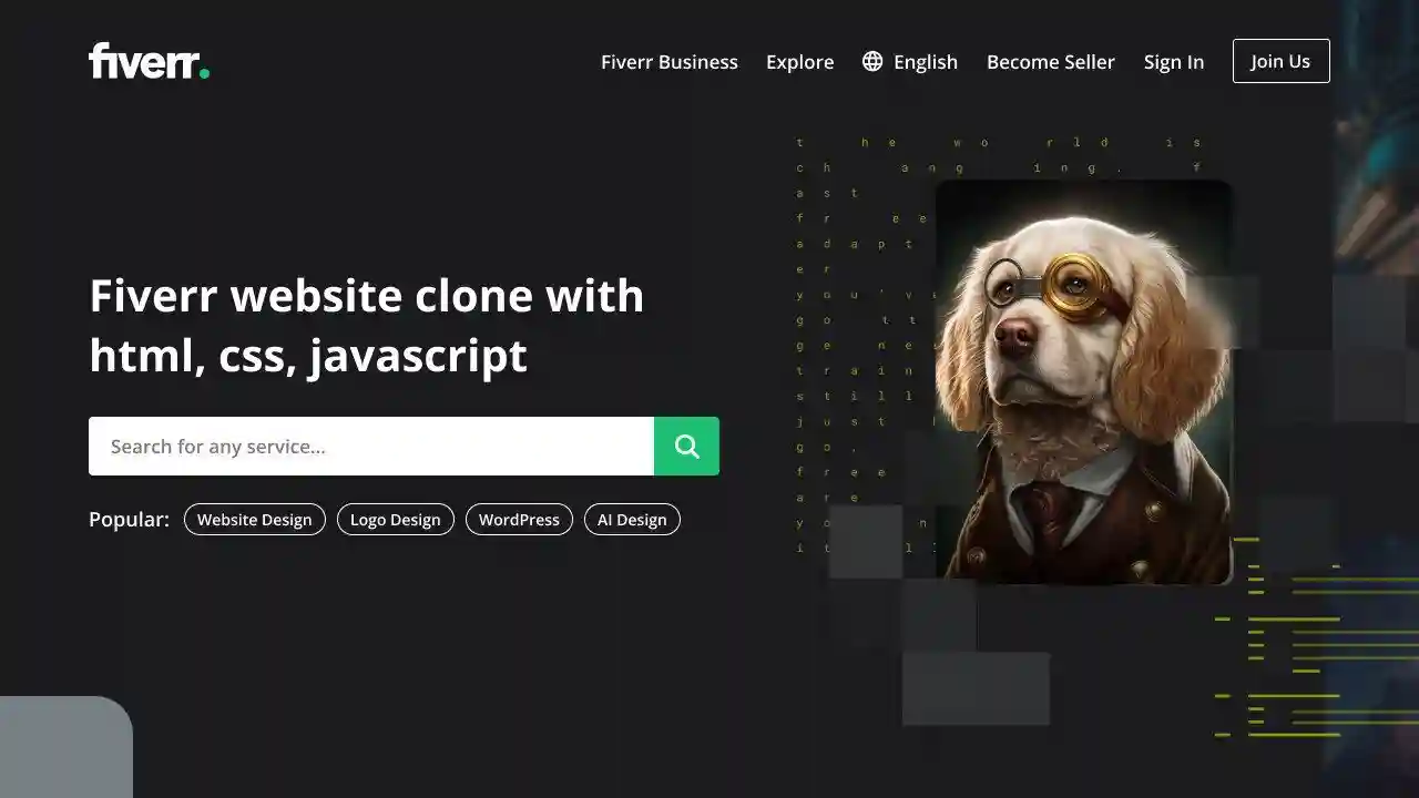
This blog post presents a straightforward guide on how to build a responsive Fiverr website using only HTML, CSS, and JavaScript. You will confidently learn how to create an interactive homepage featuring navigation bars and place elements on the page with styles matching Fiverr’s.
As we create our Fiverr-inspired homepage, we will explore a range of HTML tags and CSS attributes, such as navigation bars, sections, divs, inputs, links, and others, to craft an appealing layout and ensure an accessible interface.
How to Create a Fiverr Website Using HTML and CSS
- Follow these instructions to create a responsive Fiverr-inspired Homepage using HTML and CSS:
- Create a folder, name it, and place all necessary files inside.
- Create an index.html file as your starting point.
- Create a style.css file containing CSS code.
- The Images folder can be downloaded and placed into the project directory for use during development. It includes files for both the Fiverr Logo and Hero Background Image.
Add the HTML codes below to your index.html file for use on mobile screens. These codes provide navigation bars, sections, input fields, and links, in addition to various tags that make up your website. These codes include JavaScript lines for toggling menus on and off.
<!DOCTYPE html>
<html lang="en">
<head>
  <meta charset="UTF-8">
  <meta name="viewport" content="width=device-width, initial-scale=1.0">
  <title>Fiverr Homepage Clone</title>
  <link rel="stylesheet" href="style.css">
  <!-- Google Icons Link -->
  <link rel="stylesheet" href="https://fonts.googleapis.com/css2?family=Material+Symbols+Outlined:opsz,wght,FILL,GRAD@48,400,0,0">
</head>
<body>
  <header>
    <nav>
      <a href="#">
        <img src="images/logo.svg" alt="Fiverr Logo">
      </a>
      <ul>
        <li><a href="#">Fiverr Business</a></li>
        <li><a href="#">Explore</a></li>
        <li>
          <a href="#">
            <span>language</span>
            English
          </a>
        </li>
        <li><a href="#">Become a Seller</a></li>
        <li><a href="#">Sign In</a></li>
        <li><a href="#">Join Us</a></li>
        <span id="close-menu-btn">close</span>
      </ul>
      <span id="hamburger-btn">menu</span>
    </nav>
  </header>
  <section>
    <div>
      <h1>Find the right freelance service, right away</h1>
      <form action="#">
        <input type="text" placeholder="Search for any service..." required>
        <button type="sumbit">search</button>
      </form>
      <div>
        Popular:
        <ul>
          <li><a href="#">Webite Design</a></li>
          <li><a href="#">Logo Design</a></li>
          <li><a href="#">WordPress</a></li>
          <li><a href="#">AI Design</a></li>
        </ul>
      </div>
    </div>
  </section>
  <script>
    const header = document.querySelector("header");
    const hamburgerBtn = document.querySelector("#hamburger-btn");
    const closeMenuBtn = document.querySelector("#close-menu-btn");
    // Toggle mobile menu on hamburger button click
    hamburgerBtn.addEventListener("click", () => header.classList.toggle("show-mobile-menu"));
    // Close mobile menu on close button click
    closeMenuBtn.addEventListener("click", () => hamburgerBtn.click());
  </script>
</body>
</html>
Add the CSS codes below to your style.css to replicate the Fiverr Homepage look on your website. These CSS codes feature styles for elements such as color, border, background, and even the image from Fiverr! Additionally, media queries make your website responsive.
/* Importing Google font - Fira Sans */
@import url('https://fonts.googleapis.com/css2?family=Fira+Sans:wght@300;400;500;600;700&display=swap');
* {
  margin: 0;
  padding: 0;
  box-sizing: border-box;
  font-family: 'Fira Sans', sans-serif;
}
body {
  background: #1B1B1D;
}
header {
  position: fixed;
  left: 0;
  top: 0;
  width: 100%;
  z-index: 1;
  padding: 20px;
}
header .navbar {
  max-width: 1280px;
  margin: 0 auto;
  display: flex;
  align-items: center;
  justify-content: space-between;
}
.navbar .menu-links {
  display: flex;
  align-items: center;
  list-style: none;
  gap: 30px;
}
.navbar .menu-links li a {
  color: #fff;
  font-weight: 500;
  text-decoration: none;
  transition: 0.2s ease;
}
.navbar .menu-links .language-item a {
  display: flex;
  gap: 8px;
  align-items: center;
}
.navbar .menu-links .language-item span {
  font-size: 1.3rem;
}
.navbar .menu-links li a:hover {
  color: #1dbf73;
}
.navbar .menu-links .join-btn a {
  border: 1px solid #fff;
  padding: 8px 15px;
  border-radius: 4px;
}
.navbar .menu-links .join-btn a:hover {
  color: #fff;
  border-color: transparent;
  background: #1dbf73;
}
.hero-section {
  height: 100vh;
  background-image: url("images/hero-img.jpg");
  background-position: center;
  background-size: cover;
  position: relative;
  display: flex;
  padding: 0 20px;
  align-items: center;
}
.hero-section .content {
  max-width: 1280px;
  margin: 0 auto 40px;
  width: 100%;
}
.hero-section .content h1 {
  color: #fff;
  font-size: 3rem;
  max-width: 630px;
  line-height: 65px;
}
.hero-section .search-form {
  height: 48px;
  display: flex;
  max-width: 630px;
  margin-top: 30px;
}
.hero-section .search-form input {
  height: 100%;
  width: 100%;
  border: none;
  outline: none;
  padding: 0 15px;
  font-size: 1rem;
  border-radius: 4px 0 0 4px;
}
.hero-section .search-form button {
  height: 100%;
  width: 60px;
  border: none;
  outline: none;
  cursor: pointer;
  background: #1dbf73;
  color: #fff;
  border-radius: 0 4px 4px 0;
  transition: background 0.2s ease;
}
.hero-section .search-form button:hover {
  background: #19a463;
}
.hero-section .popular-tags {
  display: flex;
  color: #fff;
  gap: 25px;
  font-size: 0.875rem;
  font-weight: 500;
  margin-top: 25px;
}
.hero-section .popular-tags .tags {
  display: flex;
  gap: 15px;
  align-items: center;
  list-style: none;
}
.hero-section .tags li a {
  text-decoration: none;
  color: #fff;
  border: 1px solid #fff;
  padding: 4px 12px;
  border-radius: 50px;
  transition: 0.2s ease;
}
.hero-section .tags li a:hover {
  color: #000;
  background: #fff;
}
.navbar #hamburger-btn {
  color: #fff;
  cursor: pointer;
  display: none;
  font-size: 1.7rem;
}
.navbar #close-menu-btn {
  position: absolute;
  display: none;
  color: #000;
  top: 20px;
  right: 20px;
  cursor: pointer;
  font-size: 1.7rem;
}
@media screen and (max-width: 900px) {
  header.show-mobile-menu::before {
    content: "";
    height: 100%;
    width: 100%;
    position: fixed;
    left: 0;
    top: 0;
    backdrop-filter: blur(5px);
  }
  .navbar .menu-links {
    height: 100vh;
    max-width: 300px;
    width: 100%;
    background: #fff;
    position: fixed;
    left: -300px;
    top: 0;
    display: block;
    padding: 75px 40px 0;
    transition: left 0.2s ease;
  }
  header.show-mobile-menu .navbar .menu-links {
    left: 0;
  }
  .navbar .menu-links li {
    margin-bottom: 30px;
  }
  .navbar .menu-links li a {
    color: #000;
    font-size: 1.1rem;
  }
  .navbar .menu-links .join-btn a {
    padding: 0;
  }
  .navbar .menu-links .join-btn a:hover {
    color: #1dbf73;
    background: none;
  }
  .navbar :is(#close-menu-btn, #hamburger-btn) {
    display: block;
  }
  .hero-section {
    background: none;
  }
  .hero-section .content {
    margin: 0 auto 80px;
  }
  .hero-section .content :is(h1, .search-form) {
    max-width: 100%;
  }
  .hero-section .content h1 {
    text-align: center;
    font-size: 2.5rem;
    line-height: 55px;
  }
  .hero-section .search-form {
    display: block;
    margin-top: 20px;
  }
  .hero-section .search-form input {
    border-radius: 4px;
  }
  .hero-section .search-form button {
    margin-top: 10px;
    border-radius: 4px;
    width: 100%;
  }
  .hero-section .popular-tags {
    display: none;
  }
}
Read Also
- Glassmorphism Login Form in HTML and CSS
Explore the stylish world of glassmorphism as you create a modern login form using HTML and CSS. This guide breaks down the design process step by step. - Toggle Button using HTML, CSS, and JavaScript
Discover how to enhance user interaction by creating a sleek toggle button with HTML, CSS, and JavaScript. This tutorial covers everything from structure to styling. - Responsive Cards in HTML and CSS
Learn how to design eye-catching responsive cards that adapt seamlessly to any device. This guide offers practical tips for achieving stunning layouts. - Build a Google Gemini Chatbot Using HTML, CSS, and JS
Dive into chatbot development by creating a Google Gemini chatbot with HTML, CSS, and JavaScript. This tutorial will help you understand the basics of interactive forms.
Conclusion and final remarks.
Building a Fiverr website using HTML, CSS, and JavaScript can be an enjoyable project for new web programmers. You have created an engaging, responsive Fiverr homepage by following the instructions presented here! Don’t stop here! Keep the inspiration flowing by continuing to experiment and hone your skills. I encourage you to explore and recreate other impressive website designs found here, and let your creativity soar.
Clicking the Download button will provide free access to this Fiverr Homepage’s source files if any issues arise when creating your Fiverr site.