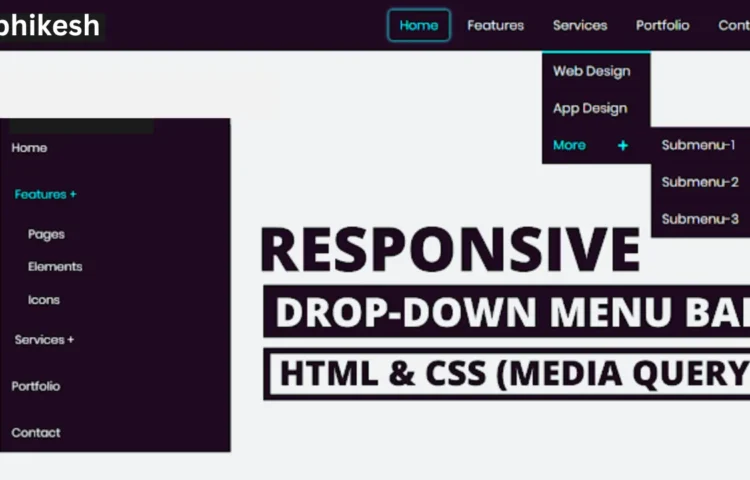
In the world of web development, having a Responsive Dropdown Menu is essential to ensure smooth and efficient navigation for users. Whether you’re building a personal blog, an eCommerce site, or a corporate webpage, a dropdown menu allows you to organize content effectively, offering a cleaner and more professional user experience. In this guide, you’ll learn how to create a Responsive Dropdown Menu Bar using HTML and CSS. By following this simple tutorial, you can add a mobile-friendly, visually appealing navigation bar that works across all devices.
Why Choose a Responsive Dropdown Menu?
A Responsive Dropdown Menu is a critical element for modern websites. It not only makes the site look organized but also improves usability. With the increasing number of users accessing websites from mobile devices, it’s more important than ever to ensure that your site navigation adapts seamlessly across all screen sizes. Dropdown menus are a great way to present a large number of links in a compact space.
Whether you’re designing for a desktop, tablet, or smartphone, your visitors will appreciate a mobile-optimized dropdown menu that is easy to use and helps them navigate your site effortlessly.
How to Create a Responsive Dropdown Menu
Now, let’s break down how you can build a fully responsive dropdown menu. This guide will help you create a dropdown that adapts to both desktop and mobile users, enhancing user interaction on every platform.
Setting Up the HTML Structure
The HTML structure is simple but forms the foundation of your dropdown menu. You’ll create a navigation bar with several links, and one of them will contain a submenu that will act as the dropdown.
<!DOCTYPE html><html lang="en" dir="ltr"><head><meta charset="utf-8"><title>Responsive Drop-down Menu Bar</title><link rel="stylesheet" href="style.css"><script src="https://kit.fontawesome.com/a076d05399.js"></script><link rel="stylesheet" href="file:///E:/fontawesome/css/all.css"><meta name="viewport" content="width=device-width, initial-scale=1.0"><script src="file:///E:/jquery.js"></script></head><body><nav><div class="logo">Abhikesh</div><label for="btn" class="icon"><span class="fa fa-bars"></span></label><input type="checkbox" id="btn"><ul><li><a href="#">Home</a></li><li><label for="btn-1" class="show">Features +</label><a href="#">Features</a><input type="checkbox" id="btn-1"><ul><li><a href="#">Pages</a></li><li><a href="#">Elements</a></li><li><a href="#">Icons</a></li></ul></li><li><label for="btn-2" class="show">Services +</label><a href="#">Services</a><input type="checkbox" id="btn-2"><ul><li><a href="#">Web Design</a></li><li><a href="#">App Design</a></li><li><label for="btn-3" class="show">More +</label><a href="#">More <span class="fa fa-plus"></span></a><input type="checkbox" id="btn-3"><ul><li><a href="#">Submenu-1</a></li><li><a href="#">Submenu-2</a></li><li><a href="#">Submenu-3</a></li></ul></li></ul></li><li><a href="#">Portfolio</a></li><li><a href="#">Contact</a></li></ul></nav><div class="content"><header>Responsive Drop-down Menu Bar</header><p>HTML and CSS</p></div><script>$('.icon').click(function(){$('span').toggleClass("cancel");});</script></body></html>
Styling the Dropdown Menu with CSS
The CSS will handle the styling and responsiveness. You will be using CSS media queries to make sure the dropdown adapts to different screen sizes, offering a horizontal layout for desktop users and a vertical, clickable menu for mobile users.
@import url('https://fonts.googleapis.com/css?family=Poppins:400,500,600,700&display=swap');*{margin: 0;padding: 0;user-select: none;box-sizing: border-box;font-family: 'Poppins', sans-serif;}body{background: #f2f2f2;}nav{background: #1b1b1b;}nav:after{content: '';clear: both;display: table;}nav .logo{float: left;color: white;font-size: 27px;font-weight: 600;line-height: 70px;padding-left: 60px;}nav ul{float: right;margin-right: 40px;list-style: none;position: relative;}nav ul li{float: left;display: inline-block;background: #1b1b1b;margin: 0 5px;}nav ul li a{color: white;line-height: 70px;text-decoration: none;font-size: 18px;padding: 8px 15px;}nav ul li a:hover{color: #D40643;border-radius: 5px;box-shadow: 0 0 5px #D40643,0 0 10px #D40643;}nav ul ul li a:hover{box-shadow: none;}nav ul ul{position: absolute;top: 90px;border-top: 3px solid #D40643;opacity: 0;visibility: hidden;transition: top .3s;}nav ul ul ul{border-top: none;}nav ul li:hover > ul{top: 70px;opacity: 1;visibility: visible;}nav ul ul li{position: relative;margin: 0px;width: 150px;float: none;display: list-item;border-bottom: 1px solid rgba(0,0,0,0.3);}nav ul ul li a{line-height: 50px;}nav ul ul ul li{position: relative;top: -60px;left: 150px;}.show,.icon,input{display: none;}.fa-plus{font-size: 15px;margin-left: 40px;}@media all and (max-width: 968px) {nav ul{margin-right: 0px;float: left;}nav .logo{padding-left: 30px;width: 100%;}.show + a, ul{display: none;}nav ul li,nav ul ul li{display: block;width: 100%;}nav ul li a:hover{box-shadow: none;}.show{display: block;color: white;font-size: 18px;padding: 0 20px;line-height: 70px;cursor: pointer;}.show:hover{color: #D40643;}.icon{display: block;color: white;position: absolute;top: 0;right: 40px;line-height: 70px;cursor: pointer;font-size: 25px;}nav ul ul{top: 70px;border-top: 0px;float: none;position: static;display: none;opacity: 1;visibility: visible;}nav ul ul a{padding-left: 40px;}nav ul ul ul a{padding-left: 80px;}nav ul ul ul li{position: static;}[id^=btn]:checked + ul{display: block;}nav ul ul li{border-bottom: 0px;}span.cancel:before{content: '\f00d';}}.content{z-index: -1;position: absolute;top: 50%;left: 50%;transform: translate(-50%,-50%);text-align: center;}header{font-size: 35px;font-weight: 600;padding: 10px 0;}p{font-size: 30px;font-weight: 500;}
Best Practices for a Responsive Dropdown Menu
- Keep it Simple: A clean and simple dropdown menu enhances user experience and reduces confusion.
- Optimize for Mobile: Ensure that the dropdown menu works smoothly on mobile devices, where most users now interact with websites.
- SEO-Friendly: Use semantic HTML tags, and descriptive text for links, and make sure the dropdown menu is easily crawlable by search engines like Google.
- Performance: Minimize the use of JavaScript and heavy libraries. Rely on HTML and CSS for lightweight, fast-loading navigation.
Enhancing User Experience
Responsive dropdown menus provide a more intuitive and organized user experience. They can help reduce clutter and offer visitors a structured way to access different sections of your website, no matter the device they’re using.
SEO Tips for Your Dropdown Menu
While dropdown menus help improve user experience, they also need to be SEO-friendly. Make sure your menu links are descriptive and easy to crawl by search engines. Additionally, it’s essential to use ALT text for any images and provide descriptive labels for each menu item.
Read Also
- Glassmorphism Login Form in HTML and CSS
Explore the stylish world of glassmorphism as you create a modern login form using HTML and CSS. This guide breaks down the design process step by step. - Toggle Button using HTML, CSS, and JavaScript
Discover how to enhance user interaction by creating a sleek toggle button with HTML, CSS, and JavaScript. This tutorial covers everything from structure to styling. - Responsive Cards in HTML and CSS
Learn how to design eye-catching responsive cards that adapt seamlessly to any device. This guide offers practical tips for achieving stunning layouts. - Build a Google Gemini Chatbot Using HTML, CSS, and JS
Dive into chatbot development by creating a Google Gemini chatbot with HTML, CSS, and JavaScript. This tutorial will help you understand the basics of interactive forms.
Conclusion
By implementing a Responsive Dropdown Menu, you significantly improve both the usability and aesthetic of your website. This feature is particularly beneficial for websites with multiple categories or large amounts of content. Plus, with our HTML and CSS approach, you can build a fully responsive dropdown menu without the need for heavy JavaScript libraries.
Download the Source Code
To get started, feel free to download the source code for this Responsive Dropdown Menu Bar by clicking the button below.

