
Are you looking for a simple yet stylish animated profile card design using only HTML and CSS? You’re in the right place! In this blog post, we’ll walk through creating an animated profile card that showcases a person’s profile details and some sleek animation effects. This design is perfect for…
Posts Written ByAbhikesh
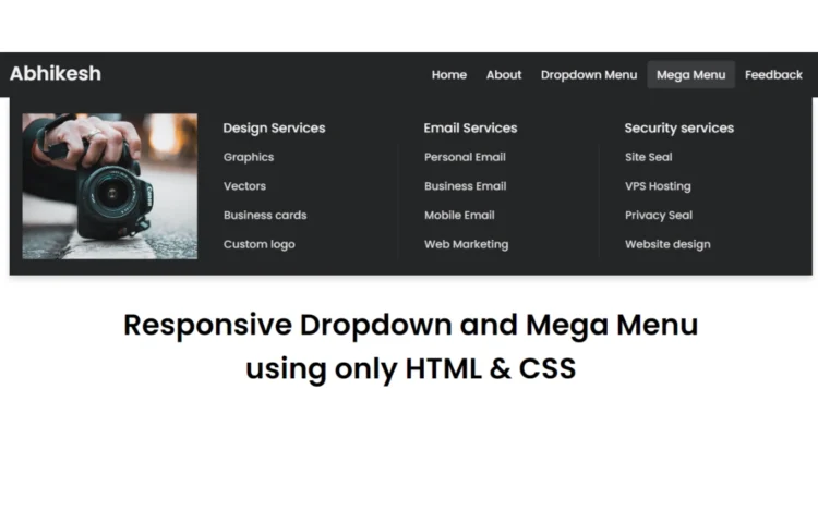
Create a Responsive Mega and Dropdown Menu with HTML & CSS: A Guide
If you’re interested in learning how to create a clean and efficient Mega and Dropdown Menu using only HTML & CSS, you’re in the right place! In this tutorial, we will walk through how to build a fully functional mega and dropdown menu navigation bar using just HTML and CSS—no…
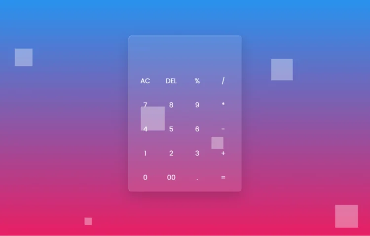
How to Create a Glassmorphism Calculator Using HTML and CSS
Hey there! Welcome to our blog! Today, we’re diving into an exciting project that’s not only fun but also visually stunning: creating a sleek Glassmorphism Calculator using just HTML and CSS. If you’re looking to spruce up your web design skills, you’re in the right place! Understanding Glassmorphism Calculator Before…
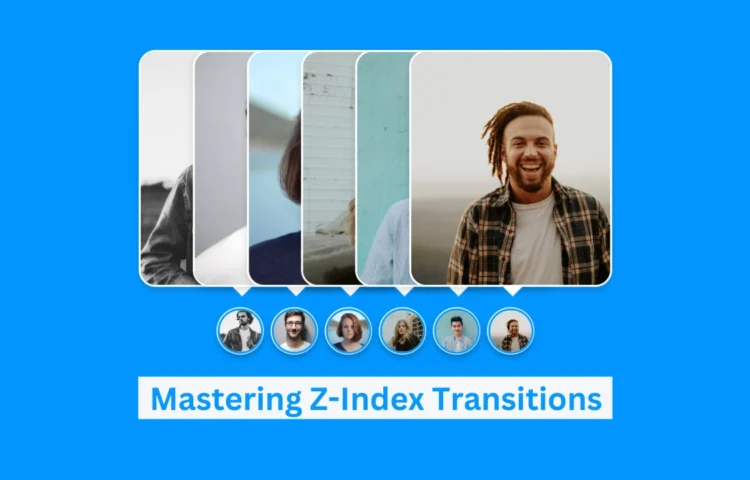
Mastering Z-Index Transitions on Images Using CSS: Create Stunning Effects
Z-Index Transitions: Enhance Your Images with CSS In this tutorial, we’ll guide you through creating Z-Index transitions, an interactive effect on images using only CSS. This approach is perfect for web developers looking to enhance user engagement by adding dynamic visual effects to images. By utilizing CSS alone, you can…
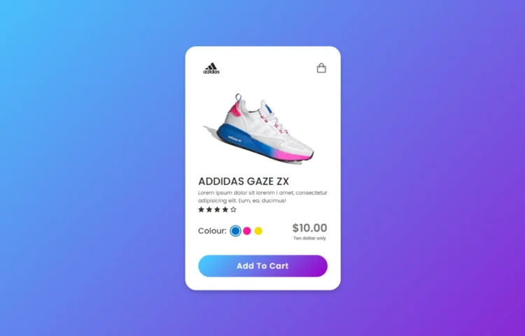
Animated Product Card using HTML & CSS | Create Beautiful & Responsive Cards
Create a Beautiful Product Card with Smooth Animations Today we are back again with another tutorial showing the process of creating an animated product card using just HTML and CSS. This is perfect for anyone looking to add interactive product cards to their website, providing users with a modern and engaging experience without…
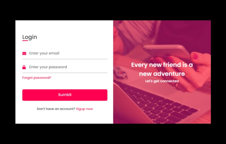
Responsive Login & Registration Form in HTML & CSS | Free Code
Are you ready to create your own responsive login and registration form in HTML and CSS? This detailed tutorial will show you how to create a responsive, user-friendly, and modern login and registration form. This form design can help you improve the user experience on your website, no matter if you’re…
Flipping Card UI Design in HTML & CSS | Download Source Code
Are you ready to create a Flipping Card UI Design in HTML & CSS? This tutorial will guide you to build a sleek, modern flipping card animation using only HTML and CSS. Whether you’re a beginner or an experienced developer looking to add flair to your web designs, mastering this…
How to Create a Simple Website in HTML & CSS | With Source Code
Creating a Simple Website in HTML & CSS is one of the best ways to start your web development journey. Whether you’re a beginner or looking to sharpen your skills, building a simple website using these core technologies is a must. In this tutorial, we’ll walk through the entire process…
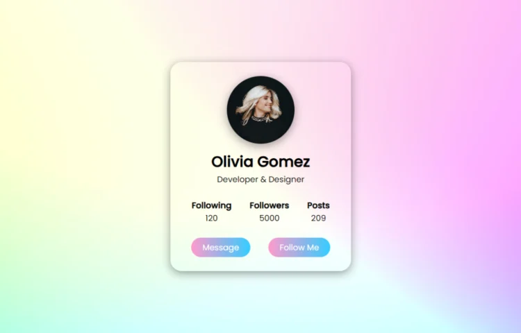
Create a Stylish Profile Card in HTML & CSS
Are you ready to give your website a fresh and modern touch? In this guide, you will learn how to create a Stylish Profile Card in HTML and CSS. Profile cards are a fantastic way to display user information such as name, role, followers, posts, and contact options. This tutorial…
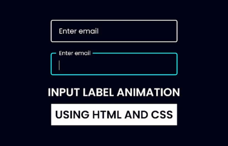
Master Input Label Animations in HTML & CSS
If you’ve ever filled out a form online, you’ve likely noticed the modern, sleek look of Input Label Animations—floating labels that animate when you click inside a text field. This small design feature not only enhances the look of your form but also improves user experience by making it clear…