Hey all! In this blog, you’ll learn how to create a Cookie Consent Box using HTML, CSS, and JavaScript. I’ve also demonstrated how to detect an Internet Connection using JavaScript. I’ve also provided various JavaScript projects that may assist in your mission, so be sure to take a look!
Cookies are small text documents with bits of data (usually no bigger than 4KB) stored by an internet server on a customer computer/browser to ensure a quality user experience at an online site. This blog demonstrates how you could set cookies into individual browsers as consent boxes through Javascript.
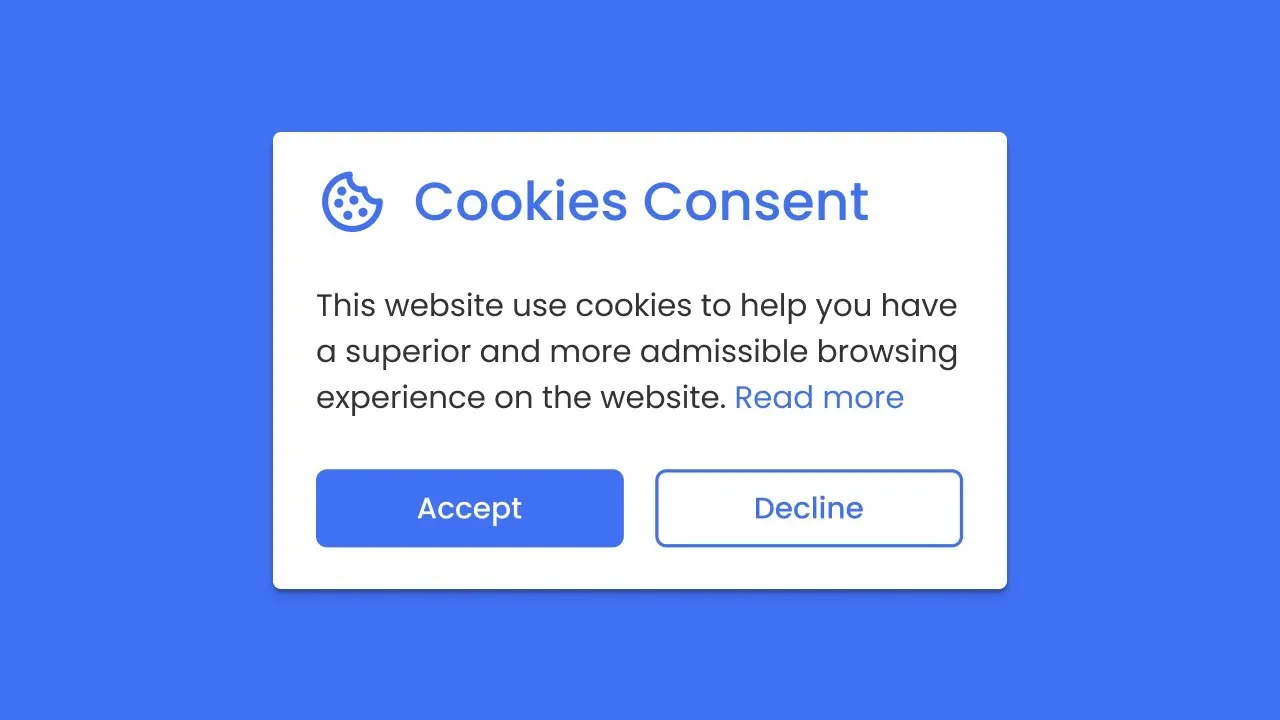
At first, an Internet webpage will have a cookie consent field, as shown in its preview image above. It contains an image, header text, a brief description, a button to accept cookies and a link for additional information about that cookie in this field. Even when refreshing pages, this cookie container will only reappear once you accept cookies through your browser.
Once you receive the cookie by clicking “I understand,” its container will disappear until you manually clear away it or it has not expired. If a website blocks cookies from being placed or this consent container cannot set any for your browser, an error alert container will display instead. By default, all consent containers set will automatically expire after one month, but this period can be increased or decreased according to your wishes.
You have seen in the video how I created a cookie consent box using HTML CSS & JavaScript to build its design layouts, while I used a bit of JavaScript codes to set cookies in consumer browsers. Even amateur programmers can easily make consent fields using our codes and take it further than ever!
As is common these days, websites use cookies to provide relevant advertisements and records, so if you also run a website or endeavour, you could quickly implement this cookie field by making minor adjustments in its code. Please find this cookie consent box and its codes to set cookies to consumer browsers useful!

Learn How to Set Cookies in a User Browser [Source Codes]

To create the Cookie Consent Box, start by creating two files: an HTML File and a CSS File. When those are complete, simply paste their codes into your document—alternatively, you can download them using the button below!
Start creating an HTML document with the name index.Html and copy-pasting these codes. Be aware that documents with an extension HTML cannot be edited directly.

<!DOCTYPE html>
<html lang="en">
<head>
  <meta charset="UTF-8">
  <title>Cookie Constent Box</title>
  <link rel="stylesheet" href="style.css">
</head>
<body>
  <div>
    <img src="#" alt="">
    <div>
      <header>Cookies Consent</header>
      <p>This website use cookies to ensure you get the best experience on our website.</p>
      <div>
        <button>I understand</button>
        <a href="#">Learn more</a>
      </div>
    </div>
  </div>
  <script>
    const cookieBox = document.querySelector(".wrapper"),
    acceptBtn = cookieBox.querySelector("button");
    acceptBtn.onclick = ()=>{
      //setting cookie for 1 month, after one month it'll be expired automatically
      document.cookie = "CookieBy=CodingNepal; max-age="+60*60*24*30;
      if(document.cookie){ //if cookie is set
        cookieBox.classList.add("hide"); //hide cookie box
      }else{ //if cookie not set then alert an error
        alert("Cookie can't be set! Please unblock this site from the cookie setting of your browser.");
      }
    }
    let checkCookie = document.cookie.indexOf("CookieBy=CodingNepal"); //checking our cookie
    //if cookie is set then hide the cookie box else show it
    checkCookie != -1 ? cookieBox.classList.add("hide") : cookieBox.classList.remove("hide");
  </script>
</body>
</html>

Second, create a CSS report named favor. Css and paste the given code into it. Please remember to name it favor.Css for your report extension.

@import url('https://fonts.googleapis.com/css2?family=Poppins:wght@200;300;400;500;600;700&display=swap');
*{
  margin: 0;
  padding: 0;
  box-sizing: border-box;
  font-family: 'Poppins', sans-serif;
}
body{
  background: #FCBA7F;
}
.wrapper{
  position: absolute;
  bottom: 30px;
  left: 30px;
  max-width: 365px;
  background: #fff;
  padding: 25px 25px 30px 25px;
  border-radius: 15px;
  box-shadow: 1px 7px 14px -5px rgba(0,0,0,0.15);
  text-align: center;
}
.wrapper.hide{
  opacity: 0;
  pointer-events: none;
  transform: scale(0.8);
  transition: all 0.3s ease;
}
::selection{
  color: #fff;
  background: #FCBA7F;
}
.wrapper img{
  max-width: 90px;
}
.content header{
  font-size: 25px;
  font-weight: 600;
}
.content{
  margin-top: 10px;
}
.content p{
  color: #858585;
  margin: 5px 0 20px 0;
}
.content .buttons{
  display: flex;
  align-items: center;
  justify-content: center;
}
.buttons button{
  padding: 10px 20px;
  border: none;
  outline: none;
  color: #fff;
  font-size: 16px;
  font-weight: 500;
  border-radius: 5px;
  background: #FCBA7F;
  cursor: pointer;
  transition: all 0.3s ease;
}
.buttons button:hover{
  transform: scale(0.97);
}
.buttons .item{
  margin: 0 10px;
}
.buttons a{
  color: #FCBA7F;
}

Assuming your code works correctly and no errors or trouble arises, download the source code files via the given download button. They are free zip files that must be extracted later.

As an amateur web developer, have you seen modern glass morphism effects on login bureaucracy, cards and various components on various websites? Have you considered designing your Login form with glass morphism effects?
Glassmorphism is an exciting consumer interface layout trend that creates the illusion of translucent and blurred glass surfaces, giving elements a semi-obvious appearance while making history and foreground combinations easy.
I will walk you through creating a Glassmorphism Login Form using HTML and CSS, including creating forms with glasslike effects and how to add floating-label animation.

Steps To Create Glassmorphism Login Form In HTML & CSS

  1. To create a Login Form with glass morphism effects and floating enter label animation using HTML and CSS, follow these easy instructions step-by-step:
  2. Create a folder. Feel free to name this folder whatever suits your needs, and then place your documents within it.
  3. Create an index.Html record; its file call must include “index” and its extension “.Html.”
  4. Create a Style.Css Document. The document name must include its extension (.Css).

Start by including the following HTML codes in your index.Html file. These contain essential HTML elements like documents, enter, hyperlinks and buttons – plus, for primary form validation purposes, I have also added a “required” feature to input fields.

<!DOCTYPE html>
<html>
<head>
  <meta charset="UTF-8">
  <meta name="viewport" content="width=device-width, initial-scale=1.0">
  <title>Glassmorphism Login Form | CodingNepal</title>
  <link rel="stylesheet" href="style.css">
</head>
<body>
  <div>
    <form action="#">
      <h2>Login</h2>
        <div>
        <input type="text" required>
        <label>Enter your email</label>
      </div>
      <div>
        <input type="password" required>
        <label>Enter your password</label>
      </div>
      <div>
        <label for="remember">
          <input type="checkbox" id="remember">
          <p>Remember me</p>
        </label>
        <a href="#">Forgot password?</a>
      </div>
      <button type="submit">Log In</button>
      <div>
        <p>Don't have an account? <a href="#">Register</a></p>
      </div>
    </form>
  </div>
</body>
</html>

Add these CSS codes to your fashion.Css file to style our login form with a glass morphism effect and floating label animation. These lines of code contain various CSS properties, such as blur, background image, and history picture, to achieve the desired Glassmorphism effect.

@import url("https://fonts.googleapis.com/css2?family=Open+Sans:wght@200;300;400;500;600;700&display=swap");
* {
  margin: 0;
  padding: 0;
  box-sizing: border-box;
  font-family: "Open Sans", sans-serif;
}
body {
  display: flex;
  align-items: center;
  justify-content: center;
  min-height: 100vh;
  width: 100%;
  padding: 0 10px;
}
body::before {
  content: "";
  position: absolute;
  width: 100%;
  height: 100%;
  background: url("https://www.codingnepalweb.com/demos/create-glassmorphism-login-form-html-css/hero-bg.jpg"), #000;
  background-position: center;
  background-size: cover;
}
.wrapper {
  width: 400px;
  border-radius: 8px;
  padding: 30px;
  text-align: center;
  border: 1px solid rgba(255, 255, 255, 0.5);
  backdrop-filter: blur(8px);
  -webkit-backdrop-filter: blur(8px);
}
form {
  display: flex;
  flex-direction: column;
}
h2 {
  font-size: 2rem;
  margin-bottom: 20px;
  color: #fff;
}
.input-field {
  position: relative;
  border-bottom: 2px solid #ccc;
  margin: 15px 0;
}
.input-field label {
  position: absolute;
  top: 50%;
  left: 0;
  transform: translateY(-50%);
  color: #fff;
  font-size: 16px;
  pointer-events: none;
  transition: 0.15s ease;
}
.input-field input {
  width: 100%;
  height: 40px;
  background: transparent;
  border: none;
  outline: none;
  font-size: 16px;
  color: #fff;
}
.input-field input:focus~label,
.input-field input:valid~label {
  font-size: 0.8rem;
  top: 10px;
  transform: translateY(-120%);
}
.forget {
  display: flex;
  align-items: center;
  justify-content: space-between;
  margin: 25px 0 35px 0;
  color: #fff;
}
#remember {
  accent-color: #fff;
}
.forget label {
  display: flex;
  align-items: center;
}
.forget label p {
  margin-left: 8px;
}
.wrapper a {
  color: #efefef;
  text-decoration: none;
}
.wrapper a:hover {
  text-decoration: underline;
}
button {
  background: #fff;
  color: #000;
  font-weight: 600;
  border: none;
  padding: 12px 20px;
  cursor: pointer;
  border-radius: 3px;
  font-size: 16px;
  border: 2px solid transparent;
  transition: 0.3s ease;
}
button:hover {
  color: #fff;
  border-color: #fff;
  background: rgba(255, 255, 255, 0.15);
}
.register {
  text-align: center;
  margin-top: 30px;
  color: #fff;
}

Conclusion and Closing Words (optional)

Conclusion Ultimately, we covered step-by-step commands for setting up your project folder, developing HTML shape code, and including CSS patterns for the Glassmorphism effect and floating label animation. Following these instructions, you have successfully built your Glassmorphism Login Form.
Consider customizing and personalizing your login shape, adding personal touches that make it even more stunning. Why recreate some login form designs featured here to further stretch your HTML and CSS skills?
If you encounter difficulties creating your Glassmorphism login form, you can download the source code documents for this form project for free using the Download button. Alternatively, click View Live for a live demo demonstration.

Cards are important web elements you may have encountered while visiting various websites. They are often used to display short articles, product details, and user profiles. Responsive cards provide an ideal project for novice developers learning CSS concepts like flexbox and grid layouts.
This blog post will demonstrate how to create a responsive design for cards using HTML and CSS. Three cards will be shown on screen, each featuring an image, title and button – plus an animated border animation when hovered over.
We will style and create responsive cards using HTML elements commonly found in card design, such as div A, image, heading, and CSS properties. The project should be straightforward, user-friendly, and able to comprehend and follow its steps.

How to create a responsive card using HTML and CSS

Follow these easy instructions to create a responsive card design using HTML and CSS:

  • Create a folder and give it any name you like, placing all necessary files inside.
  • Create an index.html file as your main document.
  • Create a style.css file containing CSS code.
  • The Images folder is in your project directory and contains images for your card project.

Add the following HTML code to your index.html file: This code includes essential HTML markups such as semantic tags such as div, image, and heading that help create our card design.

<!DOCTYPE html>
<html lang="en">
<head>
    <meta charset="UTF-8">
    <meta name="viewport" content="width=device-width, initial-scale=1.0">
    <title>Responsive Card Design HTML and CSS</title>
    <!-- Font Awesome Icons -->
    <link rel="stylesheet" href="https://cdnjs.cloudflare.com/ajax/libs/font-awesome/6.4.2/css/all.min.css">
    <!-- Custom CSS -->
    <link rel="stylesheet" href="style.css">
</head>
<body>
    <div>
        <a href="#">
            <img src="images/developer.jpg" alt="Card Image">
            <span>Developer</span>
            <h3>A "developer" codes software and websites.</h3>
            <div>
                <i></i>
            </div>
        </a>
        <a href="#">
            <img src="images/designer.jpg" alt="Card Image">
            <span>Designer</span>
            <h3>A "designer" is a design expert.</h3>
            <div>
                <i></i>
            </div>
        </a>
        <a href="#">
            <img src="images/editor.jpg" alt="Card Image">
            <span>Editor</span>
            <h3>An "editor" ensures content quality and accuracy.</h3>
            <div>
                <i></i>
            </div>
        </a>
    </div>
</body>
</html>

Add the CSS codes below to your style.css file to make your card responsive and stylish. To add an eye-catching finish, experiment with various CSS properties, such as fonts, colours, and backgrounds.

/* Importing Google font - Open Sans */
@import url('https://fonts.googleapis.com/css2?family=Open+Sans:wght@300;400;500;600;700&display=swap');
* {
    margin: 0;
    padding: 0;
    box-sizing: border-box;
    font-family: 'Open Sans', sans-serif;
}
body {
    background: #ecececdb;
}
.card-list {
    display: grid;
    grid-template-columns: repeat(auto-fill, minmax(300px, 1fr));
    max-width: 1250px;
    margin: 150px auto;
    padding: 20px;
    gap: 20px;
}
.card-list .card-item {
    background: #fff;
    padding: 26px;
    border-radius: 8px;
    box-shadow: 0px 5px 10px rgba(0, 0, 0, 0.04);
    list-style: none;
    cursor: pointer;
    text-decoration: none;
    border: 2px solid transparent;
    transition: border 0.5s ease;
}
.card-list .card-item:hover {
    border: 2px solid #000;
}
.card-list .card-item img {
    width: 100%;
    aspect-ratio: 16/9;
    border-radius: 8px;
    object-fit: cover;
}
.card-list span {
    display: inline-block;
    background: #F7DFF5;
    margin-top: 32px;
    padding: 8px 15px;
    font-size: 0.75rem;
    border-radius: 50px;
    font-weight: 600;
}
.card-list .developer {
    background-color: #F7DFF5; 
    color: #B22485;
}   
.card-list .designer {
    background-color: #d1e8ff;
    color: #2968a8;
}
.card-list .editor {
    background-color: #d6f8d6; 
    color: #205c20;
}
.card-item h3 {
    color: #000;
    font-size: 1.438rem;
    margin-top: 28px;
    font-weight: 600;
}
.card-item .arrow {
    display: flex;
    align-items: center;
    justify-content: center;
    transform: rotate(-35deg);
    height: 40px;
    width: 40px;
    color: #000;
    border: 1px solid #000;
    border-radius: 50%;
    margin-top: 40px;
    transition: 0.2s ease;
}
.card-list .card-item:hover .arrow  {
    background: #000;
    color: #fff; 
}
@media (max-width: 1200px) {
    .card-list .card-item {
        padding: 15px;
    }
}
@media screen and (max-width: 980px) {
    .card-list {
        margin: 0 auto;
    }
}

Conclusion. Final Thoughts and Conclusion.

Conclusion: Constructing responsive CSS cards enables web developers just starting out to use their HTML and CSS knowledge, putting it to the test in practice. I hope you have successfully created your CSS cards by following the code and steps in this article.
Create other functional website elements, such as login forms, navigation bars and homepages.
Clicking the Download button will allow you to access this project’s source code, while View Live gives a live demonstration.

Web developers must understand how to structure and design essential components. A pricing card is one component commonly used to display different pricing plans and subscription options on websites.
This blog post will give you a step-by-step guide on how to make a simple price card using HTML and CSS. It was designed for beginners as it’s easy to understand and follow. You will learn various HTML tags and CSS attributes that will allow you to create a visually pleasing pricing card.
To create this price card, we will use HTML elements such as div, button, h2, and h1, as well as CSS properties. This project is designed for beginners, so you shouldn’t have trouble following along.
How to create a pricing card in HTML and CSS
Follow these easy steps to create a price card in HTML and CSS:
Create a new folder. This folder can be named anything you want, and the files will be created inside.
Create a file called index.html. The index.html file must have the extension.html and the name index.
Create a file called style.css. The file must have the name style with the extension.css.
Add the HTML code below to your index.html. This code contains essential HTML markup, including h1,h2, div,p, etc. Create a pricing sheet.

<!DOCTYPE html>
<html lang="en">
<head>
  <meta charset="UTF-8">
  <meta name="viewport" content="width=device-width, initial-scale=1.0">
  <title>Pricing Card HTML and CSS</title>
  <link rel="stylesheet" href="style.css">
</head>
<body>
  <div>
    <h2>Unlock Exclusive <br> Content</h2>
    <h3>$29<span>/month</span></h3>
    <p>Gain exclusive access to our premium content library. Explore and enjoy high-quality videos on your preferred devices.</p>
    <b>Act fast! Offer ends on September 20, 2023.</b>
    <a href="#">Subscribe Now</a>
    <div>
      <div>Special Offer!</div>
    </div>
  </div>
</body>
</html>

Add the CSS codes below to your style.css to style the pricing card. You can apply colour, font, border and background. After adding the CSS codes, you can view your newly styled price card by loading the page in your web browser.

/* Importing Google font -Open+Sans */
@import url('https://fonts.googleapis.com/css2?family=Open+Sans:wght@300;400;500;600;700&display=swap');
* {
    margin: 0;
    padding: 0;
    box-sizing: border-box;
    font-family: 'Open Sans', sans-serif;
}
body {
    width: 100%;
    height: 100vh;
    background: #fff6f6;
    display: flex;
    justify-content: center;
    align-items: center;
}
.container {
    width: 460px;
    padding: 40px;
    background: #ffffff;
    text-align: center;
    border-radius: 12px;
    overflow: hidden;
    box-shadow: 0 0 15px rgba(0, 0, 0, 0.05);
    position: relative;
}
.container .title {
    font-size: 2rem;
    color: #333;
}
.container .price {
    color: #FF6B6B;
    font-weight: 700;
    font-size: 2.2rem;
    margin: 15px 0;
}
.container span {
    font-size: 1.2rem;
}
.container .description {
    color: #3b3b3b;
    font-size: 1.1rem;
    margin: 20px 0 20px;
}
.container .offer {
    display: block;
    color: #555;
    font-size: 1rem;
    margin-top: 25px;
}
.subscribe-button {
    display: inline-block;
    padding: 15px 0;
    background-color: #FF6B6B;
    color: #fff;
    text-decoration: none;
    border-radius: 30px;
    font-size: 1.2rem;
    margin-top: 40px;
    width: 100%;
    font-weight: 500;
    transition: 0.2s ease;
}
.subscribe-button:hover {
    background: #ff4d4d;
}
.ribbon-wrap {
    width: 150px;
    height: 150px;
    position: absolute;
    top: -10px;
    left: -10px;
    pointer-events: none;
}
.ribbon {
    width: 230px;
    font-size: 0.918rem;
    text-align: center;
    padding: 8px 0;
    background: #FF6B6B;
    color: #fff;
    position: absolute;
    transform: rotate(-45deg);
    right: -17px;
    top: 29%;
}

Final Words and Conclusion

If you are a beginner at web development, you can start with a simple project. It’s easy to create your pricing cards using HTML and CSS. This blog post will provide simple codes and steps to create a beautiful pricing card.
You can also recreate other CSS cards on this site to improve your HTML and CSS skills. If you have any problems, please feel free to click the Download button and download the source code for this project. You will receive a zip file on your device.

Forms are essential in web development, allowing users to submit data. Form validation is integral to this process and must ensure the accuracy and integrity of user input.
Form validation is the practice of verifying that data entered by individuals meets certain criteria and is accurate. Its primary goal is to prevent incomplete or inaccurate form submissions.
This blog aims to guide novice web developers through the validation process using HTML, CSS and JavaScript. Starting from scratch, we will teach how to build responsive forms using these technologies before diving deeper into form validation using JavaScript.
Discover how to easily hide or show password visibility using the toggle button, scrolling to the bottom of this page, and clicking the View Live Demo link.

How to Implement Form Validation in HTML

Follow these step-by-step instructions to create a JavaScript form using HTML, CSS and vanilla JavaScript.

  • Establish a new folder. Add files to this new directory, giving it any name you wish.
  • Create an index.html file.
  • Thank-you.html is an index file you can create with an extension.html.
  • Create a file named style.css with this name as its file extension.
  • Create a file named script.js. The file should have its name prefixed with “script.js”.

Add this HTML code to your index.html file to create a basic form layout. It includes fields for full name, email address, password, date of birth, and gender of birth, as well as additional fields that you may add or delete as necessary.

<!DOCTYPE html>
<html lang="en">
  <head>
    <meta charset="UTF-8">
    <meta name="viewport" content="width=device-width, initial-scale=1.0">
    <title>Form Validation in HTML</title>
    <link rel="stylesheet" href="style.css">
    <!-- Fontawesome CDN Link For Icons -->
    <link rel="stylesheet" href="https://cdnjs.cloudflare.com/ajax/libs/font-awesome/6.2.1/css/all.min.css" />
  </head>
  <body>
    <form action="thank-you.html">
      <h2>Form Validation</h2>
      <div>
        <label for="fullname">Full Name</label>
        <input type="text" id="fullname" placeholder="Enter your full name">
      </div>
      <div>
        <label for="email">Email Address</label>
        <input type="text" id="email" placeholder="Enter your email address">
      </div>
      <div>
        <label for="password">Password</label>
        <input type="password" id="password" placeholder="Enter your password">
        <i id="pass-toggle-btn"></i>
      </div>
      <div>
        <label for="date">Birth Date</label>
        <input type="date" id="date" placeholder="Select your date">
      </div>
      <div>
        <label for="gender">Gender</label>
        <select id="gender">
          <option value="" selected disabled>Select your gender</option>
          <option value="Male">Male</option>
          <option value="Female">Female</option>
          <option value="Other">Other</option>
        </select>
      </div>
      <div>
        <input type="submit" value="Submit">
      </div>
    </form>
    <script src="script.js"></script>
  </body>
</html>

Add these HTML codes to your thank-you.html page: When the user submits their form correctly, they’ll be taken directly to this HTML webpage, which only has one heading that says: “Thanks for filling out your form accurately!”

<!DOCTYPE html>
<html lang="en">
<head>
    <meta charset="UTF-8">
    <meta name="viewport" content="width=device-width, initial-scale=1.0">
    <title>Thanks page</title>
</head>
<body>
    <h1>Thank you for filling out the form correctly.</h1>
</body>
</html>

Add these CSS codes to your style.css file to style and make your form visually pleasing and responsive. You can tailor these codes by changing the font, colour, and size settings to meet your needs.

@import url('https://fonts.googleapis.com/css2?family=Open+Sans:wght@400;500;600;700&display=swap');
* {
  margin: 0;
  padding: 0;
  box-sizing: border-box;
  font-family: 'Open Sans', sans-serif;
}
body {
  display: flex;
  align-items: center;
  justify-content: center;
  padding: 0 10px;
  min-height: 100vh;
  background: #1BB295;
}
form {
  padding: 25px;
  background: #fff;
  max-width: 500px;
  width: 100%;
  border-radius: 7px;
  box-shadow: 0 10px 15px rgba(0, 0, 0, 0.05);
}
form h2 {
  font-size: 27px;
  text-align: center;
  margin: 0px 0 30px;
}
form .form-group {
  margin-bottom: 15px;
  position: relative;
}
form label {
  display: block;
  font-size: 15px;
  margin-bottom: 7px;
}
form input,
form select {
  height: 45px;
  padding: 10px;
  width: 100%;
  font-size: 15px;
  outline: none;
  background: #fff;
  border-radius: 3px;
  border: 1px solid #bfbfbf;
}
form input:focus,
form select:focus {
  border-color: #9a9a9a;
}
form input.error,
form select.error {
  border-color: #f91919;
  background: #f9f0f1;
}
form small {
  font-size: 14px;
  margin-top: 5px;
  display: block;
  color: #f91919;
}
form .password i {
  position: absolute;
  right: 0px;
  height: 45px;
  top: 28px;
  font-size: 13px;
  line-height: 45px;
  width: 45px;
  cursor: pointer;
  color: #939393;
  text-align: center;
}
.submit-btn {
  margin-top: 30px;
}
.submit-btn input {
  color: white;
  border: none;
  height: auto;
  font-size: 16px;
  padding: 13px 0;
  border-radius: 5px;
  cursor: pointer;
  font-weight: 500;
  text-align: center;
  background: #1BB295;
  transition: 0.2s ease;
}
.submit-btn input:hover {
  background: #179b81;
}

Add this JavaScript code to your script.js file to activate form validation, display appropriate error messages, and implement toggle functionality to make passwords visible.

// Selecting form and input elements
const form = document.querySelector("form");
const passwordInput = document.getElementById("password");
const passToggleBtn = document.getElementById("pass-toggle-btn");
// Function to display error messages
const showError = (field, errorText) => {
    field.classList.add("error");
    const errorElement = document.createElement("small");
    errorElement.classList.add("error-text");
    errorElement.innerText = errorText;
    field.closest(".form-group").appendChild(errorElement);
}
// Function to handle form submission
const handleFormData = (e) => {
    e.preventDefault();
    // Retrieving input elements
    const fullnameInput = document.getElementById("fullname");
    const emailInput = document.getElementById("email");
    const dateInput = document.getElementById("date");
    const genderInput = document.getElementById("gender");
    // Getting trimmed values from input fields
    const fullname = fullnameInput.value.trim();
    const email = emailInput.value.trim();
    const password = passwordInput.value.trim();
    const date = dateInput.value;
    const gender = genderInput.value;
    // Regular expression pattern for email validation
    const emailPattern = /^[^ ]+@[^ ]+.[a-z]{2,3}$/;
    // Clearing previous error messages
    document.querySelectorAll(".form-group .error").forEach(field => field.classList.remove("error"));
    document.querySelectorAll(".error-text").forEach(errorText => errorText.remove());
    // Performing validation checks
    if (fullname === "") {
        showError(fullnameInput, "Enter your full name");
    }
    if (!emailPattern.test(email)) {
        showError(emailInput, "Enter a valid email address");
    }
    if (password === "") {
        showError(passwordInput, "Enter your password");
    }
    if (date === "") {
        showError(dateInput, "Select your date of birth");
    }
    if (gender === "") {
        showError(genderInput, "Select your gender");
    }
    // Checking for any remaining errors before form submission
    const errorInputs = document.querySelectorAll(".form-group .error");
    if (errorInputs.length > 0) return;
    // Submitting the form
    form.submit();
}
// Toggling password visibility
passToggleBtn.addEventListener('click', () => {
    passToggleBtn.className = passwordInput.type === "password" ? "fa-solid fa-eye-slash" : "fa-solid fa-eye";
    passwordInput.type = passwordInput.type === "password" ? "text" : "password";
});
// Handling form submission event
form.addEventListener("submit", handleFormData);

Final Words and Conclusion

We started by creating the structure of our form in HTML, which included outlining its input fields and attributes as well as any required elements. Then, we used CSS to style elements such as form fields, buttons, and labels before using JavaScript for validation logic to ensure users enter only valid data into our form.
Following the instructions here, your form should be functional and possess validation features. I encourage you to experiment and explore the variety of forms available here to enhance your web development abilities.
Clicking the Download button allows you to quickly and freely access this form’s source files in case you encounter any difficulties creating your form or your code misbehaves as expected. Click View Live for an online demonstration.

Hello friends, and welcome! Today, you will learn how to hide and show passwords using HTML, CSS, and JavaScript. I have developed various Login Forms with their animations and features; many of you have asked me for input field label animations and toggle password visibility features – here they are!
You can reveal or conceal your password’s letters by pressing the toggle button. This feature has been included as an extra security measure, as many users wish to keep their passwords private.
Look at the image below; it clearly demonstrates how to hide and reveal a password. In one input field, password letters remain concealed, while in another, we can clearly see them.
I created this project with code. By following along, you’ll learn how to code this project yourself!

Make an Array to Hide/Show Password in HTML CSS & JavaScript

Before jumping into source code development, it is vital to comprehend some critical points from this video tutorial.
Watching this video, it is clear that initially, there was only a grey border around our password field with an eye icon. But as soon as I focused on that password field, the text moved up, the border changed from grey to blue, and the eye icon and border colour altered accordingly – this animation was produced entirely using HTML CSS! To achieve such results.
I hope that creating the Show and Hide Password project is straightforward for you. If you need assistance building it, all necessary source codes are listed below.

Access Contact Form Validate Password on Login/Signup Form [Source Code]

After you have created two files—HTML and CSS—copy and paste their respective source codes from these two documents into this Login & Registration Form. By clicking download, you can get all its source code.

<!DOCTYPE html>
<html lang="en">
<head>
    <meta charset="UTF-8">
    <meta http-equiv="X-UA-Compatible" content="IE=edge">
    <meta name="viewport" content="width=device-width, initial-scale=1.0">
    <!----==== CSS ====-->
    <link rel="stylesheet" href="style.css">
    <!----==== Icounscout Link ====-->
    <link rel="stylesheet" href="https://unicons.iconscout.com/release/v4.0.0/css/line.css">
     <title>Password Show & Hide</title>
</head>
<body>
    <div>
        <div>
            <input type="password" spellcheck="false" required>
            <label for="">Password</label>
            <i></i>
        </div>
    </div>
    <script>
       const toggle = document.querySelector(".toggle"),
              input = document.querySelector("input");
              toggle.addEventListener("click", () =>{
                  if(input.type ==="password"){
                    input.type = "text";
                    toggle.classList.replace("uil-eye-slash", "uil-eye");
                  }else{
                    input.type = "password";
                  }
              })
    </script>
</body>
</html>
/* Google Font Import - Poppins */
@import url('https://fonts.googleapis.com/css2?family=Poppins:wght@300;400;500;600;700&display=swap');
*{
    margin: 0;
    padding: 0;
    box-sizing: border-box;
    font-family: 'Poppins', sans-serif;
}
body{
    height: 100vh;
    display: flex;
    align-items: center;
    justify-content: center;
    background: #4070f4;
}
.container{
    position: relative;
    max-width: 340px;
    width: 100%;
    padding: 20px;
    border-radius: 6px;
    background-color: #fff;
}
.container .input-box{
    position: relative;
    height: 50px;
}
.input-box input{
    position: absolute;
    height: 100%;
    width: 100%;
    outline: none;
    border: 2px solid #ccc;
    border-radius: 6px;
    padding: 0 35px 0 15px;
    transition: all 0.2s linear;
}
input:is(:focus, :valid){
    border-color: #4070f4;
}
.input-box :is(label, i){
    position: absolute;
    top: 50%;
    transform: translateY(-50%);
    color: #999;
    transition: all 0.2s linear;
}
.input-box label{
    left: 15px;
    pointer-events: none;
    font-size: 16px;
    font-weight: 400;
}
input:is(:focus, :valid) ~ label{
    color: #4070f4;
    top: 0;
    font-size: 12px;
    font-weight: 500;
    background-color: #fff;
}
.input-box i{
    right: 15px;
    cursor: pointer;
    font-size: 20px;
}
input:is(:focus, :valid) ~ i{
    color: #4070f4;
}

View a live demo by clicking “view live.” If you experience difficulty creating this Password Show-and-Hide Project or its code does not function as expected, feel free to download a copy of its source code from here free of charge.

Necessary Plugins For WordPress Blog: Whenever We Choose a WordPress Platform For Blogging, We Have To Choose The Best Plugins For It. Many New Bloggers Do Not Know Which Plugins To Choose For Their Blog.

Through Today’s Article, We Will Tell You About the best WordPress Plugins For Blog. Every Blogger needs to Use It.

In A Previous Article, I Told You Why WordPress Is Better For Blogging. Apart From This, I Have Compared WordPress to Blogger, After Reading You Will Also Be Able To Know About The Benefits Of WordPress.

New Bloggers Do Not Understand Which WordPress Plugins Are Right For Their Website And Start Using the Wrong WP Plugins Which Are Not Of Any Use To Them.

The Best WordPress Plugins Mentioned By Us Will Not Only Help You In Ranking In Google But Will Also Take You One Step Closer To Becoming A Successful Blogger.

Now Without Any Delay Let’s Start This Article And Know Important WordPress Plugin For

Best WordPress Plugins For Blogger
A List Of Essential Plugins For A Blog Website Is Given, Which We Also Use.

1. Updraft Plus

Updraft Plus Is Used For Backup Of WordPress Website. With Its Help, You Can Make Daily Backup Of Your Website. So That If Any Of Your Content Gets Deleted By Mistake, You Will Have Its Backup Available.

2. One Signal (One Signal Information)

One Signal Plugin Is used for Push Notification. Whenever A User Visits Our Blog, One Signal Plugin Sends A Push Notification To The User.

With The Help Of Which The User Can Subscribe To Our Website The Update Of Every New Post Of Ours Reaches Him. Due To Which Our Website Also Gets Good Traffic.

3. Yoast SEO Premium

Whenever We Write An Article, It Is Very Important To Do Its SEO. Yoast SEO Is One Of The Best And Most Used SEO plugins of WordPress.

Yoast SEO Plugin Analyzes The Entire SEO Of Our Article. If There Is Any Shortcoming In SEO Then It Is Also Told. We Have Told You How To Do The Settings Of Yoast SEO Plugin In The Previous Post.

4. AMP

AMP Plugin Is Used To Increase The Loading Speed Of The Website In Mobile. Google Also Recommends AMP. AMP Plugin Reduces The Loading Speed I.E. Time Of The Website In Mobile,

5. WP Rocket (Rocket Cache Plugin)

WP Rocket Plugin Will Make Your WordPress Website Super Fast, It Is Also A Best Cache Plugin. Whenever A User Opens Your Website, It Creates A Cache In His Browser, Due To Which Your Website Will Open Very Quickly In That User’s Browser.

6. Smush (Smush Image Optimize)

Through Smush Plugin We Can Compress The Image Size Of Our Website. Smush Compresses The Large Image Size In Our Website And Converts It Into Smaller Image Size, Due To Which The Image Of Our Website Opens Quickly In Any Browser.

7. A3 Lazy Load

Images Take The Most Time To Load In Our Content. Using A3 Lazy Load Plugin, An Image Is Loaded Only When The User Scrolls. With The Help Of Which The Speed Of The Website Also Remains Good.

8. Redirection (Redirection Plugin)

Redirection Plugin Is Used To Fix Broken Links In The Website. With The Help Of Redirection, You Can Redirect Your 404 Error Page To Another Webpage.

With The Help Of Redirection, We Can Fix The Errors Of Our Website, Which Also Improves The SEO Of The Website.

9. Akismet Anti Spam (Spam Comment Plugin)

Akismet Anti Spam Plugin Is Used To Protect Your Website From Spam Commenting. This Is The Best Anti Spam Commenting Plugin Which Is Most Used On WordPress Websites.

10. Jetpack (Jet Pack Plugin)

There Are Many Features Available In the Jetpack Plugin With The Help Of Which We Can Add Many Features To Our Website Like –


  • Takes Daily Backup.
  • You Can Auto Share The Post On Social Media.
  • You Can Create A Contact Us Page.
  • Can Show Related Posts.
  • Social Share Buttons Are Available.
  • Can See The Pageview.

11. Wordfence (Security Plugin)

Wordfence Is A Security Plugin. With The Help Of Which We Can Make Our WordPress Site Secure & Safe. There Is Also A Paid Version Of Wordfence, But It’s a Free Version Also We Get Many Features that protect Our Website From Attacks By Hackers.

12. LuckyWP – Table of Content (Table of Content Plugin)

LuckyWP Plugin Is Used To Create The Table Of Content At The Beginning Of The Content. It Is Quite User Friendly And SEO Friendly. Any User Can Easily Access The Heading In Our Content That He Wants To Read.

13. Insert Header and Footer (Code Plugin in Header and Footer)

If You Do Not Have Much Knowledge Of Coding And You Do Not Want To Mess With The Coding Of Your Website Again And Again, Then Inserting Header And Footer Plugin Is Best For You. With Its Help, You Can Implement Any Code In The Header And Footer Of Your Website.

14. Ad Inserter (Ad Inserter Plugin)

If You Have Google AdSense Approval Then Ad Inserter Is The Best Plugin For Ad Placement. With Its Help, You Can Place The Best Ads As Per Your Requirement on your Website, Which Will Also Increase Your Earning.

15. Elementor Page Builder (Page Builder Plugin)

If You Want To Give A Premium Look To Your Website Then Elementor Is The Best Plugin. With Its Help, You Can Give Better Design To Your Content So That Users Will Be Attracted to your Website.

16. Broken Link Checker (Broken Link Checker Plugin)

You Can Find All The Broken Links Created on your Website Through Broken Link Checker Plugin. This Is A Very Good Plugin.

17. Google site kit

If You Want To See All The Statistics Of Google On Your WordPress Dashboard, Then Google Site Kit Plugin Is Best For You. You Can Connect It With Your Google Analytics, Search Console And Track The Traffic Coming To Your Website.

Conclusion – Essential Plugin for WordPress Website
So Friends, These Were The 18 Best WordPress Plugin For Blogger Which Are Very Important For Any WordPress Blog Website , All These Plugins Will Make Your Website Better .

We Hope You Liked This Article, Do Tell In The Comments Which Plugins You Use In Your WordPress Website .

The field of Artificial Intelligence (AI) is gradually growing. At the same time, AI tools like ChatGPT, Murf.AI, and OpenAI API key are becoming quite popular these days. These tools work with the help of this technology. Keeping this in view, today we are going to tell you about some such selected Artificial Intelligence tools, which will make your daily tasks easier and faster. If you also want to use such tools, then let us tell you about them further.

1. ChatGPT

chat-gpt

ChatGPT is an Artificial Intelligence tool. Its full form is a generative Pre-trained Transformer. At the same time, through this the user i.e. you can get the answer to any question. For this, users will have to go to the official website of Chat GPT chat.openai.com.

2. Bard LaMDa

lamda

If we look at Google’s AI tool Bard, it is quite different from ChatGPT. The artificial intelligence tool ChatGPT answers questions based on pre-existing data, while Google has equipped its AI chatbot with a language model and dialogue application i.e. LaMDA.

3. Ai Valley

valley

With the help of this AI tool, you can do many things simultaneously. With the help of this AI, work like copywriting, image generation and editing, coding, productivity, etc. can be done without spending much time.

4. Murf AI

murf

If you want to generate voice-over for yourself with the help of AI then this is a great AI tool. With the help of this website, you can generate voiceovers for yourself just by writing text. It offers a free plan with just 10 minutes of free voice generation and 10 minutes of transcription time.

5. OpenAI API

openai

With the help of Microsoft’s proprietary OpenAI, you can do data extraction, translation, etc. apart from image generation and converting speech to text.

6. Midjourney

midjourney

Midjourney is an AI image generator that lets you create stunning images. This AI tool can do a lot with realistic photos. However, only some accesses to this tool are free. Apart from this, you will have to spend money on more features.

7. Synthesia

synthesia

You can create AI-generated videos with the help of synthesis. For this, you will have to upload your script. After this, you will get a video call with the AI ​​anchor. However, initially, it is free. But, to use it you will have to spend money.

8. Soundraw

soundraw

If you are a music lover and listening and creating songs is your hobby then this tool is going to be useful for you. Soundraw is a unique tool for generating music for musicians.

9. AI Slides

ai-slides

If you work then this tool is no less than a boon for you. With the help of this AI tool, you can do hours of work in just minutes. With the help of this tool, long presentations can be made quickly.

10. Elai

This is another video generator tool on the list. If you are a creator then with its help you can create videos for your channel with AI video anchor.