


Hello, friends! I hope you’re having an amazing day. Today, I’m here to guide you through creating an easy and effective multiple-typing text animation using HTML, CSS, and JavaScript. This effect not only looks attractive but also is a fantastic way to engage your visitors and make your website stand out.
What Is Multiple Typing Text Animation?
Multiple typing text animation is the dynamic and engaging effect where text changes automatically, just like a classic typewriter. This animation has become a popular trend in web design, giving websites a modern and interactive feel. Whether you’re creating a portfolio, a personal blog, or a business site, incorporating this effect can enhance user experience and keep visitors on your page longer.
Why Use Typing Text Animation?
- Engagement: Animated text captures attention and encourages visitors to read your content.
- Modern Aesthetic: It adds a contemporary touch to your website design, making it feel fresh and up-to-date.
- Versatility: This animation can be used in various contexts, from showcasing skills to highlighting services.
How Multiple Typing Text Animation Works
In this project, we’ll create a simple yet effective animation with two types of text: a static part and a dynamic part that changes over time. The static text remains constant, while the dynamic text will cycle through different phrases like a typewriter.
To achieve this effect, we’ll utilize CSS for styling and animation, alongside JavaScript to control the text changes. Below, I’ll provide the complete source code to help you get started.
Source Code for Multiple Typing Text Animation
To implement this animation on your website, you’ll need to create two files: one for HTML and one for CSS. Simply copy and paste the code provided below into your respective files.
HTML Code
<!DOCTYPE html>
<html lang="en">
<head>
<meta charset="UTF-8">
<meta http-equiv="X-UA-Compatible" content="IE=edge">
<meta name="viewport" content="width=device-width, initial-scale=1.0">
<link rel="stylesheet" href="style.css">
</head>
<body>
      <div class="container">
          <span class="text first-text">I'm a</span>
          <span class="text sec-text">Designer</span>
      </div>
<script>
      const text = document.querySelector(".sec-text");

      const textLoad = () => {
      setTimeout(() => {
      text.textContent = "Designer";
      }, 0);
      setTimeout(() => {
      text.textContent = "Blogger";
      }, 4000);
      setTimeout(() => {
      text.textContent = "YouTuber";
      }, 8000);
      }

      textLoad();
      setInterval(textLoad, 12000);
</script>
</body>
</html>
CSS Code
@import url('https://fonts.googleapis.com/css2?family=Poppins:wght@200;300;400;500;600&display=swap');

* {
    margin: 0;
    padding: 0;
    box-sizing: border-box;
    font-family: 'Poppins', sans-serif;
}

body {
    min-height: 100vh;

    align-items: center;
    justify-content: center;
    background: #010718;
    overflow: hidden;
}

.container {
    width: 246px;
    overflow: hidden;
}

.container .text {
    position: relative;
    color: #4070F4;
    font-size: 30px;
    font-weight: 600;
}

.container .text.first-text {
    color: #FFF;
}

.text.sec-text:before {
    content: "";
    position: absolute;
    top: 0;
    left: 0;
    height: 100%;
    width: 100%;
    background-color: #010718;
    border-left: 2px solid #4070F4;
    animation: animate 4s steps(12) infinite;
}

@keyframes animate {
    40%, 60% {
        left: calc(100% + 4px);
    }
    100% {
        left: 0%;
    }
}
Download the Source Code
Ready to bring this multiple-typing text animation to your website? You can easily download the complete source code by clicking the button below. This zip file includes both the HTML and CSS files, so you can get started right away!
Simply extract the files and customize the text and styles to fit your unique vision. Enjoy creating an engaging and interactive experience for your visitors!


Comments
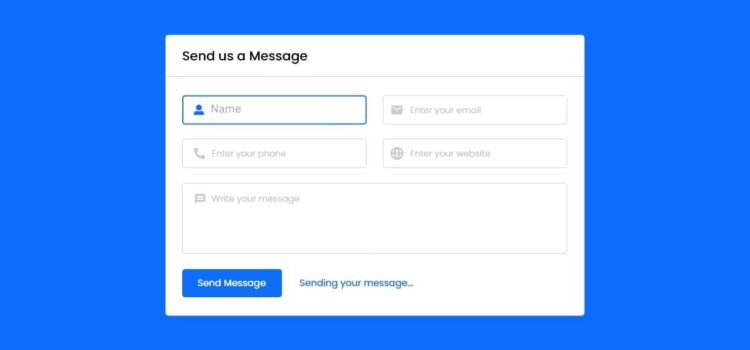
Learn to build a functional contact form in PHP
Learn to build a functional contact form in PHP
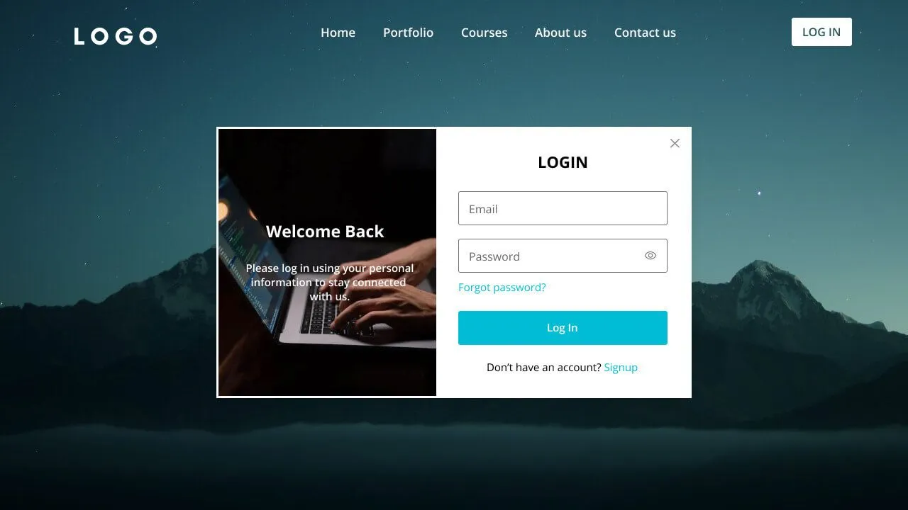
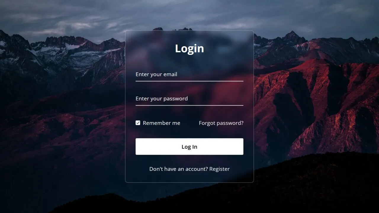
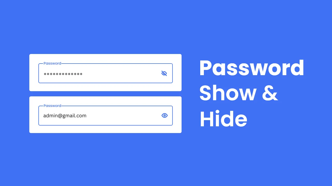
Create a Website with a Login/Registration Form in HTML, CSS and JavaScript
Learn to build a functional contact form in PHP
Create a Website with a Login/Registration Form in HTML, CSS and JavaScript