


Introduction to Toast Notifications
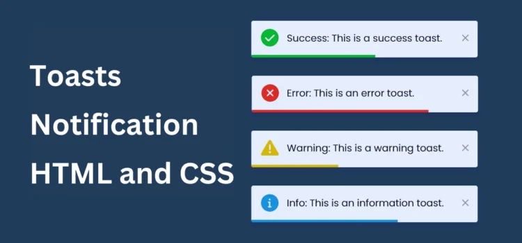
Toast notifications are those small, friendly alerts that pop up on your screen to give you feedback or updates about what’s happening. They’re commonly used in web applications to keep users informed without interrupting the workflow. I am sharing this guide to show you how to create a customizable toast notification using HTML, CSS, and JavaScript.
Why Use Toast Notifications?
Toast notifications are essential for providing feedback and enhancing user interactions. Here are several reasons to incorporate them into your web applications:
- User Engagement: Notifications can inform users about important actions like successful form submissions or errors, keeping them engaged with the application.
- Real-time Feedback: They provide immediate feedback without requiring page refreshes, which is crucial for improving user experience.
- Customizable: Developers can easily customize the appearance and behavior of toast notifications to align with the application’s design.
Understanding the Structure of Toast Notifications
A typical toast notification consists of:
- A message that informs the user about an action’s success, failure, or warning.
- An optional close button to dismiss the notification.
- A progress indicator to show the notification duration.
Setting Up Your Project
Before diving into coding, let’s set up a project folder that will contain all necessary files. Follow these steps:
- Create a Project Folder: Name your folder something like toast-notification.
- Create Essential Files:
- index.html: This file will contain the main HTML structure.
- style.css: This file will manage the styling of the toast notifications.
- script.js: This file will handle the functionality of the toast notifications.
Creating the HTML Layout
In your index.html file, add the following code to establish the basic layout for your toast notification:
<!DOCTYPE html><!-- Coding By Abhikesh - www.abhikesh.com --><html lang="en" dir="ltr"><head><meta charset="utf-8"><title>Toast Notification | abhikesh</title><link rel="stylesheet" href="style.css"><meta name="viewport" content="width=device-width, initial-scale=1.0"><!-- Font Awesome CDN link for icons --><link rel="stylesheet" href="https://cdnjs.cloudflare.com/ajax/libs/font-awesome/6.2.1/css/all.min.css"><script src="script.js" defer></script></head><body><ul class="notifications"></ul><div class="buttons"><button class="btn" id="success">Success</button><button class="btn" id="error">Error</button><button class="btn" id="warning">Warning</button><button class="btn" id="info">Info</button></div></body></html>
Styling the Toast Notification
Next, open your style.css file and add the following CSS code to style the toast notifications and the buttons:
/* Import Google font - Poppins */@import url('https://fonts.googleapis.com/css2?family=Poppins:wght@400;500;600&display=swap');* {margin: 0;padding: 0;box-sizing: border-box;font-family: 'Poppins', sans-serif;}:root {--dark: #34495E;--light: #ffffff;--success: #0ABF30;--error: #E24D4C;--warning: #E9BD0C;--info: #3498DB;}body {display: flex;align-items: center;justify-content: center;min-height: 100vh;background: var(--dark);}.notifications {position: fixed;top: 30px;right: 20px;}.notifications :where(.toast, .column) {display: flex;align-items: center;}.notifications .toast {width: 400px;position: relative;overflow: hidden;list-style: none;border-radius: 4px;padding: 16px 17px;margin-bottom: 10px;background: var(--light);justify-content: space-between;animation: show_toast 0.3s ease forwards;}@keyframes show_toast {0% {transform: translateX(100%);}40% {transform: translateX(-5%);}80% {transform: translateX(0%);}100% {transform: translateX(-10px);}}.notifications .toast.hide {animation: hide_toast 0.3s ease forwards;}@keyframes hide_toast {0% {transform: translateX(-10px);}40% {transform: translateX(0%);}80% {transform: translateX(-5%);}100% {transform: translateX(calc(100% + 20px));}}.toast::before {position: absolute;content: "";height: 3px;width: 100%;bottom: 0px;left: 0px;animation: progress 5s linear forwards;}@keyframes progress {100% {width: 0%;}}.toast.success::before, .btn#success {background: var(--success);}.toast.error::before, .btn#error {background: var(--error);}.toast.warning::before, .btn#warning {background: var(--warning);}.toast.info::before, .btn#info {background: var(--info);}.toast .column i {font-size: 1.75rem;}.toast.success .column i {color: var(--success);}.toast.error .column i {color: var(--error);}.toast.warning .column i {color: var(--warning);}.toast.info .column i {color: var(--info);}.toast .column span {font-size: 1.07rem;margin-left: 12px;}.toast i:last-child {color: #aeb0d7;cursor: pointer;}.toast i:last-child:hover {color: var(--dark);}.buttons .btn {border: none;outline: none;cursor: pointer;margin: 0 5px;color: var(--light);font-size: 1.2rem;padding: 10px 20px;border-radius: 4px;}@media screen and (max-width: 530px) {.notifications {width: 95%;}.notifications .toast {width: 100%;font-size: 1rem;margin-left: 20px;}.buttons .btn {margin: 0 1px;font-size: 1.1rem;padding: 8px 15px;}}
Customizing Toast Styles
You can create different styles for success, error, warning, and info notifications by adding specific classes. Here’s an example of how to define the different classes in your CSS, as shown above.
Implementing JavaScript Functionality
In your script.js file, implement the functionality to display toast notifications. Add the following code:
const notifications = document.querySelector(".notifications"),buttons = document.querySelectorAll(".buttons .btn");const toastDetails = {timer: 5000,success: {icon: 'fa-circle-check',text: 'Success: This is a success toast.',},error: {icon: 'fa-circle-xmark',text: 'Error: This is an error toast.',},warning: {icon: 'fa-triangle-exclamation',text: 'Warning: This is a warning toast.',},info: {icon: 'fa-circle-info',text: 'Info: This is an information toast.',}}const removeToast = (toast) => {toast.classList.add("hide");if(toast.timeoutId) clearTimeout(toast.timeoutId); // Clearing the timeout for the toastsetTimeout(() => toast.remove(), 500); // Removing the toast after 500ms}const createToast = (id) => {// Getting the icon and text for the toast based on the id passedconst { icon, text } = toastDetails[id];const toast = document.createElement("li"); // Creating a new 'li' element for the toasttoast.className = `toast ${id}`; // Setting the classes for the toast// Setting the inner HTML for the toasttoast.innerHTML = `<div class="column"><i class="fa-solid ${icon}"></i><span>${text}</span></div><i class="fa-solid fa-xmark" onclick="removeToast(this.parentElement)"></i>`;notifications.appendChild(toast); // Append the toast to the notification ul// Setting a timeout to remove the toast after the specified durationtoast.timeoutId = setTimeout(() => removeToast(toast), toastDetails.timer);}// Adding a click event listener to each button to create a toast when clickedbuttons.forEach(btn => {btn.addEventListener("click", () => createToast(btn.id));});
How the JavaScript Works
- Function: The showToast function creates a new toast element based on the type passed to it (success, error, warning, info).
- Auto-Dismiss: Each toast automatically fades out after five seconds but can also be dismissed manually by clicking the close button.
Testing Your Toast Notification
After setting up your HTML, CSS, and JavaScript files, open index.html in your web browser to test the functionality. Click the buttons to see the toast notifications appear, and observe how they behave according to the specified styles.
Want to Check Username Availability on Social Media?If you’re looking to check username availability on various social media platforms, visit NameChkr to find out!
Read Also
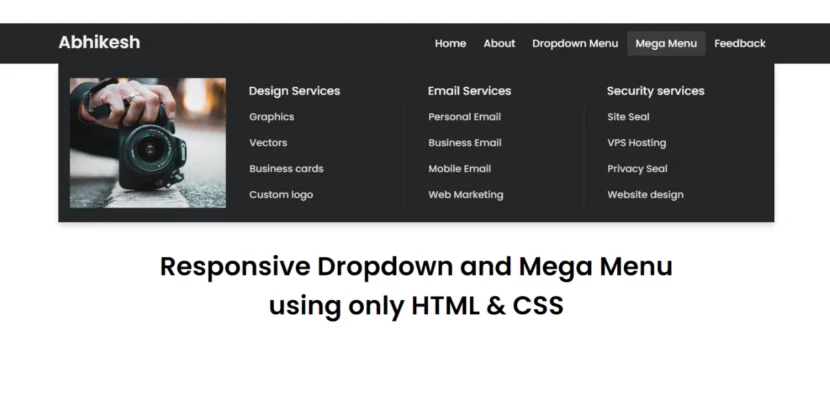
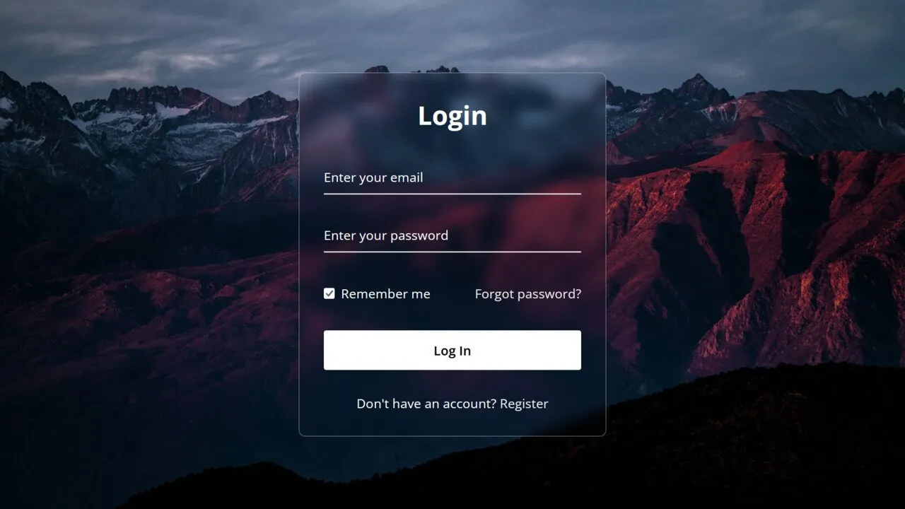
- Glassmorphism Login Form in HTML and CSS
Explore the stylish world of glassmorphism as you create a modern login form using HTML and CSS. This guide breaks down the design process step by step. - Toggle Button using HTML, CSS, and JavaScript
Discover how to enhance user interaction by creating a sleek toggle button with HTML, CSS, and JavaScript. This tutorial covers everything from structure to styling. - Responsive Cards in HTML and CSS
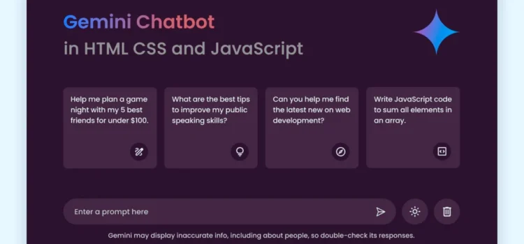
Learn how to design eye-catching responsive cards that adapt seamlessly to any device. This guide offers practical tips for achieving stunning layouts. - Build a Google Gemini Chatbot Using HTML, CSS, and JS
Dive into chatbot development by creating a Google Gemini chatbot with HTML, CSS, and JavaScript. This tutorial will help you understand the basics of interactive forms.
Conclusion
Congratulations! You have successfully created a customizable toast notification system using HTML, CSS, and JavaScript. This implementation not only enhances user interaction but also improves overall usability within your web application.
Feel free to further customize the design and functionality to match your specific needs, making your notifications more engaging for users.
Download Source Code
To get started with your toast notification system, download the source code by clicking the button below:
Comments
Learn to build a functional contact form in PHP
Learn to build a functional contact form in PHP
Create a Website with a Login/Registration Form in HTML, CSS and JavaScript
Learn to build a functional contact form in PHP
Create a Website with a Login/Registration Form in HTML, CSS and JavaScript