


Are you looking for a simple yet stylish animated profile card design using only HTML and CSS? You’re in the right place! In this blog post, we’ll walk through creating an animated profile card that showcases a person’s profile details and some sleek animation effects. This design is perfect for portfolio websites, personal branding pages, or anywhere you want to present an individual’s identity confidently.
Whether you’re a beginner or an experienced developer, this tutorial will help you build a functional and aesthetically pleasing profile card. And the best part? No JavaScript is needed—everything is achieved with pure HTML and CSS!
What is a Profile Card?
A profile card is a visual representation of a person’s basic information. It typically includes the individual’s name, job title, social media links, and sometimes a photo. This compact way to present essential details about someone is commonly used on personal websites, business platforms, or portfolio pages.
Why Use HTML & CSS for Profile Cards?
Using only HTML and CSS for your profile card design ensures the code remains lightweight, fast to load, and easy to manage. No heavy JavaScript libraries are required, making your website more accessible and SEO-friendly.
With just HTML for structure and CSS for styling, you can create a clean and professional-looking profile card that looks great and performs well across all devices.
Features of Our Animated Profile Card
This animated profile card design includes the following features:
- A visually appealing layout with a picture, name, job title, and social media icons.
- A button that toggles the profile card’s visibility with sliding animations.
- Smooth animations for social media icons when hovered.
- Flexible layout optimized for all screen sizes.
Now, let’s explore the steps to bring this design to life!
Step-by-Step Guide to Building the Animated Profile Card
Step 1: Building the HTML Structure
The straightforward HTML structure includes elements like the profile image, name, job title, social media icons, and a button. Here’s how you can structure it:
<!DOCTYPE html><!-- Website - www.abhikesh.com --><html lang="en" dir="ltr"><head><meta charset="UTF-8" /><title>Animated Profile Card HTML CSS | CodingNepal</title><link rel="stylesheet" href="style.css" /><script src="https://kit.fontawesome.com/a076d05399.js"></script></head><body><div class="main-box"><div class="content"><input type="checkbox" id="check" /><label class="box" for="check"><div class="share">SHARE</div><div class="cancel">CANCEL</div></label><div class="image-box"><img src="james.jpeg" alt="" /><div class="about"><div class="details"><div class="name">Abhikesh</div><div class="job">Devoloper | Designer</div><div class="icon"><a href="#"><i class="fab fa-facebook-f"></i></a><a href="#"><i class="fab fa-twitter"></i></a><a href="#"><i class="fab fa-instagram"></i></a><a href="#"><i class="fab fa-youtube"></i></a></div></div></div></div></div></div></body></html>
Step 2: Styling the Profile Card with CSS
Next, we’ll use CSS to style the card. We’ll apply Flexbox to centre the content and give the profile card a sleek look with modern design elements.
@import url("https://fonts.googleapis.com/css2?family=Poppins:wght@200;300;400;500;600;700&display=swap");* {margin: 0;padding: 0;box-sizing: border-box;font-family: "Poppins", sans-serif;}body {background: #3498db;}.main-box {position: absolute;left: 50%;top: 50%;transform: translate(-50%, -50%);width: 400px;height: 550px;text-align: center;}.main-box .content {position: relative;height: 100%;width: 100%;}.content .box {position: absolute;height: 50px;width: 100%;left: 0;bottom: 0;border-radius: 25px;cursor: pointer;}.share,.cancel {position: absolute;height: 100%;width: 100%;left: 0;top: 0;font-size: 20px;font-weight: 600;color: #2980b9;line-height: 50px;background: #fff;letter-spacing: 1px;border-radius: 25px;opacity: 0;transition: all 0.3s ease;}.content .box .share {opacity: 1;}#check:checked ~ .box .share {opacity: 0;}#check:checked ~ .box .cancel {opacity: 1;}.content .image-box {position: absolute;height: 450px;width: 100%;bottom: 130px;left: 50%;transform: translateX(-50%);background: #fff;padding: 10px;border-radius: 25px;transition: all 0.4s ease;}#check:checked ~ .image-box {bottom: 70px;}#check {display: none;}.image-box::before {position: absolute;content: "";bottom: -12px;left: 50%;transform: translateX(-50%) rotate(45deg);height: 30px;width: 30px;background: #fff;z-index: -1;}.image-box img {height: 100%;width: 100%;object-fit: cover;border-radius: 26px;}.image-box .about {position: absolute;background: rgba(0, 0, 0, 0.5);height: 100%;width: 100%;left: 0;top: 0;border-radius: 25px;padding: 20px;text-align: center;opacity: 0;transition: all 0.3s ease;}#check:checked ~ .image-box .about {opacity: 1;}.about .details {position: absolute;width: 100%;left: 0;bottom: 35px;}.details .name,.job {font-size: 18px;font-weight: 500;color: #fff;}
Step 3: Adding Animations
CSS animations bring life to your profile card. We’ll add simple sliding and hover effects for the social media icons and use a button to control the visibility of the profile card.
.details .icon i {font-size: 20px;color: #fff;height: 45px;width: 45px;line-height: 43px;border-radius: 50%;border: 2px solid #fff;margin: 14px 5px;transition: all 0.3s ease;}.details .icon i:hover {transform: scale(0.95);}
Step 4: Making the Profile Card Responsive
You’ll want to add media queries to ensure your profile card looks great on all devices. This will allow the card to resize and adjust its layout based on the screen size.
@media screen and (max-width: 768px) {
.image-box .about {
position: absolute;
background: rgba(0, 0, 0, 0.5);
height: 100%;
width: 100%;
left: 0;
top: 0;
border-radius: 25px;
padding: 20px;
text-align: center;
opacity: 0;
transition: all 0.3s ease;
}
}
Want to Check Username Availability on Social Media?If you’re looking to check username availability on various social media platforms, visit NameChkr to find out!
Read Also
- Glassmorphism Login Form in HTML and CSS
Explore the stylish world of glassmorphism as you create a modern login form using HTML and CSS. This guide breaks down the design process step by step.
- Toggle Button using HTML, CSS, and JavaScript
Discover how to enhance user interaction by creating a sleek toggle button with HTML, CSS, and JavaScript. This tutorial covers everything from structure to styling.
- Responsive Cards in HTML and CSS
Learn how to design eye-catching responsive cards that adapt seamlessly to any device. This guide offers practical tips for achieving stunning layouts.
- Build a Google Gemini Chatbot Using HTML, CSS, and JS
Dive into chatbot development by creating a Google Gemini chatbot with HTML, CSS, and JavaScript. This tutorial will help you understand the basics of interactive forms.
Conclusion
Building an animated profile card using only HTML and CSS is a great way to add interactive, visually appealing elements to your website. By keeping it simple, lightweight, and responsive, you can ensure that your profile card performs well on all devices.
Whether using this card for your portfolio, business site, or personal blog, you now have a versatile and engaging way to display your profile information.
Download the Source Code
If you want to dive deeper or face any issues while creating the animated profile card, please download the complete source code below.
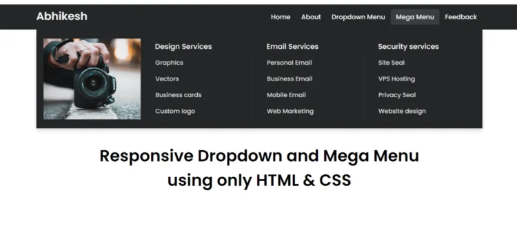
If you’re interested in learning how to create a clean and efficient Mega and Dropdown Menu using only HTML & CSS, you’re in the right place! In this tutorial, we will walk through how to build a fully functional mega and dropdown menu navigation bar using just HTML and CSS—no JavaScript needed!
Mega and Dropdown Menu are becoming increasingly popular on websites with complex structures or multiple categories. In contrast, a dropdown menu is a simpler form of navigation. Combining both in a responsive menu ensures that your visitors enjoy a smooth user experience, regardless of their device.
Whether you’re a beginner or a seasoned developer, this guide will help you design a visually appealing, responsive menu for your site. We’ll explore the essential HTML structure, CSS styling, and how to ensure your navigation bar looks great on all devices.
What is a Responsive Mega and Dropdown Menu?
A Responsive Mega and Dropdown Menu is a website navigation system that combines the simplicity of a dropdown menu with the functionality of a mega menu. A dropdown menu displays a list of items when you hover or click on a parent link. In contrast, a mega menu presents multiple columns of links and additional content like categories or product lists.
When built with pure HTML and CSS, these menus become lightweight, fast-loading, and compatible across browsers without needing JavaScript.
Benefits of Using Only HTML & CSS
Building a Responsive Mega and Dropdown Menu using only HTML and CSS offers several advantages:
- Performance: HTML and CSS menus are lightweight and don’t require heavy JavaScript libraries, ensuring fast load times for your website.
- SEO: Search engines can easily crawl and index HTML content, improving your website’s visibility.
- Accessibility: HTML and CSS menus work seamlessly on most devices and assistive technologies.
- Responsiveness: CSS media queries allow you to create a fully responsive menu for mobile devices.
Now, let’s get into how to create a Responsive Mega Menu and Dropdown Menu using only HTML & CSS step by step.
Step-by-Step Guide to Building a Responsive Mega and Dropdown Menu with Just HTML & CSS
Creating a Responsive Mega and Dropdown Menu is straightforward if you break it down into steps. Here’s the complete process:
Step 1: Building the HTML Structure
To begin, we will establish the foundational structure of the mega and dropdown menu with HTML. This will include a navbar containing links, dropdown items, and mega menu sections. Below is a sample code snippet to help you get started:
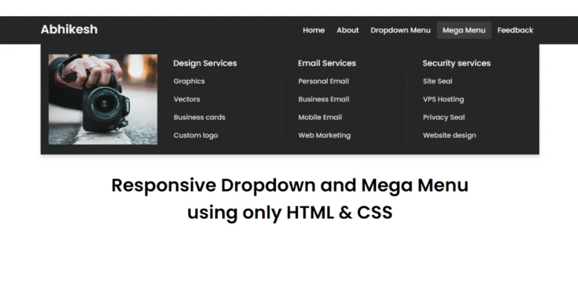
<!DOCTYPE html><!-- Created By abhikesh - www.abhikesh.com --><html lang="en"><head><meta charset="UTF-8"><meta name="viewport" content="width=device-width, initial-scale=1.0"><title>Responsive Mega Menu | abhikesh</title><link rel="stylesheet" href="style.css"><link rel="stylesheet" href="https://cdnjs.cloudflare.com/ajax/libs/font-awesome/5.15.3/css/all.min.css"/></head><body><nav><div class="wrapper"><div class="logo"><a href="#">Abhikesh</a></div><input type="radio" name="slider" id="menu-btn"><input type="radio" name="slider" id="close-btn"><ul class="nav-links"><label for="close-btn" class="btn close-btn"><i class="fas fa-times"></i></label><li><a href="#">Home</a></li><li><a href="#">About</a></li><li><a href="#" class="desktop-item">Dropdown Menu</a><input type="checkbox" id="showDrop"><label for="showDrop" class="mobile-item">Dropdown Menu</label><ul class="drop-menu"><li><a href="#">Drop menu 1</a></li><li><a href="#">Drop menu 2</a></li><li><a href="#">Drop menu 3</a></li><li><a href="#">Drop menu 4</a></li></ul></li><li><a href="#" class="desktop-item">Mega Menu</a><input type="checkbox" id="showMega"><label for="showMega" class="mobile-item">Mega Menu</label><div class="mega-box"><div class="content"><div class="row"><img src="img.jpg" alt=""></div><div class="row"><header>Design Services</header><ul class="mega-links"><li><a href="#">Graphics</a></li><li><a href="#">Vectors</a></li><li><a href="#">Business cards</a></li><li><a href="#">Custom logo</a></li></ul></div><div class="row"><header>Email Services</header><ul class="mega-links"><li><a href="#">Personal Email</a></li><li><a href="#">Business Email</a></li><li><a href="#">Mobile Email</a></li><li><a href="#">Web Marketing</a></li></ul></div><div class="row"><header>Security services</header><ul class="mega-links"><li><a href="#">Site Seal</a></li><li><a href="#">VPS Hosting</a></li><li><a href="#">Privacy Seal</a></li><li><a href="#">Website design</a></li></ul></div></div></div></li><li><a href="#">Feedback</a></li></ul><label for="menu-btn" class="btn menu-btn"><i class="fas fa-bars"></i></label></div></nav><div class="body-text"><div class="title">Responsive Dropdown and Mega Menu</div><div class="sub-title">using only HTML & CSS</div></div></body></html>Step 2: Styling the Mega Menu with CSS
Next, we’ll style the navigation bar, dropdown menu, and mega menu using CSS. The menu will have a modern look with a clean design, suitable for any professional website. Below is an example of CSS styling:
@import url('https://fonts.googleapis.com/css2?family=Poppins:wght@200;300;400;500;600;700&display=swap');* {margin: 0;padding: 0;box-sizing: border-box;font-family: 'Poppins', sans-serif;}nav {position: fixed;z-index: 99;width: 100%;background: #242526;}nav .wrapper {position: relative;max-width: 1300px;padding: 0px 30px;height: 70px;line-height: 70px;margin: auto;display: flex;align-items: center;justify-content: space-between;}.wrapper .logo a {color: #f2f2f2;font-size: 30px;font-weight: 600;text-decoration: none;}.wrapper .nav-links {display: inline-flex;}.nav-links li {list-style: none;}.nav-links li a {color: #f2f2f2;text-decoration: none;font-size: 18px;font-weight: 500;padding: 9px 15px;border-radius: 5px;transition: all 0.3s ease;}.nav-links li a:hover {background: #3A3B3C;}.nav-links .mobile-item {display: none;}.nav-links .drop-menu {position: absolute;background: #242526;width: 180px;line-height: 45px;top: 85px;opacity: 0;visibility: hidden;box-shadow: 0 6px 10px rgba(0, 0, 0, 0.15);}.nav-links li:hover .drop-menu,.nav-links li:hover .mega-box {transition: all 0.3s ease;top: 70px;opacity: 1;visibility: visible;}.drop-menu li a {width: 100%;display: block;padding: 0 0 0 15px;font-weight: 400;border-radius: 0px;}.mega-box {position: absolute;left: 0;width: 100%;padding: 0 30px;top: 85px;opacity: 0;visibility: hidden;}.mega-box .content {background: #242526;padding: 25px 20px;display: flex;width: 100%;justify-content: space-between;box-shadow: 0 6px 10px rgba(0, 0, 0, 0.15);}.mega-box .content .row {width: calc(25% - 30px);line-height: 45px;}.content .row img {width: 100%;height: 100%;object-fit: cover;}.content .row header {color: #f2f2f2;font-size: 20px;font-weight: 500;}.content .row .mega-links {margin-left: -40px;border-left: 1px solid rgba(255, 255, 255, 0.09);}.row .mega-links li {padding: 0 20px;}.row .mega-links li a {padding: 0px;padding: 0 20px;color: #d9d9d9;font-size: 17px;display: block;}.row .mega-links li a:hover {color: #f2f2f2;}.wrapper .btn {color: #fff;font-size: 20px;cursor: pointer;display: none;}.wrapper .btn.close-btn {position: absolute;right: 30px;top: 10px;}nav input {display: none;}.body-text {position: absolute;top: 50%;left: 50%;transform: translate(-50%, -50%);width: 100%;text-align: center;padding: 0 30px;}.body-text div {font-size: 45px;font-weight: 600;}Step 3: Adding ResponsivenessTo make our Responsive Mega and Dropdown Menu adapt to different screen sizes, we’ll use CSS media queries. This ensures the menu looks good on both desktop and mobile devices. Here’s how to do it:@media screen and (max-width: 970px) {.wrapper .btn {display: block;}.wrapper .nav-links {position: fixed;height: 100vh;width: 100%;max-width: 350px;top: 0;left: -100%;background: #242526;display: block;padding: 50px 10px;line-height: 50px;overflow-y: auto;box-shadow: 0px 15px 15px rgba(0, 0, 0, 0.18);transition: all 0.3s ease;}/* custom scroll bar */::-webkit-scrollbar {width: 10px;}::-webkit-scrollbar-track {background: #242526;}::-webkit-scrollbar-thumb {background: #3A3B3C;}#menu-btn:checked~.nav-links {left: 0%;}#menu-btn:checked~.btn.menu-btn {display: none;}#close-btn:checked~.btn.menu-btn {display: block;}.nav-links li {margin: 15px 10px;}.nav-links li a {padding: 0 20px;display: block;font-size: 20px;}.nav-links .drop-menu {position: static;opacity: 1;top: 65px;visibility: visible;padding-left: 20px;width: 100%;max-height: 0px;overflow: hidden;box-shadow: none;transition: all 0.3s ease;}#showDrop:checked~.drop-menu,#showMega:checked~.mega-box {max-height: 100%;}.nav-links .desktop-item {display: none;}.nav-links .mobile-item {display: block;color: #f2f2f2;font-size: 20px;font-weight: 500;padding-left: 20px;cursor: pointer;border-radius: 5px;transition: all 0.3s ease;}.nav-links .mobile-item:hover {background: #3A3B3C;}.drop-menu li {margin: 0;}.drop-menu li a {border-radius: 5px;font-size: 18px;}.mega-box {position: static;top: 65px;opacity: 1;visibility: visible;padding: 0 20px;max-height: 0px;overflow: hidden;transition: all 0.3s ease;}.mega-box .content {box-shadow: none;flex-direction: column;padding: 20px 20px 0 20px;}.mega-box .content .row {width: 100%;margin-bottom: 15px;border-top: 1px solid rgba(255, 255, 255, 0.08);}.mega-box .content .row:nth-child(1),.mega-box .content .row:nth-child(2) {border-top: 0px;}.content .row .mega-links {border-left: 0px;padding-left: 15px;}.row .mega-links li {margin: 0;}.content .row header {font-size: 19px;}}With these media queries, the navigation menu will stack vertically on smaller screens, and the mega menu will adjust to fit the width of the screen.
Want to Check Username Availability on Social Media?If you’re looking to check username availability on various social media platforms, visit NameChkr to find out!
Read Also
- Glassmorphism Login Form in HTML and CSS
Explore the stylish world of glassmorphism as you create a modern login form using HTML and CSS. This guide breaks down the design process step by step.- Toggle Button using HTML, CSS, and JavaScript
Discover how to enhance user interaction by creating a sleek toggle button with HTML, CSS, and JavaScript. This tutorial covers everything from structure to styling.- Responsive Cards in HTML and CSS
Learn how to design eye-catching responsive cards that adapt seamlessly to any device. This guide offers practical tips for achieving stunning layouts.- Build a Google Gemini Chatbot Using HTML, CSS, and JS
Dive into chatbot development by creating a Google Gemini chatbot with HTML, CSS, and JavaScript. This tutorial will help you understand the basics of interactive forms.Conclusion
Building a Responsive Mega and Dropdown Menu using only HTML and CSS is a great way to enhance your website’s navigation without relying on JavaScript. This approach provides a lightweight, fast-loading solution that is both accessible and SEO-friendly. You now have a responsive, clean, and professional menu that adapts seamlessly across different screen sizes.
If you run into any issues while coding or need further guidance, feel free to download the source code below.
Download Source Code
To get the full source code for this Responsive Mega and Dropdown Menu using only HTML & CSS, click the button below:
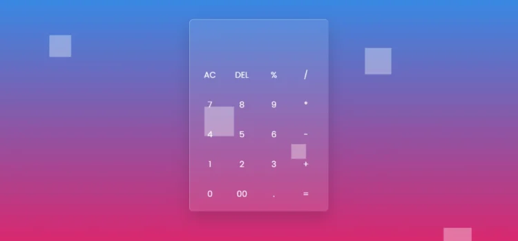
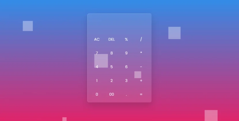
Hey there! Welcome to our blog! Today, we’re diving into an exciting project that’s not only fun but also visually stunning: creating a sleek Glassmorphism Calculator using just HTML and CSS. If you’re looking to spruce up your web design skills, you’re in the right place!
Understanding Glassmorphism Calculator
Before we jump into the fun stuff, let’s chat a bit about glassmorphism calculator. This design trend is all about that frosted glass effect that feels so modern and fresh. Imagine creating an interface that not only works well but also looks great—it’s like the icing on the cake for your web projects!
Setting Up the Project
So, let’s get started! First things first, we’ll need to set up our project. Don’t worry; it’s super easy!
- Create a new folder for your project.
- Inside that folder, make two files: index.html and style.css.
Features of Our Glassmorphism Calculator
Now, let’s talk about what our Glassmorphism Calculator will do. Here are some cool features we’ll implement:
- A visually appealing interface that draws users in with its glassy effect.
- Basic arithmetic operations: addition, subtraction, multiplication, and division—everything you need for those everyday calculations.
- Responsive design that looks fabulous on any device, so your calculator is ready to go wherever you are.
Building the HTML Structure
Let’s begin by crafting the HTML structure for our calculator. Below is the code that forms the basic layout:
<!DOCTYPE html><html lang="en" dir="ltr"><!-- Website - www.abhikesh.com --><head><meta charset="UTF-8" /><title>Glassmorphism Calculator HTML CSS JavaScript | CodingNepal</title><link rel="stylesheet" href="style.css" /></head><body><div class="bubbles"><span class="one"></span><span class="two"></span><span class="three"></span><span class="four"></span><span class="five"></span><span class="six"></span><span class="seven"></span><span class="seven"></span></div><div class="bubbles"><span class="one"></span><span class="two"></span><span class="three"></span><span class="four"></span><span class="five"></span><span class="six"></span><span class="seven"></span><span class="seven"></span></div><div class="bubbles"><span class="one"></span><span class="two"></span><span class="three"></span><span class="four"></span><span class="five"></span><span class="six"></span><span class="seven"></span><span class="seven"></span></div><div class="bubbles"><span class="one"></span><span class="two"></span><span class="three"></span><span class="four"></span><span class="five"></span><span class="six"></span><span class="seven"></span><span class="seven"></span></div><div class="container"><form action="#" name="forms"><input type="text" name="answer" /><div class="buttons"><input type="button" value="AC" onclick="forms.answer.value = ''" /><input type="button" value="DEL" onclick="forms.answer.value = forms.answer.value.substr(0 , forms.answer.value.length -1)" /><input type="button" value="%" onclick="forms.answer.value += '%'" /><input type="button" value="/" onclick="forms.answer.value += '/'" /></div><div class="buttons"><input type="button" value="7" onclick="forms.answer.value += '7'" /><input type="button" value="8" onclick="forms.answer.value += '8'" /><input type="button" value="9" onclick="forms.answer.value += '9'" /><input type="button" value="*" onclick="forms.answer.value += '*'" /></div><div class="buttons"><input type="button" value="4" onclick="forms.answer.value += '4'" /><input type="button" value="5" onclick="forms.answer.value += '5'" /><input type="button" value="6" onclick="forms.answer.value += '6'" /><input type="button" value="-" onclick="forms.answer.value += '-'" /></div><div class="buttons"><input type="button" value="1" onclick="forms.answer.value += '1'" /><input type="button" value="2" onclick="forms.answer.value += '2'" /><input type="button" value="3" onclick="forms.answer.value += '3'" /><input type="button" value="+" onclick="forms.answer.value += '+'" /></div><div class="buttons"><input type="button" value="0" onclick="forms.answer.value += '0'" /><input type="button" value="00" onclick="forms.answer.value += '00'" /><input type="button" value="." onclick="forms.answer.value += '.'" /><input type="button" value="=" onclick="forms.answer.value = eval(forms.answer.value)" /></div></form></div></body></html>Explanation of the HTML Code
- The <div class=”bubbles”> contains several <span> elements that create animated bubbles, giving a dynamic feel to the background.
- The <div class=”container”> holds the calculator layout, including an input field for the calculations and various buttons for user interaction.
Styling with CSS
Now, let’s style our calculator to give it that beautiful glass morphism effect. Here’s how the CSS looks:
@import url('https://fonts.googleapis.com/css2?family=Poppins:wght@200;300;400;500;600;700&display=swap');*{margin: 0;padding: 0;box-sizing: border-box;font-family: 'Poppins',sans-serif;}body{height: 100vh;width: 100%;overflow: hidden;display: flex;justify-content: center;align-items: center;background: linear-gradient(#2196f3 , #e91e63);}.bubbles{position: absolute;bottom: -120px;display: flex;flex-wrap: wrap;margin-top: 70px;width: 100%;justify-content: space-around;}.bubbles span{height: 60px;width: 60px;background: rgba(255, 255, 255, 0.1);animation: move 10s linear infinite;position: relative;overflow: hidden;}@keyframes move {100%{transform: translateY(-100vh);}}.bubbles span.one{animation-delay: 2.2s;transform: scale(2.15)}.bubbles span.two{animation-delay: 3.5s;transform: scale(1.55);}.bubbles span.three{animation-delay: 0.2s;transform: scale(0.35);}.bubbles span.four{animation-delay: 6s;transform: scale(2.15);}.bubbles span.five{animation-delay: 7s;transform: scale(0.5);}.bubbles span.six{animation-delay: 4s;transform: scale(2.5);}.bubbles span.seven{animation-delay: 3;transform: scale(1.5);}.bubbles span:before{content: '';position: absolute;left: 0;top: 0;height: 60px;width: 40%;transform: skew(45deg) translateX(150px);background: rgba(255, 255, 255, 0.15);animation: mirror 3s linear infinite;}@keyframes mirror {100%{transform: translateX(-450px);}}.bubbles span.one:before{animation-delay: 1.5s;}.bubbles span.two:before{animation-delay: 3.5s;}.bubbles span.three:before{animation-delay: 2.5s;}.bubbles span.four:before{animation-delay: 7.5s;}.bubbles span.five:before{animation-delay: 4.5s;}.bubbles span.six:before{animation-delay: 0.5s;}.bubbles span.seven:before{animation-delay: 6s;}.container{z-index: 12;width: 420px;padding: 15px;border-radius: 12px;background: rgba(255, 255, 255, 0.1);box-shadow: 0 20px 50px rgba(0, 0, 0, 0.15);border-top: 1px solid rgba(255, 255, 255, 0.5);border-left: 1px solid rgba(255, 255, 255, 0.5);}.container input[type="text"]{width: 100%;height: 100px;margin: 0 3px;outline: none;border: none;color: #fff;font-size: 30px;text-align: right;padding-right: 10px;background: transparent;}.container input[type="button"]{height: 75px;color: #fff;width: calc(100% / 4 - 5px);background: transparent;border-radius: 12px;margin-top: 15px;outline: none;border: none;font-size: 25px;cursor: pointer;transition: all 0.3s ease;}.container input[type="button"]:hover{background: rgba(255, 255, 255, 0.1);}Explanation of the CSS Code
The CSS file starts with an import statement to include the Poppins font from Google Fonts.
- The body element is styled with a vibrant gradient background, ensuring a visually appealing backdrop for the calculator.
- The .container class applies the glass morphism effect with a transparent background and rounded edges, along with subtle shadows for depth.
Want to Check Username Availability on Social Media?If you’re looking to check username availability on various social media platforms, visit NameChkr to find out!
Read Also
- Glassmorphism Login Form in HTML and CSS
Explore the stylish world of glassmorphism as you create a modern login form using HTML and CSS. This guide breaks down the design process step by step.- Toggle Button using HTML, CSS, and JavaScript
Discover how to enhance user interaction by creating a sleek toggle button with HTML, CSS, and JavaScript. This tutorial covers everything from structure to styling.- Responsive Cards in HTML and CSS
Learn how to design eye-catching responsive cards that adapt seamlessly to any device. This guide offers practical tips for achieving stunning layouts.- Build a Google Gemini Chatbot Using HTML, CSS, and JS
Dive into chatbot development by creating a Google Gemini chatbot with HTML, CSS, and JavaScript. This tutorial will help you understand the basics of interactive forms.Conclusion
Congratulations! You’ve just created a beautiful Glassmorphism Calculator using only HTML and CSS. This project showcases not only your coding skills but also your ability to implement modern design trends effectively.
Feel free to experiment with the code, tweak the styles, and make it your own. The beauty of web development lies in the endless possibilities for customization!
Download Source Code
If you want to get your hands on the full source code for this glass morphism calculator, simply click the button below:
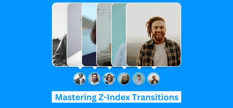
Z-Index Transitions: Enhance Your Images with CSS
In this tutorial, we’ll guide you through creating Z-Index transitions, an interactive effect on images using only CSS. This approach is perfect for web developers looking to enhance user engagement by adding dynamic visual effects to images. By utilizing CSS alone, you can create seamless transitions that add depth to your design and improve the user experience without the need for JavaScript.
Whether you’re a beginner or an experienced developer, you’ll find value in learning how to implement Z-Index transitions on your website. Not only do these effects provide a professional look, but they also keep your site lightweight and fast. In this step-by-step guide, you’ll discover just how easy it is to create this eye-catching effect using only HTML and CSS.
What is a Z-Index Transition?
Z-Index transitions are a CSS effect that allows specific elements, such as images or cards, to layer over one another in a smooth and visually appealing manner. This technique is widely used in image galleries, product cards, and various designs where visual hierarchy plays a key role in user interaction.
Why Master Z-Index Transitions?
Mastering Z-Index transitions offers several advantages:
- Enhances User Interaction: This technique adds a dynamic and engaging visual effect to your website.
- Lightweight Design: Since no JavaScript is needed, you can ensure faster load times.
- Improves SEO: A faster, cleaner website contributes to better rankings on search engines.
- Responsive and Accessible: When implemented correctly, these transitions work beautifully across all devices.
How to Create Z-Index Transitions on Images with CSS
Here’s a step-by-step guide to building this visually appealing feature using only HTML and CSS.
Set Up Your Basic HTML Structure
Start by creating the structure of your HTML, where each image or card will have its section. Below is an example of how to set up the basic HTML for this:
<!DOCTYPE html><!-- Website - www.abhikesh.com --><html lang="en" dir="ltr"><head><meta charset="UTF-8" /><title>Image Hover Animation HTML CSS | abhikesh</title><link rel="stylesheet" href="style.css" /></head><body><div class="container"><div class="icon-image"><div class="icon"><img src="images/img1.jpg" alt="" /></div><div class="hover-image one"><div class="img"><img src="images/img1.jpg" alt="" /></div><div class="content"><div class="details"><div class="name">Rahul</div><div class="job">Designer || Developer</div></div></div></div></div><div class="icon-image"><div class="icon"><img src="images/img2.jpg" alt="" /></div><div class="hover-image one"><div class="img"><img src="images/img2.jpg" alt="" /></div><div class="content"><div class="details"><div class="name">Rohit</div><div class="job">Blogger || Designer</div></div></div></div></div><div class="icon-image"><div class="icon"><img src="images/img3.jpg" alt="" /></div><div class="hover-image one"><div class="img"><img src="images/img3.jpg" alt="" /></div><div class="content"><div class="details"><div class="name">Arzu</div><div class="job">Designer || Developer</div></div></div></div></div><div class="icon-image"><div class="icon"><img src="images/img4.jpg" alt="" /></div><div class="hover-image one"><div class="img"><img src="images/img4.jpg" alt="" /></div><div class="content"><div class="details"><div class="name">Shivani</div><div class="job">Photographer || Youtuber</div></div></div></div></div><div class="icon-image"><div class="icon"><img src="images/img5.jpg" alt="" /></div><div class="hover-image one"><div class="img"><img src="images/img5.jpg" alt="" /></div><div class="content"><div class="details"><div class="name">Aryn</div><div class="job">Developer || Designer</div></div></div></div></div><div class="icon-image last"><div class="icon"><img src="images/img6.jpg" alt="" /></div><div class="hover-image one"><div class="img"><img src="images/img6.jpg" alt="" /></div><div class="content"><div class="details"><div class="name">Anil</div><div class="job">Blogger || Youtuber</div></div></div></div></div></div></body></html>
- Product Image: The image element that will display the product image.
- Card Info: This section will include product details such as the name, price, and an “Add to Cart” button.
Style with CSS for the Transition
Next, add CSS to style the product card and create smooth transitions when users hover over it. We will use the z-index property along with other CSS properties like transform and transition to create this effect.
@import url('https://fonts.googleapis.com/css2?family=Poppins:wght@200;300;400;500;600;700&display=swap');*{margin: 0;padding: 0;box-sizing: border-box;font-family: 'Poppins',sans-serif;}body{height: 100vh;width: 100%;display: flex;justify-content: center;align-items: center;background: #0396FF;}.container{height: 500px;display: flex;min-width: 400px;align-items: flex-end;justify-content: center;margin-top: -55px;}.icon-image{position: relative;height: 70px;width: 70px;margin: 0 5px;cursor: pointer;box-shadow: 0 5px 10px rgba(0, 0, 0, 0.25);border-radius: 50%;background: #fff;}.icon-image .icon img{position: absolute;height: 95%;width: 95%;left: 50%;top: 50%;transform: translate(-50%, -50%);object-fit: cover;border-radius: 50%;border: 3px solid #0396FF;}.icon-image::before{content: '';position: absolute;width: 50px;height: 50px;left: 50%;top: -50px;transform: translateX(-50%);}.icon-image .hover-image{position: absolute;height: 350px;width: 300px;bottom: 100px;left: 50%;z-index: 0;transform: translateX(-50%);border-radius: 25px;pointer-events: none;box-shadow: 0 5px 10px rgba(0, 0, 0, 0.15);transition: transform 0.5s ease, z-index 0s, left 0.5s ease ;transition-delay: 0s, 0.5s, 0.5s;}.icon-image:hover .hover-image{left: -200px;z-index: 12;transform: translateX(80px);transition: left 0.5s ease, z-index 0s, transform 0.5s ease;transition-delay: 0s, 0.5s, 0.5s;}.hover-image img{position: absolute;height: 100%;width: 100%;object-fit: cover;border: 3px solid #fff;border-radius: 25px;}.hover-image .content{position: absolute;width: 100%;bottom: -10px;padding: 0 10px;}.content::before{content: '';position: absolute;height: 20px;width: 20px;background: #fff;left: 50%;bottom: -7px;transform: rotate(45deg) translateX(-50%);z-index: -1;}.content .details{position: relative;background: #fff;padding: 10px;border-radius: 12px;text-align: center;opacity: 0;pointer-events: none;transform: translateY(10px);}.icon-image:hover .details{transition: all 0.5s ease;transition-delay: 0.9s;opacity: 1;transform: translateY(4px);pointer-events: auto;}.details::before{content: '';position: absolute;height: 20px;width: 20px;background: #fff;left: 50%;bottom: -15px;transform: rotate(45deg) translateX(-50%);z-index: -1;}.content .details .name{font-size: 20px;font-weight: 500;}.content .details .job{font-size: 17px;color: #0396FF;margin: -3px 0 5px 0;}.content .details a:hover{color: #0396FF;}.container .last .hover-image{transition: none;}.container .last:hover .hover-image{transition: 0;}.last:hover .details{transition-delay: 0s;}This approach ensures the card adapts to mobile screens, maintaining a responsive and user-friendly design.
Best Practices for SEO and Performance
When building animated and interactive designs, it’s essential to consider SEO and performance optimization. Here are a few tips:
Semantic HTML: Use proper HTML tags like <h2>, <p>, and <button> to structure your content for search engines.
- Optimize Images: Compress images to reduce load times while maintaining high quality.
- Alt Text for Images: Use descriptive alt text to improve accessibility and SEO.
- Responsive Design: Ensure your designs are mobile-friendly by testing them across different screen sizes.
- Fast Load Times: Keep your CSS clean and lightweight to ensure faster loading times, which improves both user experience and SEO ranking.
Want to Check Username Availability on Social Media?If you’re looking to check username availability on various social media platforms, visit NameChkr to find out!
Read Also
- Glassmorphism Login Form in HTML and CSS
Explore the stylish world of glassmorphism as you create a modern login form using HTML and CSS. This guide breaks down the design process step by step.- Toggle Button using HTML, CSS, and JavaScript
Discover how to enhance user interaction by creating a sleek toggle button with HTML, CSS, and JavaScript. This tutorial covers everything from structure to styling.- Responsive Cards in HTML and CSS
Learn how to design eye-catching responsive cards that adapt seamlessly to any device. This guide offers practical tips for achieving stunning layouts.- Build a Google Gemini Chatbot Using HTML, CSS, and JS
Dive into chatbot development by creating a Google Gemini chatbot with HTML, CSS, and JavaScript. This tutorial will help you understand the basics of interactive forms.Conclusion
By following this guide, you’ve learned how to create stunning Z-Index transitions on images using only HTML and CSS. This powerful technique not only enhances your website’s visual appeal but also improves performance and SEO, all while maintaining a lightweight structure.
Ready to start building? You can download the complete source code below and try it out on your project.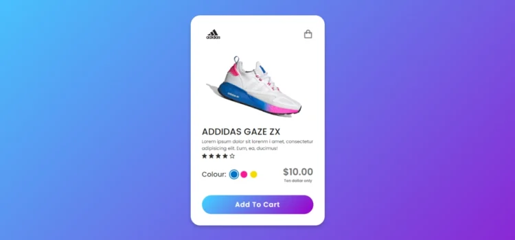
Create a Beautiful Product Card with Smooth Animations
Today we are back again with another tutorial showing the process of creating an animated product card using just HTML and CSS. This is perfect for anyone looking to add interactive product cards to their website, providing users with a modern and engaging experience without needing JavaScript.
This tutorial is useful for both an experienced developer or even if you’re not a pro in web development. So, let’s create our animated product card that works across devices.
What is a Product Card?
A product card is a small visual element on a webpage that showcases essential product details. Typically, a product card includes:
- High-Resolution Product Image
- Product Name and Logo
- Product Price
- The “Add to Cart” Button
- Color and Size Options
Adding an animated product card to your site can boost user interaction, helping visitors visualize product attributes like color, size, or variations. With CSS animations, you can create sleek transitions and effects that enhance the user experience.
Why Use Only HTML & CSS for Product Card Animation?
Using just HTML and CSS for your product card animations offers several advantages:
- No JavaScript Required: This keeps the website lightweight and ensures faster page load times.
- Responsive Design: CSS media queries allow you to make your product card design mobile-friendly and adaptable to any screen size.
- SEO-Friendly: By sticking to HTML and CSS, you optimize page performance, improving your site’s SEO ranking.
How to Create an Animated Product Card Using HTML & CSS
Follow the steps below to create a product card with smooth animations. We’ll focus on a simple and clean design while applying some beautiful CSS transitions to make the card visually appealing.
1. Set Up Your HTML Structure
The first step is to create the structure for the product card using semantic HTML. You’ll create an HTML file where you define the layout for your product card.
Here’s an example:
<!DOCTYPE html><!-- Designed by abhikesh | www.abhikesh.com/ --><html lang="en" dir="ltr"><head><meta charset="UTF-8"><title> Responsive Animated Product Card | abhikesh </title><link rel="stylesheet" href="style.css"><!-- Boxicons CDN Link --><link href='https://unpkg.com/[email protected]/css/boxicons.min.css' rel='stylesheet'><meta name="viewport" content="width=device-width, initial-scale=1.0"></head><body><div class="product-card"><div class="logo-cart"><img src="images/logo.jpg" alt="logo"><i class='bx bx-shopping-bag'></i></div><div class="main-images"><img id="blue" class="blue active" src="images/blue.png" alt="blue"><img id="pink" class="pink" src="images/pink.png" alt="blue"><img id="yellow" class="yellow" src="images/yellow.png" alt="blue"></div><div class="shoe-details"><span class="shoe_name">ADDIDAS GAZE ZX</span><p>Lorem ipsum dolor sit lorenm i amet, consectetur adipisicing elit. Eum, ea, ducimus!</p><div class="stars"><i class='bx bxs-star'></i><i class='bx bxs-star'></i><i class='bx bxs-star'></i><i class='bx bxs-star'></i><i class='bx bx-star'></i></div></div><div class="color-price"><div class="color-option"><span class="color">Colour:</span><div class="circles"><span class="circle blue active" id="blue"></span><span class="circle pink " id="pink"></span><span class="circle yellow " id="yellow"></span></div></div><div class="price"><span class="price_num">$10.00</span><span class="price_letter">Ten dollar only</span></div></div><div class="button"><div class="button-layer"></div><button>Add To Cart</button></div></div><script>let circle = document.querySelector(".color-option");circle.addEventListener("click", (e) => {let target = e.target;if (target.classList.contains("circle")) {circle.querySelector(".active").classList.remove("active");target.classList.add("active");document.querySelector(".main-images .active").classList.remove("active");document.querySelector(`.main-images .${target.id}`).classList.add("active");}});</script></body></html>In this example:
- The product card container holds the product image and the product details.
- Product image contains the image element for your product.
- Product info includes the product name, price, and an “Add to Cart” button.
2. Style the Product Card with CSS
Now, we’ll use CSS to style the product card and add animations. You’ll need to create a separate CSS file or include the CSS within a <style> tag.
Here’s the basic CSS for styling and animations:
/* Google Fonts Poppins */@import url('https://fonts.googleapis.com/css2?family=Poppins:wght@400;500;600&display=swap');*{margin: 0;padding: 0;box-sizing: border-box;font-family: 'Poppins', sans-serif;}body{height: 100vh;display: flex;align-items: center;justify-content: center;background-image: linear-gradient(135deg, #43CBFF 10%, #9708CC 100%);}.product-card {position: relative;max-width: 355px;width: 100%;border-radius: 25px;padding: 20px 30px 30px 30px;background: #fff;box-shadow: 0 5px 10px rgba(0, 0, 0, 0.2);z-index: 3;overflow: hidden;}.product-card .logo-cart{display: flex;align-items: center;justify-content: space-between;}.product-card .logo-cart img{height: 60px;width: 60px;object-fit: cover;}.product-card .logo-cart i{font-size: 27px;color: #707070;cursor: pointer;transition: color 0.3s ease;}.product-card .logo-cart i:hover{color: #333;}.product-card .main-images{position: relative;height: 210px;}.product-card .main-images img{position: absolute;height: 300px;width: 300px;object-fit: cover;transform: rotate(18deg);left: 12px;top: -40px;z-index: -1;opacity: 0;transition: opacity 0.5s ease;}.product-card .main-images img.active{opacity: 1;}.product-card .shoe-details .shoe_name{font-size: 24px;font-weight: 500;color: #161616;}.product-card .shoe-details p{font-size: 12px;font-weight: 400;color: #333;text-align: justify;}.product-card .shoe-details .stars i{margin: 0 -1px;color: #333;}.product-card .color-price .color-option{display: flex;align-items: center;}.color-price{display: flex;justify-content: space-between;align-items: center;margin-top: 10px;}.color-price .color-option .color{font-size: 18px;font-weight: 500;color: #333;margin-right: 8px;}.color-option .circles{display: flex;}.color-option .circles .circle{height: 18px;width: 18px;background: #0071C7;border-radius: 50%;margin: 0 4px;cursor: pointer;transition: all 0.4s ease;}.color-option .circles .circle.blue.active{box-shadow: 0 0 0 2px #fff,0 0 0 4px #0071C7;}.color-option .circles .circle.pink{background: #FA1795;}.color-option .circles .circle.pink.active{box-shadow: 0 0 0 2px #fff,0 0 0 4px #FA1795;}.color-option .circles .circle.yellow{background: #F5DA00;}.color-option .circles .circle.yellow.active{box-shadow: 0 0 0 2px #fff,0 0 0 4px #F5DA00;}.color-price .price{display: flex;flex-direction: column;justify-content: center;align-items: center;}.color-price .price .price_num{font-size: 25px;font-weight: 600;color: #707070;}.color-price .price .price_letter{font-size: 10px;font-weight: 600;margin-top: -4px;color: #707070;}.product-card .button{position: relative;height: 50px;width: 100%;border-radius: 25px;margin-top: 30px;overflow: hidden;}.product-card .button .button-layer{position: absolute;height: 100%;width: 300%;left: -100%;background-image: linear-gradient(135deg,#9708CC, #43CBFF,#9708CC, #43CBFF );transition: all 0.4s ease;border-radius: 25PX;}.product-card .button:hover .button-layer{left: 0;}.product-card .button button{position: relative;height: 100%;width: 100%;background: none;outline: none;border: none;font-size: 18px;font-weight: 600;letter-spacing: 1px;color: #fff;}In this CSS code:
- The product card defines the overall card styling, including a border and a hover effect that scales the card when hovered.
- Product image ensures the image is responsive, filling the card’s width.
- Price styles the price in a standout color.
- The button adds a hover effect to the “Add to Cart” button.
3. Make Your Product Card Responsive
To ensure the product card works well across different devices, you’ll want to include media queries. Here’s a simple way to adjust the product card for smaller screens:
@media screen and (max-width: 600px) {.product-card .button button{color: pink;}}This media query adjusts the card width on screens smaller than 600px, ensuring it remains user-friendly on mobile devices.
Best Practices for SEO and Performance
When building a website, especially one that features animations and interactivity, it’s crucial to optimize for SEO and page performance. Here are a few crucial tips to remember:
- Use Semantic HTML: Properly structure your HTML using appropriate tags like <h2>, <p>, and <button>. This helps search engines understand your content.
- Optimize Images: Use high-quality images, but make sure they’re compressed to improve page loading speed.
- Alt Text for Images: Ensure each image includes descriptive alt text to improve accessibility and SEO.
- Responsive Design: Make sure your product cards look great on all devices by using media queries.
- Fast Load Times: Clean and simple CSS ensures faster loading times, which is beneficial for SEO.
Want to Check Username Availability on Social Media?If you’re looking to check username availability on various social media platforms, visit NameChkr to find out!
Read Also
- Glassmorphism Login Form in HTML and CSS
Explore the stylish world of glassmorphism as you create a modern login form using HTML and CSS. This guide breaks down the design process step by step.- Toggle Button using HTML, CSS, and JavaScript
Discover how to enhance user interaction by creating a sleek toggle button with HTML, CSS, and JavaScript. This tutorial covers everything from structure to styling.- Responsive Cards in HTML and CSS
Learn how to design eye-catching responsive cards that adapt seamlessly to any device. This guide offers practical tips for achieving stunning layouts.- Build a Google Gemini Chatbot Using HTML, CSS, and JS
Dive into chatbot development by creating a Google Gemini chatbot with HTML, CSS, and JavaScript. This tutorial will help you understand the basics of interactive forms.Conclusion
By following this guide, you’ve learned how to create a fully responsive, animated product card using only HTML and CSS. The simple but elegant design showcases how CSS transitions can bring life to a product display, without the need for JavaScript.
If you’re ready to start building your animated product card, you can download the source code below.
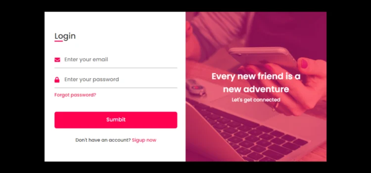
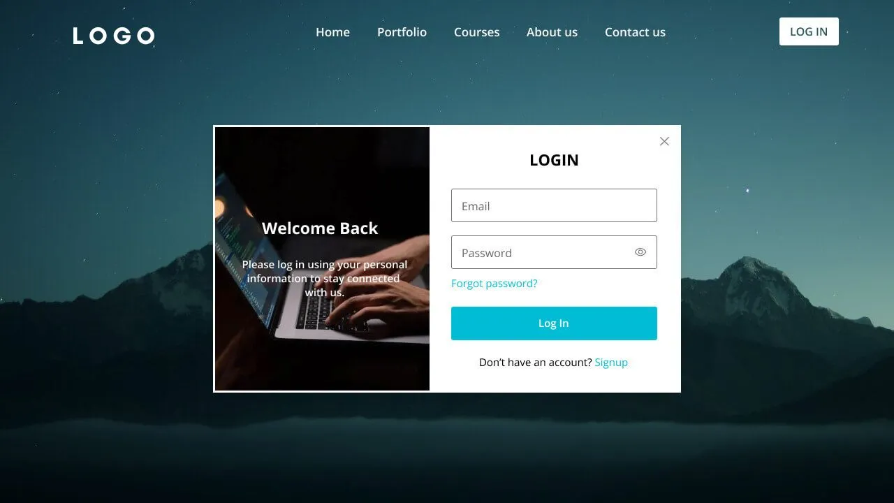
Are you ready to create your own responsive login and registration form in HTML and CSS? This detailed tutorial will show you how to create a responsive, user-friendly, and modern login and registration form. This form design can help you improve the user experience on your website, no matter if you’re a beginner in this field. Plus, you can also download the full source code to customize and use in your projects.
By the end of this guide, you’ll understand how to create a Responsive Login and Registration Form and optimize it for better performance and SEO. So, let’s get started!
What is a Responsive Login and Registration Form?
Websites that need user authentication must have a responsive login and registration form. While the registration form gathers user data for account creation, the login form enables users to enter their email address, phone number, or password to access the website. Combining both forms on a single page with a seamless design improves the user experience, especially on mobile devices.
The form is responsive, and it adjusts perfectly to a variety of screen sizes, ensuring that your website looks professional and operates efficiently on all devices.
Why Build a Responsive Login and Registration Form Using HTML & CSS?
Using HTML and CSS to create a responsive login and registration form has several benefits:
- Lightweight Design: HTML and CSS ensure your form loads quickly, which is critical for SEO and user retention.
- No JavaScript Required: This form uses only HTML and CSS, keeping your design simple and efficient while avoiding unnecessary JavaScript.
- Fully Responsive: CSS media queries ensure your form adapts seamlessly to various screen sizes, providing an optimal user experience.
- SEO-Friendly: By using semantic HTML and focusing on performance, your page will rank better in search engines.
Features of the Responsive Login and Registration Form
- Single-page Design: Both the login and registration forms are integrated on one page, and users can easily toggle between them with a smooth transition.
- CSS Flip Animation: The form smoothly flips between the login and registration sections, creating an engaging visual effect.
- No JavaScript: This design relies solely on CSS transitions, simplifying the development process.
- Responsive Layout: The form is designed to work perfectly across all devices, ensuring a great user experience.
- SEO Optimization: Semantic HTML tags and lightweight CSS ensure that your form loads quickly and ranks well in search engines.
Step-by-Step Guide: Building a Responsive Login and Registration Form
1. Setting Up the HTML Structure
Start by setting up the basic HTML structure. The HTML will contain two main sections: the login form and the registration form. The form toggles between login and registration using a checkbox and CSS transitions.
Here’s the basic HTML structure:
<!DOCTYPE html><!-- Created by abhikesh |www.abhikesh.com--><html lang="en" dir="ltr"><head><meta charset="UTF-8"><title> Login and Registration Form in HTML & CSS | abhikesh </title><link rel="stylesheet" href="style.css"><!-- Fontawesome CDN Link --><link rel="stylesheet" href="https://cdnjs.cloudflare.com/ajax/libs/font-awesome/5.15.3/css/all.min.css"><meta name="viewport" content="width=device-width, initial-scale=1.0"></head><body><div class="container"><input type="checkbox" id="flip"><div class="cover"><div class="front"><img src="images/frontImg.jpg" alt=""><div class="text"><span class="text-1">Every new friend is a <br> new adventure</span><span class="text-2">Let's get connected</span></div></div><div class="back"><img class="backImg" src="images/backImg.jpg" alt=""><div class="text"><span class="text-1">Complete miles of journey <br> with one step</span><span class="text-2">Let's get started</span></div></div></div><div class="forms"><div class="form-content"><div class="login-form"><div class="title">Login</div><form action="#"><div class="input-boxes"><div class="input-box"><i class="fas fa-envelope"></i><input type="text" placeholder="Enter your email" required></div><div class="input-box"><i class="fas fa-lock"></i><input type="password" placeholder="Enter your password" required></div><div class="text"><a href="#">Forgot password?</a></div><div class="button input-box"><input type="submit" value="Sumbit"></div><div class="text sign-up-text">Don't have an account? <label for="flip">Sigup now</label></div></div></form></div><div class="signup-form"><div class="title">Signup</div><form action="#"><div class="input-boxes"><div class="input-box"><i class="fas fa-user"></i><input type="text" placeholder="Enter your name" required></div><div class="input-box"><i class="fas fa-envelope"></i><input type="text" placeholder="Enter your email" required></div><div class="input-box"><i class="fas fa-lock"></i><input type="password" placeholder="Enter your password" required></div><div class="button input-box"><input type="submit" value="Sumbit"></div><div class="text sign-up-text">Already have an account? <label for="flip">Login now</label></div></div></form></div></div></div></div></body></html>2. Styling with CSS
Now that you have the structure, it’s time to style the form using CSS. The CSS will manage the layout, colors, and flip animation.
Here’s an example of the basic CSS for the form:
/* Google Font Link */@import url('https://fonts.googleapis.com/css2?family=Poppins:wght@200;300;400;500;600;700&display=swap');* {margin: 0;padding: 0;box-sizing: border-box;font-family: "Poppins", sans-serif;}body {min-height: 100vh;display: flex;align-items: center;justify-content: center;background: #000;padding: 30px;}.container {position: relative;max-width: 850px;width: 100%;background: #fff;padding: 40px 30px;box-shadow: 0 5px 10px rgba(0, 0, 0, 0.2);perspective: 2700px;}.container .cover {position: absolute;top: 0;left: 50%;height: 100%;width: 50%;z-index: 98;transition: all 1s ease;transform-origin: left;transform-style: preserve-3d;backface-visibility: hidden;}.container #flip:checked ~ .cover {transform: rotateY(-180deg);}.container #flip:checked ~ .forms .login-form {pointer-events: none;}.container .cover .front,.container .cover .back {position: absolute;top: 0;left: 0;height: 100%;width: 100%;}.cover .back {transform: rotateY(180deg);}.container .cover img {position: absolute;height: 100%;width: 100%;object-fit: cover;z-index: 10;}.container .cover .text {position: absolute;z-index: 10;height: 100%;width: 100%;display: flex;flex-direction: column;align-items: center;justify-content: center;}.container .cover .text::before {content: '';position: absolute;height: 100%;width: 100%;opacity: 0.5;background: #FF014F;}.cover .text .text-1,.cover .text .text-2 {z-index: 20;font-size: 26px;font-weight: 600;color: #fff;text-align: center;}.cover .text .text-2 {font-size: 15px;font-weight: 500;}.container .forms {height: 100%;width: 100%;background: #fff;}.container .form-content {display: flex;align-items: center;justify-content: space-between;}.form-content .login-form,.form-content .signup-form {width: calc(100% / 2 - 25px);}.forms .form-content .title {position: relative;font-size: 24px;font-weight: 500;color: #333;}.forms .form-content .title:before {content: '';position: absolute;left: 0;bottom: 0;height: 3px;width: 25px;background: #FF014F;}.forms .signup-form .title:before {width: 20px;}.forms .form-content .input-boxes {margin-top: 30px;}.forms .form-content .input-box {display: flex;align-items: center;height: 50px;width: 100%;margin: 10px 0;position: relative;}.form-content .input-box input {height: 100%;width: 100%;outline: none;border: none;padding: 0 30px;font-size: 16px;font-weight: 500;border-bottom: 2px solid rgba(0, 0, 0, 0.2);transition: all 0.3s ease;}.form-content .input-box input:focus,.form-content .input-box input:valid {border-color: #FF014F;}.form-content .input-box i {position: absolute;color: #FF014F;font-size: 17px;}.forms .form-content .text {font-size: 14px;font-weight: 500;color: #333;}.forms .form-content .text a {text-decoration: none;}.forms .form-content .text a:hover {text-decoration: underline;}.forms .form-content .button {color: #fff;margin-top: 40px;}.forms .form-content .button input {color: #fff;background: #FF014F;border-radius: 6px;padding: 0;cursor: pointer;transition: all 0.4s ease;}.forms .form-content .button input:hover {background: #FF014F;}.forms .form-content label {color: #FF014F;cursor: pointer;}.forms .form-content label:hover {text-decoration: underline;}.forms .form-content .login-text,.forms .form-content .sign-up-text {text-align: center;margin-top: 25px;}.container #flip {display: none;}a{color: #FF014F;}@media (max-width: 730px) {.container .cover {display: none;}.form-content .login-form,.form-content .signup-form {width: 100%;}.form-content .signup-form {display: none;}.container #flip:checked ~ .forms .signup-form {display: block;}.container #flip:checked ~ .forms .login-form {display: none;}}3. Making the Form Responsive
To make sure the form works on all screen sizes, you’ll need to use CSS media queries. This ensures that the form adjusts its layout when viewed on smaller devices like phones and tablets.
Here’s an example:
@media (max-width: 730px) {.container .cover {display: none;}.form-content .login-form,.form-content .signup-form {width: 100%;}.form-content .signup-form {display: none;}.container #flip:checked ~ .forms .signup-form {display: block;}.container #flip:checked ~ .forms .login-form {display: none;}}This media query adjusts the width of the form for mobile devices and ensures the form is easy to interact with on smaller screens.
Best Practices for Optimizing Your Form for SEO
To ensure your Responsive Login and Registration Form performs well on search engines and offers a smooth user experience, follow these best practices:
- Fast Loading Speed: Keep your HTML and CSS code clean and efficient to minimize loading times, which is crucial for SEO.
- Keyword Optimization: Include relevant keywords like “Responsive Login and Registration Form,” “HTML and CSS,” and “UI Design” throughout your content for better search engine ranking.
- Semantic HTML: Use meaningful HTML tags like <h2>, <h3>, <form>, and <label> to structure your content in a way that is easy for search engines to understand.
- Alt Text for Images: If you include any images in your form, use alt text to describe them. This improves accessibility and helps search engines interpret the content.
- Mobile Responsiveness: Ensure your form is fully responsive by testing it on various devices and screen sizes. A mobile-friendly design improves SEO and user experience.
Want to Check Username Availability on Social Media?If you’re looking to check username availability on various social media platforms, visit NameChkr to find out!
Read Also
- Glassmorphism Login Form in HTML and CSS
Explore the stylish world of glassmorphism as you create a modern login form using HTML and CSS. This guide breaks down the design process step by step.- Toggle Button using HTML, CSS, and JavaScript
Discover how to enhance user interaction by creating a sleek toggle button with HTML, CSS, and JavaScript. This tutorial covers everything from structure to styling.- Responsive Cards in HTML and CSS
Learn how to design eye-catching responsive cards that adapt seamlessly to any device. This guide offers practical tips for achieving stunning layouts.- Build a Google Gemini Chatbot Using HTML, CSS, and JS
Dive into chatbot development by creating a Google Gemini chatbot with HTML, CSS, and JavaScript. This tutorial will help you understand the basics of interactive forms.Download the Source Code for Responsive Login and Registration Form
Ready to add this form to your website? You can download the complete source code for the Responsive Login and Registration Form by clicking the button below. Customize it for your project, and enjoy the simplicity of HTML and CSS to create a user-friendly interface.
Are you ready to create a Flipping Card UI Design in HTML & CSS? This tutorial will guide you to build a sleek, modern flipping card animation using only HTML and CSS. Whether you’re a beginner or an experienced developer looking to add flair to your web designs, mastering this effect will enhance your skillset and make your projects stand out.
By the end of this guide, you’ll not only understand how to create a Flipping Card UI Design, but you’ll also be able to download the source code and customize it for your use. Let’s get started!
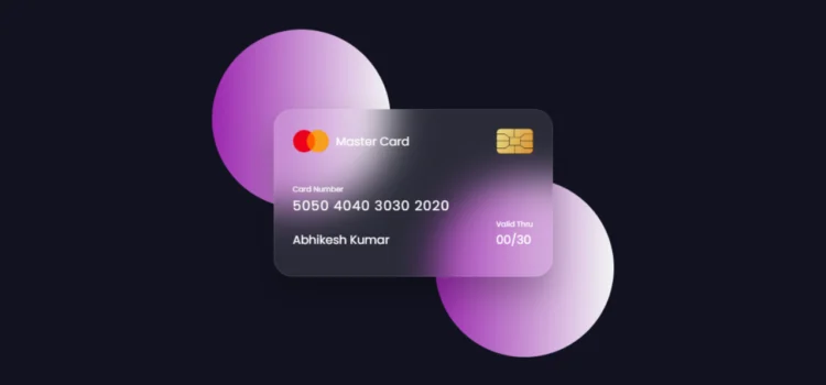
Introduction to Flipping Card UI Design
A Flipping Card UI Design adds interactive and visually appealing elements to your website. It’s a design feature where the card “flips” when hovered over, revealing more information on the other side. This technique is widely used in modern web design, especially for displaying product information, portfolio items, or cards containing key details concisely.
By learning to create a Flipping Card UI Design using HTML & CSS, you can add unique interactivity to your web projects without relying on JavaScript, ensuring faster load times and smoother performance.
Why Use HTML & CSS for Flipping Card UI?
Using HTML & CSS for your Flipping Card UI offers several benefits:
- Ease of Use: HTML and CSS are straightforward, making it easy to create interactive designs without complex code.
- No JavaScript Required: You can achieve smooth animations using just CSS, which keeps your design lightweight and SEO-friendly.
- Responsive Design: CSS allows you to make the design responsive, ensuring that your flipping cards work perfectly on mobile devices and different screen sizes.
- Improved Load Speed: By sticking to HTML & CSS, you minimize the need for heavy libraries, which leads to faster load times—a key factor for SEO.
Incorporating Flipping Card UI Design not only improves the user experience but also enhances the visual appeal of your site, keeping visitors engaged.
How to Create a Flipping Card UI Design: Step-by-Step Guide
1. Setting Up HTML Structure
The foundation of your Flipping Card UI Design lies in the HTML structure. Start by setting up the basic layout for the card and its content. Here’s how you can create the skeleton of your flipping card.
<!DOCTYPE html><html lang="en"><head><meta charset="UTF-8" /><meta name="viewport" content="width=device-width, initial-scale=1.0" /><title>Flipping Card UI Design</title><link rel="stylesheet" href="style.css" /></head><body><section><div class="container"><div class="card front-face"><header><span class="logo"><img src="images/logo.png" alt="" /><h5>Master Card</h5></span><img src="images/chip.png" alt="" class="chip" /></header><div class="card-details"><div class="name-number"><h6>Card Number</h6><h5 class="number">5050 4040 3030 2020</h5><h5 class="name">Abhikesh Kumar</h5></div><div class="valid-date"><h6>Valid Thru</h6><h5>00/30</h5></div></div></div><div class="card back-face"><h6>For customer service call +977 1111 3433 or email at</h6><span class="magnetic-strip"></span><div class="signature"><i>001</i></div><h5>Lorem ipsum dolor sit amet, consectetur adipisicing elit. Officiamaiores sed doloremque nesciunt neque beatae voluptatibus doloribus.Libero et quis magni magnam nihil temporibus? Facere consecteturdolore reiciendis et veniam.</h5></div></div></section></body></html>In this HTML code:
- Card-container: Contains the card and manages the overall layout.
- Front and back classes represent the two sides of the flipping card.
Make sure to structure your HTML with semantic tags for better SEO and accessibility. Using elements like <header>, <section>, and <article> can improve how search engines interpret your content.
2. Styling with CSS
Now that the structure is in place, let’s style the Flipping Card with CSS. The CSS will control the size, color, and the actual flipping animation.
Create a style.css file and add the following code:
/* Import Google Font - Poppins */@import url("https://fonts.googleapis.com/css2?family=Poppins:wght@300;400;500;600&display=swap");* {margin: 0;padding: 0;box-sizing: border-box;font-family: "Poppins", sans-serif;}section {position: relative;min-height: 100vh;width: 100%;background: #121321;display: flex;align-items: center;justify-content: center;color: #fff;perspective: 1000px;}section::before {content: "";position: absolute;height: 240px;width: 240px;border-radius: 50%;transform: translate(-150px, -100px);background: linear-gradient(90deg, #9c27b0, #f3f5f5);}section::after {content: "";position: absolute;height: 240px;width: 240px;border-radius: 50%;transform: translate(150px, 100px);background: linear-gradient(90deg, #9c27b0, #f3f5f5);}.container {position: relative;height: 225px;width: 375px;z-index: 100;transition: 0.6s;transform-style: preserve-3d;}.container:hover {transform: rotateY(180deg);}.container .card {position: absolute;height: 100%;width: 100%;padding: 25px;border-radius: 25px;backdrop-filter: blur(25px);background: rgba(255, 255, 255, 0.1);box-shadow: 0 25px 45px rgba(0, 0, 0, 0.25);border: 1px solid rgba(255, 255, 255, 0.1);backface-visibility: hidden; /* Ensure backface-visibility is set */transform-style: preserve-3d;}.front-face {backface-visibility: hidden;}.front-face header,.front-face .logo {display: flex;align-items: center;}.front-face header {justify-content: space-between;}.front-face .logo img {width: 48px;margin-right: 10px;}h5 {font-size: 16px;font-weight: 400;}.front-face .chip {width: 50px;}.front-face .card-details {display: flex;margin-top: 40px;align-items: flex-end;justify-content: space-between;}h6 {font-size: 10px;font-weight: 400;}h5.number {font-size: 18px;letter-spacing: 1px;}h5.name {margin-top: 20px;}.card.back-face {border: none;padding: 15px 25px 25px 25px;transform: rotateY(180deg);backface-visibility: hidden; /* Ensure backface-visibility is set */}.card.back-face h6 {font-size: 8px;}.card.back-face .magnetic-strip {position: absolute;top: 40px;left: 0;height: 45px;width: 100%;background: #000;}.card.back-face .signature {display: flex;justify-content: flex-end;align-items: center;margin-top: 80px;height: 40px;width: 85%;border-radius: 6px;background: repeating-linear-gradient(#fff,#fff 3px,#efefef 0px,#efefef 9px);}.signature i {color: #000;font-size: 12px;padding: 4px 6px;border-radius: 4px;background-color: #fff;margin-right: -30px;z-index: -1;}.card.back-face h5 {font-size: 8px;margin-top: 15px;}In this CSS code:
- Perspective adds the 3D effect needed for the card flip.
- Transform and transition properties enable the smooth flip animation.
- Backface visibility hides the content of the back until the flip occurs.
This CSS will make your Flipping Card UI Design functional, responsive, and engaging for users.
Best Practices for Flipping Card UI
When creating a Flipping Card UI, follow these best practices to ensure it’s optimized for both SEO and user experience:
- Responsive Design: Make sure your card is mobile-friendly by using media queries to adjust the layout on smaller screens. Here’s an example of a responsive media query:
@media (max-width: 600px) { .card.back-face h5 { font-size: 6px; margin-top: 15px; } }- Optimize for Speed: Keep the CSS simple and clean to reduce the load time of your page. Quick loading speeds play a crucial role in improving your website’s SEO performance.
- Alt Text for Accessibility: Include alt text for any images or visual elements within your card. This ensures that users with disabilities, and search engines, can interpret the content correctly.
- Semantic HTML: Use proper heading tags (<h2>, <h3>, etc.) and organize your content logically. This improves SEO by helping search engines understand the structure of your webpage.
- Keyword Optimization: Use trending keywords related to UI Design, HTML, CSS animations, and responsive web design to attract organic traffic.
Following these practices will make your Flipping Card UI Design not only look great but also perform well on search engines and across all devices.
Want to Check Username Availability on Social Media?If you’re looking to check username availability on various social media platforms, visit NameChkr to find out!
Read Also
- Glassmorphism Login Form in HTML and CSS
Explore the stylish world of glassmorphism as you create a modern login form using HTML and CSS. This guide breaks down the design process step by step.- Toggle Button using HTML, CSS, and JavaScript
Discover how to enhance user interaction by creating a sleek toggle button with HTML, CSS, and JavaScript. This tutorial covers everything from structure to styling.- Responsive Cards in HTML and CSS
Learn how to design eye-catching responsive cards that adapt seamlessly to any device. This guide offers practical tips for achieving stunning layouts.- Build a Google Gemini Chatbot Using HTML, CSS, and JS
Dive into chatbot development by creating a Google Gemini chatbot with HTML, CSS, and JavaScript. This tutorial will help you understand the basics of interactive forms.Download the Flipping Card Source Code
Ready to experiment with the code? You can download the full source code for the Flipping Card UI Design by clicking the button below. This gives you a head start to customize and use it in your projects.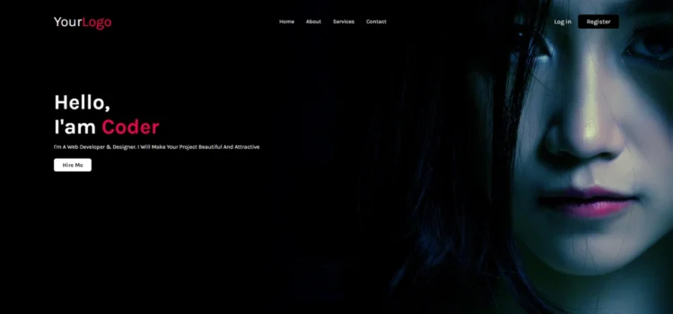
Creating a Simple Website in HTML & CSS is one of the best ways to start your web development journey. Whether you’re a beginner or looking to sharpen your skills, building a simple website using these core technologies is a must. In this tutorial, we’ll walk through the entire process step-by-step, and by the end, you’ll have a complete website and you can even download the source code to practice and improve further. So, let’s get started creating your first simple website in HTML & CSS.
What is a Simple Website in HTML & CSS?
A Simple Website in HTML & CSS refers to a basic web page design built using two primary web development languages: HTML (Hypertext Markup Language) and CSS (Cascading Style Sheets). These websites usually contain key components like headers, footers, buttons, and text.
HTML provides the structure or skeleton of the website, while CSS adds the style, such as colors, fonts, and layout designs. Even with this simplicity, you can still create an aesthetically pleasing and fully functional website that loads quickly and delivers a smooth user experience.
Why Use HTML & CSS for Simple Websites?
HTML and CSS serve as the foundation for all websites, providing the essential structure and style that power the web. If you’re new to web development, starting with a Simple Website in HTML & CSS helps you:
- Understand the fundamentals of front-end web development.
- Build clean, efficient, and responsive designs.
- Gain confidence by working with easy-to-learn and intuitive technologies.
Creating a simple website not only teaches the basics but also offers hands-on experience that can be applied to more complex projects later.
Step-by-Step Guide: How to Create a Simple Website in HTML & CSS
1. Setting Up HTML Structure
Start by setting up the HTML structure of your website. The basic structure includes the head and body tags, which contain essential elements like the title, meta information, and the content displayed on the page.
Below is an example of what your index.html file should look like:
<!DOCTYPE html><!---Coding By Abhikesh!---><html lang="en"><head><meta charset="UTF-8"><meta name="viewport" content="width=device-width, initial-scale=1.0"><meta http-equiv="X-UA-Compatible" content="ie=edge"><title>Simple Website Design</title><!---Custom Css File!---><link rel="stylesheet" href="style.css"></head><body><div class="container"><nav><div class="logo"><a href="#">Your<span>Logo</span></a></div><ul><li><a href="#">Home</a></li><li><a href="#">About</a></li><li><a href="#">Services</a></li><li><a href="#">Contact</a></li></ul><div class="buttons"><a href="#" class="login">Log in</a><a href="#" class="btn">Register</a></div></nav><div class="content"><h2>Hello,<br>I'am <span>Coder</span></h2><p>I'm A Web Developer & Designer. I Will Make Your Project Beautiful And Attractive</p></div><div class="link"><a href="#" class="hire">Hire Me</a></div></div></body></html>2. Styling Your Website with CSS
Next, let’s add styling to our website using CSS. Create a style.css file that will give your website a polished look. Here’s an example:
@import url('https://fonts.googleapis.com/css2?family=Karla:wght@300;400;500;600;700&display=swap');*{margin: 0;padding: 0;box-sizing: border-box;font-family: 'Karla', sans-serif;}body{color: #fff;}.container{width: 100%;height: 100vh;background-image: url(back.jpg);background-position: center;background-size: cover;padding-top: 35px;padding-left: 8%;padding-right: 8%;}nav{padding: 10px 0;display: flex;align-items: center;justify-content: space-between;}.logo a{font-size: 40px;text-decoration: none;}span{color: #f9004d;}nav ul li{display: inline-block;list-style: none;margin: 10px 15px;}nav ul li a{text-decoration: none;transition: 0.5s;}nav ul li a:hover{color: #f9004d;}.login{text-decoration: none;margin-right: 15px;font-size: 18px;}.btn{background: #000;border-radius: 6px;padding: 9px 25px;text-decoration: none;transition: 0.5s;font-size: 18px;}.content{margin-top: 10%;max-width: 600px;}.content h2{font-size: 60px}.content p{margin-top: 10px;line-height: 25px;}a{color: #fff;}.link {margin-top: 30px;}.hire{color: #000;text-decoration: none;background: #fff;padding: 9px 25px;font-weight: bold;border-radius: 6px;transition: 0.5s;}.link .hire:hover{background: transparent;border: 1px solid #fff;color: #fff;}This CSS stylesheet will style your website by giving it a responsive layout, clean typography, and visually appealing colors. The header section stands out, while the body text is easy to read.
Best Practices for a Simple Website
When creating a Simple Website in HTML & CSS, keep the following best practices in mind:
- Use Semantic HTML Tags: These help search engines understand your website structure and improve SEO. Use tags like <header>, <main>, <section>, and <footer>.
- Optimize for SEO: Include relevant keywords in your meta descriptions, headings, and throughout your content. For example, in this guide, the focus keyword is “Simple Website in HTML & CSS.”
- Mobile-First Design: Ensure your website is responsive and looks good on all screen sizes, especially mobile devices. You can use media queries to adjust your layout for smaller screens.
- Fast Load Times: Keep your code clean and avoid unnecessary elements. Optimize images and minimize CSS and JS files.
- Accessibility: Make your website accessible to everyone, including people with disabilities, by using proper contrast, alt tags, and keyboard navigation.
Sample Media Query for Responsiveness
To make your website responsive, you can add a media query in your CSS:
@media (max-width: 600px) {.btn{background: red;border-radius: 6px;padding: 9px 25px;text-decoration: none;transition: 0.5s;font-size: 18px;}}This makes the navigation links stack vertically on smaller screens, ensuring your site looks great on mobile devices.
Want to Check Username Availability on Social Media?If you’re looking to check username availability on various social media platforms, visit NameChkr to find out!
Read Also
- Glassmorphism Login Form in HTML and CSS
Explore the stylish world of glassmorphism as you create a modern login form using HTML and CSS. This guide breaks down the design process step by step.- Toggle Button using HTML, CSS, and JavaScript
Discover how to enhance user interaction by creating a sleek toggle button with HTML, CSS, and JavaScript. This tutorial covers everything from structure to styling.- Responsive Cards in HTML and CSS
Learn how to design eye-catching responsive cards that adapt seamlessly to any device. This guide offers practical tips for achieving stunning layouts.- Build a Google Gemini Chatbot Using HTML, CSS, and JS
Dive into chatbot development by creating a Google Gemini chatbot with HTML, CSS, and JavaScript. This tutorial will help you understand the basics of interactive forms.How to Download the Source Code
If you’re ready to experiment with the code and create your own Simple Website in HTML & CSS, you can download the entire source code. Click the button below to get started!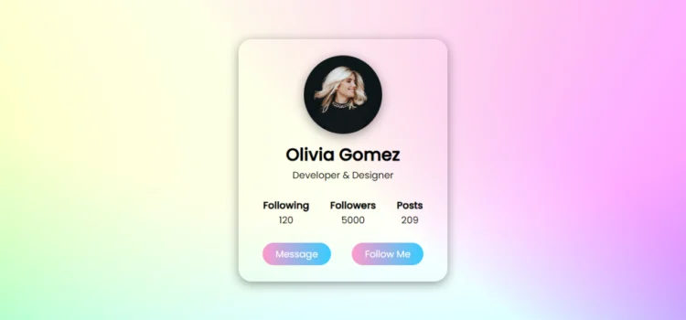
Are you ready to give your website a fresh and modern touch? In this guide, you will learn how to create a Stylish Profile Card in HTML and CSS. Profile cards are a fantastic way to display user information such as name, role, followers, posts, and contact options. This tutorial will walk you through designing a sleek profile card perfect for portfolios, personal websites, or social media profiles.
What is a Stylish Profile Card?
A Stylish Profile Card in HTML is not just a design element; it’s a compact and visually appealing way to present user information. Typically, these cards showcase a user’s image, name, profession, and relevant metrics like followers, posts, and following counts. By combining HTML for structure and CSS for design, we can craft a professional profile card that enhances user experience and engages visitors.
How to Create a Stylish Profile Card in HTML
Let’s dive into the steps of building your own Stylish Profile Card:
Step 1: HTML Structure
First, let’s set up the basic structure using HTML. We’ll define a section for the profile card and include an image, user name, user profession, and interactive buttons like “Message” and “Follow.”
<!DOCTYPE html><!---Coding By abhikesh---><html lang="en"><head><meta charset="UTF-8"><meta name="viewport" content="width=device-width, initial-scale=1.0"><meta http-equiv="X-UA-Compatible" content="ie=edge"><title> Profle Card UI Design | abhikesh </title><!---Custom Css File!---><link rel="stylesheet" href="style.css"></head><body><section class="main"><div class="profile-card"><div class="image"><img src="images/profile.jpg" alt="" class="profile-pic"></div><div class="data"><h2>Olivia Gomez</h2><span>Developer & Designer</span></div><div class="row"><div class="info"><h3>Following</h3><span>120</span></div><div class="info"><h3>Followers</h3><span>5000</span></div><div class="info"><h3>Posts</h3><span>209</span></div></div><div class="buttons"><a href="#" class="btn">Message</a><a href="#" class="btn">Follow Me</a></div></div></section></body></html>Step 2: Adding the ImageThe image section features the user’s profile picture, making it the focal point of your Stylish Profile Card. In this example, the image is circular with a soft shadow effect, giving it a polished and professional look.Step 3: CSS StylingNow, let’s add some flair to our profile card using CSS. This is where the magic happens! CSS enhances the card with shadows, hover effects, and stylish buttons, ensuring the card is centrally aligned and visually appealing.@import url('https://fonts.googleapis.com/css2?family=Poppins:wght@200;300;400;500&display=swap'); *{ margin: 0; padding: 0; box-sizing: border-box; font-family: 'Poppins', sans-serif; } .main{ width: 100%; height: 100vh; display: flex; align-items: center; justify-content: center; background-image: url(images/back.jpg); background-position: center; background-size: cover; } .profile-card{ display: flex; flex-direction: column; align-items: center; max-width: 400px; width: 100%; border-radius: 25px; padding: 30px; border: 1px solid #ffffff40; box-shadow: 0 5px 20px rgba(0,0,0,0.4); } .image{ position: relative; height: 150px; width: 150px; } .image .profile-pic{ width: 100%; height: 100%; object-fit: cover; border-radius: 50%; box-shadow: 0 5px 20px rgba(0,0,0,0.4); } .data{ display: flex; flex-direction: column; align-items: center; margin-top: 15px; } .data h2{ font-size: 33px; font-weight: 600; } span{ font-size: 18px; } .row{ display: flex; align-items: center; margin-top: 30px; } .row .info{ text-align: center; padding: 0 20px; } .buttons{ display: flex; align-items: center; margin-top: 30px; } .buttons .btn{ color: #fff; text-decoration: none; margin: 0 20px; padding: 8px 25px; border-radius: 25px; font-size: 18px; white-space: nowrap; background: linear-gradient(to left, #33ccff 0%, #ff99cc 100%); } .buttons .btn:hover{ box-shadow: inset 0 5px 20px rgba(0,0,0,0.4); }Key Elements of a Stylish Profile Card in HTML
- Profile Image: The user’s image is the focal point of any Stylish Profile Card. CSS is used to make it circular and add shadows for a polished look.
- User Information: Display the user’s name and profession prominently. This gives immediate context to who the person is.
- Metrics Section: Following, followers, and posts data is displayed in a neat row for quick user insights.
- Buttons: The “Message” and “Follow” buttons invite interaction, making the card functional and aesthetic.
Benefits of Using a Stylish Profile Card in HTML
- Visual Appeal: A well-designed profile card improves the overall visual experience on a website or app.
- User Interaction: By adding buttons for messaging and following, the profile card encourages user interaction.
- Responsive Design: This Stylish Profile Card is fully responsive, ensuring it looks great on both desktop and mobile devices.
Improving User Engagement with a Stylish Profile Card
User engagement can be significantly improved by integrating Stylish Profile Cards into your website. The combination of attractive visuals and useful user information encourages visitors to connect and explore more about the individual featured.
Want to Check Username Availability on Social Media?If you’re looking to check username availability on various social media platforms, visit NameChkr to find out!
Read Also
- Glassmorphism Login Form in HTML and CSS
Explore the stylish world of glassmorphism as you create a modern login form using HTML and CSS. This guide breaks down the design process step by step.- Toggle Button using HTML, CSS, and JavaScript
Discover how to enhance user interaction by creating a sleek toggle button with HTML, CSS, and JavaScript. This tutorial covers everything from structure to styling.- Responsive Cards in HTML and CSS
Learn how to design eye-catching responsive cards that adapt seamlessly to any device. This guide offers practical tips for achieving stunning layouts.- Build a Google Gemini Chatbot Using HTML, CSS, and JS
Dive into chatbot development by creating a Google Gemini chatbot with HTML, CSS, and JavaScript. This tutorial will help you understand the basics of interactive forms.
Conclusion
Creating a Stylish Profile Card in HTML and CSS is a fantastic way to enhance the user interface of any website. The balance of aesthetic appeal and functionality makes these cards ideal for personal portfolios, social media platforms, and business profiles. Follow the steps outlined here to create your own custom Stylish Profile Card and elevate your web design game!For further customization, feel free to download the source code below and start tweaking it to suit your needs!
Download Source Code
Click the button below to download the full source code for the Input Label Animation project:
If you’ve ever filled out a form online, you’ve likely noticed the modern, sleek look of Input Label Animations—floating labels that animate when you click inside a text field. This small design feature not only enhances the look of your form but also improves user experience by making it clear which field is currently active.
In this guide, we’ll show you how to create Input Label Animations using HTML and CSS from scratch. We’ll cover everything from the basic structure of the form to the CSS styling that makes the label float when the input is focused. By the end of this article, you’ll have a fully functional, aesthetically pleasing form that can be easily integrated into any website.
Let’s dive right in!
What is Input Label Animation?
Input Label Animations, often called floating label animations, are a popular UI design pattern where the label, usually placed inside the input field, “floats” or moves above the input box when the user interacts with the field. This method is not only visually appealing but also more efficient in terms of space. The input label transitions from being inside the field to hovering above it, providing a clear distinction between inactive and active input fields.
Floating labels are commonly used in modern web forms, helping maintain a clean, minimalist design. Moreover, this animation improves usability by clearly indicating where the user is supposed to input data.
Benefits of Floating Label Animation
Why should you consider implementing input label animation in your forms? Here are a few benefits:
1. Enhanced User Experience
Floating labels offer a more interactive and dynamic experience for users, helping them navigate through forms with ease. It gives visual cues to the user about the input they are currently filling out, which is particularly helpful on forms with multiple fields.
2. Space-Saving Design
With floating labels, there’s no need to place static labels above input fields, saving precious screen real estate. This makes it perfect for mobile-responsive designs where space is limited.
3. Improved Readability
Since the label floats above the input field when the user begins typing, there’s no confusion about what information needs to be entered in each field. This design also makes the form appear cleaner and more intuitive.
4. Modern Aesthetic
Incorporating animations in web forms adds a polished, professional look to the design. It makes your website feel more up-to-date, which can enhance user trust and overall brand perception.
Creating the Basic HTML Structure
Before we get to the fun part of styling the animation, we need to set up a simple HTML structure. Follow these steps:
Step 1: Create an HTML File
First, create a file named index.html. This file will contain the basic HTML structure for your form.
<!DOCTYPE html><!---Coding By abhikesh | www.abhikesh.com---><html lang="en"><head><meta charset="UTF-8"><meta name="viewport" content="width=device-width, initial-scale=1.0"><meta http-equiv="X-UA-Compatible" content="ie=edge"><title>Input Label Animaton | CoderGirl</title><!---Custom CSS File---><link rel="stylesheet" href="style.css"></head><body><div class="input-field"><inputtype="text"requiredspellcheck="false"><label>Enter email</label></div></body></html>In this structure, we have two input fields: one for the name and one for the email. Each field is wrapped in a div with the class input group for easier styling and alignment.
CSS Styling for Input Label Animation
Now that we have our HTML structure, let’s add some CSS to bring the animation to life. This will be done in a file named style.css.
/* Import Google font - Poppins */ @import url('https://fonts.googleapis.com/css2?family=Poppins:wght@200;300;400;500;600;700&display=swap'); *{ margin: 0; padding: 0; box-sizing: border-box; font-family: 'Poppins', sans-serif; } body{ min-height: 100vh; display: flex; align-items: center; justify-content: center; background-color: #060b23; } .input-field{ position: relative; } .input-field input{ width: 350px; height: 60px; border-radius: 6px; font-size: 18px; padding: 0 15px; border: 2px solid #fff; background: transparent; color: #fff; outline: none; } .input-field label{ position: absolute; top: 50%; left: 15px; transform: translateY(-50%); color: #fff; font-size: 19px; pointer-events: none; transition: 0.3s; } input:focus{ border: 2px solid #18ffff; } input:focus ~ label, input:valid ~ label{ top: 0; left: 15px; font-size: 16px; padding: 0 2px; background: #060b23; }Step 2: Create a CSS File
Create a file named style.css and add the following CSS code:
Explanation of the CSS
- Form Styling: The form is centered both vertically and horizontally using Flexbox.
- Input Field Styling: Each input field has a basic border and padding, and when focused, the border color changes to blue (#007BFF).
- Label Animation: The label starts inside the input field, aligned vertically to the middle. When the user clicks inside the field or starts typing, the label moves to the top of the input box and shrinks in size.
Understanding the Animation Process
When a user interacts with the input field, CSS transitions are used to smoothly move the label from inside the input field to above it. This movement gives a clear indication of where the label goes as the user focuses on the input field, enhancing the overall user experience.
The transition is primarily controlled by the transform, top, and font-size properties of the label. Additionally, the color of the border changes when the input is focused, which provides a visual cue to users.
The key to this input label animation lies in the following lines of CSS:
input:focus ~ label, input:valid ~ label { top: 0; left: 15px; font-size: 16px; padding: 0 2px; background: #060b23; }This code tells the browser to move the label upwards when the input field is focused or when valid input is detected. The label floats above the input, stays in this position while the user is typing, and returns to its original position if the input field is cleared. The border color also changes on focus, providing a responsive and elegant experience for the user.
This ensures a clean and dynamic interaction between the user and the form, making the label behavior intuitive and visually appealing.
Additional Customization Options
If you want to further enhance the look and feel of your form, you can try the following:
- Custom Fonts: Experiment with different Google Fonts to give your form a unique look.
- Theme Colors: Change the border color and label colors to match your website’s theme.
- Input Validation: Add some JavaScript to validate user input in real-time, providing feedback when a field is incorrectly filled.
Tips for Optimizing Input Label Animation
To ensure that your floating label animations look great and perform well across all devices, follow these best practices:
- Mobile Responsiveness: Always test your forms on different screen sizes to ensure the labels and input fields scale properly on mobile devices.
- Accessibility: Make sure that your forms are accessible by adding proper aria-label tags and ensuring that the animations are easy to understand for screen reader users.
- Performance: Use lightweight CSS animations to avoid impacting your website’s load time. Avoid using too many CSS animations in one page, as this can slow down the user experience.
Want to Check Username Availability on Social Media?If you’re looking to check username availability on various social media platforms, visit NameChkr to find out!
Read Also
- Glassmorphism Login Form in HTML and CSS
Explore the stylish world of glassmorphism as you create a modern login form using HTML and CSS. This guide breaks down the design process step by step.- Toggle Button using HTML, CSS, and JavaScript
Discover how to enhance user interaction by creating a sleek toggle button with HTML, CSS, and JavaScript. This tutorial covers everything from structure to styling.- Responsive Cards in HTML and CSS
Learn how to design eye-catching responsive cards that adapt seamlessly to any device. This guide offers practical tips for achieving stunning layouts.- Build a Google Gemini Chatbot Using HTML, CSS, and JS
Dive into chatbot development by creating a Google Gemini chatbot with HTML, CSS, and JavaScript. This tutorial will help you understand the basics of interactive forms.Conclusion
You’ve now learned how to create a sleek and user-friendly Input Label Animation using HTML and CSS. By integrating this feature into your forms, you’ll enhance both the functionality and aesthetic appeal of your website, making it more engaging for users.
Input label animations are a small but impactful UI/UX feature that can make your forms look modern and professional. Experiment with different styles, colors, and fonts to find the perfect fit for your website.
For further customization, feel free to download the source code below and start tweaking it to suit your needs!
Download Source Code
Click the button below to download the full source code for the Input Label Animation project:
Comments
Learn to build a functional contact form in PHP
Learn to build a functional contact form in PHP
Create a Website with a Login/Registration Form in HTML, CSS and JavaScript
Learn to build a functional contact form in PHP
Create a Website with a Login/Registration Form in HTML, CSS and JavaScript