When you run a website or web app, people usually sit and stare at a blank screen while the main content arrives. Adding a small loading animation, called a preloader, fills that dead space with something more visually appealing to look at. The tutorial shows how to build a heart-shaped loader using only HTML, CSS, and JavaScript. Because the technique relies on built-in markup and styles, the result remains lightweight, loads quickly, and is easy for beginners to try.
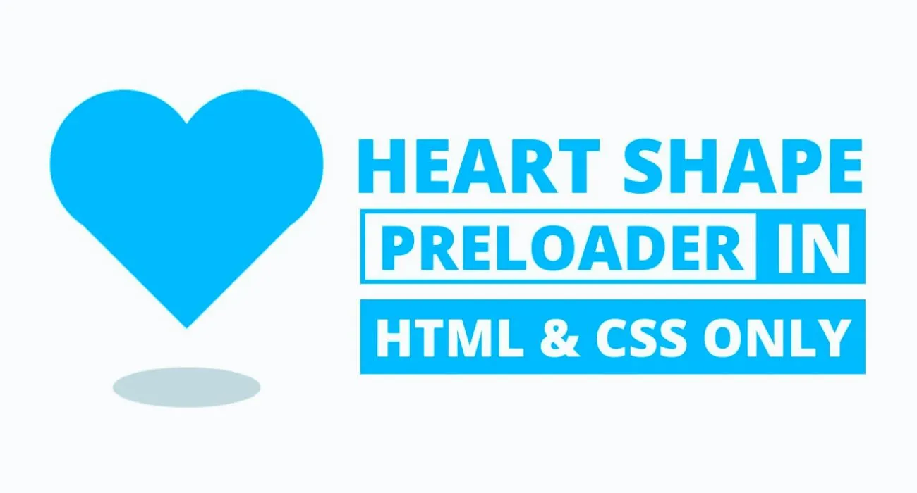
The signature effect turns a round blob into a heart shape that slowly spins on its center. That simple gesture gives the page a friendly, upbeat vibe, which works well on personal blogs, dating sites, artist portfolios, or any project that wants to spread good feelings.
So grab a code editor as the guide walks through every step of the process, explaining why each line matters and showing live previews along the way.
What Is a Preloader and Why Use One?
A preloader is the little animation you see while a page is still loading. Rather than leaving visitors staring at a blank portal, you give them a friendly graphic that calmly says, Wait a moment, we are loading good stuff. This tiny gesture can.
- Upgrade the first impression your site makes.
- Drop the number of people who hit Back because nothing seems to happen.
- Enhance the overall navigation experience to be smoother and more polished.
Preloaders excel on image-heavy blogs, online shops, or web apps where videos, fonts, and scripts can slow down the final reveal.
Why Choose a Heart Shape Preloader?
The heart outline is a worldwide shorthand for warmth, care and human links. Swap the standard spinner for a heart-shaped loader, and your project suddenly has attitude, charm, and the sort of little detail people remember. It works beautifully.
- Freelance portfolio homes.
- Dating apps or relationship blogs.
- Wedding planning hubs.
- Lifestyle magazines.
- Creative studios.
A simple CSS keyframe can transform a circle into that familiar curve while spinning slowly, and because the trick runs only in graphics hardware, it won’t compromise speed for real content.
Key Features of This Preloader
This heart loader breaks away from the usual spinning dots and bars, offering something a little more playful:
- Its entire setup is pure HTML and CSS; JavaScript is not needed.
- A clever shape transformation swaps the circle for a heart.
- The whole thing spins a full 720 degrees in one smooth loop.
- It adjusts to any screen size and plays nicely with all modern browsers.
- Because it weighs in at under a kilobyte, it loads almost instantly.
How the Preloader Animation Works
The animation is driven by a single HTML element, with the heart formed by two pseudo-elements positioned precisely. Behind the scenes, it does three main tricks:
- Endless rotation controlled by a simple CSS @keyframes block.
- Shape-shifting is done with a border-radius and a gentle twist.
- Transitions are sprinkled throughout to smooth out any jarring jumps.
Together, these steps create a floating, heartbeat-like rhythm as the rest of the page comes to life.
Technologies Used
- HTML5 gives the loader its bare-bones structure.
- CSS3 handles the animation, the shaping, and all the finishing touches.
- There are no external libraries, no tangled frameworks —just vanilla code.
- If you want, Flexbox or CSS Grid can give it a responsive layout.
Because everything sits in CSS, you dodge long load times, broken scripts, and extra file dependencies.
Step-by-Step Instructions to Create It
Building this heart-shaped preloader from the ground up is simple. You need two files: one HTML file and one CSS file.
1. Create the HTML File
Call the HTML file index.html. Inside, place a single div that acts as the loader container. Keep the markup minimal and tidy.
<!DOCTYPE html><!-- Created By abhikesh.com --><html lang="en" dir="ltr"><head><meta charset="utf-8"><title>Heart Shape Preloader | abhikesh</title><link rel="stylesheet" href="style.css"></head><body><div class="container"><div class="preloader"><span></span><span></span><span></span></div><div class="shadow"></div></div></body></html>
2. Create the CSS File
Name the second file style.css. Here, you add all the styles, animations, and shape math. Position, transform, border-radius, and @keyframes do most of the heavy lifting.
        .container {
            position: absolute;
            top: 50%;
            left: 50%;
            transform: translate(-50%, -50%);
        }

        .container .preloader {
            animation: rotate 2.3s cubic-bezier(0.75, 0, 0.5, 1) infinite;
        }

        @keyframes rotate {
            50% {
                transform: rotate(360deg);
            }

            100% {
                transform: rotate(720deg);
            }
        }

        .preloader span {
            position: absolute;
            display: block;
            height: 64px;
            width: 64px;
            background: #ff3c00;
            border: 1px solid #ff3c00;
            border-radius: 100%;
        }

        .preloader span:nth-child(1) {
            transform: translate(-28px, -28px);
            animation: shape_1 2.3s cubic-bezier(0.75, 0, 0.5, 1) infinite;
        }

        @keyframes shape_1 {
            60% {
                transform: scale(0.4);
            }
        }

        .preloader span:nth-child(2) {
            transform: translate(28px, -28px);
            animation: shape_2 2.3s cubic-bezier(0.75, 0, 0.5, 1) infinite;
        }

        @keyframes shape_2 {
            40% {
                transform: scale(0.4);
            }
        }

        .preloader span:nth-child(3) {
            position: relative;
            border-radius: 0px;
            transform: scale(0.98) rotate(-45deg);
            animation: shape_3 2.3s cubic-bezier(0.75, 0, 0.5, 1) infinite;
        }

        @keyframes shape_3 {
            50% {
                border-radius: 100%;
                transform: scale(0.5) rotate(-45deg);
            }

            100% {
                transform: scale(0.98) rotate(-45deg);
            }
        }

        .shadow {
            position: relative;
            top: 30px;
            left: 50%;
            transform: translateX(-50%);
            display: block;
            height: 16px;
            width: 64px;
            border-radius: 50%;
            background-color: #d9d9d9;
            border: 1px solid #d9d9d9;
            animation: shadow 2.3s cubic-bezier(0.75, 0, 0.5, 1) infinite;
        }

        @keyframes shadow {
            50% {
                transform: translateX(-50%) scale(0.5);
                border-color: #f2f2f2;
            }
        }
Remember to link style.css in the head of index.html so the animation runs as soon as the page loads.
How to Customize the Preloader
Personalizing the preloader takes only a few quick edits.
- Swap the background color or change the border shade.
- Make the loader bigger or smaller.
- Speed up or slow down the spin or flip its direction.
- Adjust the width or height of the heart’s stretch during the pulse.
- Add fade-in and fade-out at the start and end.
If you’re familiar with advanced CSS, try incorporating filters, subtle gradients, or soft shadows for an extra polished look.
Performance and SEO Considerations
When used thoughtfully, a simple CSS preloader can boost the feel of speed on your site. Here are the main upsides of this approach:
- Lightweight: Because it skips JavaScript, the CSS keeps the initial page shrunk.
- Fast to load: Pure CSS hits the browser almost instantly, so nothing blocks rendering.
- Better UX: A gentle spin or pulse holds attention rather than leaving a blank screen.
- Lower bounce rate: Viewers are less likely to click away while the animation is in progress.
- Responsive: The spinner scales with every screen, needing no extra mobile code.
Still, reserve the preloader for spots where a genuine delay occurs, such as fetching API data or serving image-heavy pages.
Where to Use This Preloader
You can drop this mini loader into plenty of day-to-day scenarios. Try it for:
- Intro slides on a portfolio site.
- Splash screens for mobile web apps.
- Loading masks over Ajax forms or API calls.
- Background spinners in a gallery of large images.
- Any spot where you want a bit of flair while data appears.
If you manage a blog, small business site, or design project, adding the loader makes your pages feel sharper and more inviting.
Learning Opportunity for Beginners
If you’re new to front-end development, this mini-project is ideal for you. You will learn
- How to use:: before and:: after to build complex shapes
- How to create animations using @keyframes
- How transform, rotate, and scale work together
- How to design visually appealing UI components without JS
Working on a project like this helps you develop solid CSS habits that easily carry over to other areas, such as transitions, SVG animations, or even CSS-based games.
Source Code Access
To add the heart preloader to your site, set up the two files mentioned earlier, copy the HTML and CSS code inside them, and then tweak any values you want. You can slot it into your current layout or turn it into a full-screen loading overlay.
If the animation does not show as expected, check that the file names and paths match. Most problems arise from tiny typos, missing brackets, or links that were omitted.
Read Also
- Glassmorphism Login Form in HTML and CSS
Explore the stylish world of glassmorphism as you create a modern login form using HTML and CSS. This guide breaks down the design process step by step. - Toggle Button using HTML, CSS, and JavaScript
Discover how to enhance user interaction by creating a sleek toggle button with HTML, CSS, and JavaScript. This tutorial covers everything from structure to styling. - Responsive Cards in HTML and CSS
Learn how to design eye-catching responsive cards that adapt seamlessly to any device. This guide offers practical tips for achieving stunning layouts. - Build a Google Gemini Chatbot Using HTML, CSS, and JS
Dive into chatbot development by creating a Google Gemini chatbot with HTML, CSS, and JavaScript. This tutorial will help you understand the basics of interactive forms.
Final Thoughts
Using a heart-shaped preloader allows you to combine a touch of creative fun with solid front-end expertise. It signals to visitors that your site works well and looks good and that small details can stick with people. From a personal blog to a sweet product landing page or even a designer’s portfolio, this loader adds a touch of personality while smoothing out the wait.
The best part is that you don’t need any JavaScript or bulky plugins, and the load time barely nudges. Clean HTML and a few lines of CSS do all the work.