If you’re interested in learning how to create a clean and efficient Mega and Dropdown Menu using only HTML & CSS, you’re in the right place! In this tutorial, we will walk through how to build a fully functional mega and dropdown menu navigation bar using just HTML and CSS—no JavaScript needed!
Mega and Dropdown Menu are becoming increasingly popular on websites with complex structures or multiple categories. In contrast, a dropdown menu is a simpler form of navigation. Combining both in a responsive menu ensures that your visitors enjoy a smooth user experience, regardless of their device.
Whether you’re a beginner or a seasoned developer, this guide will help you design a visually appealing, responsive menu for your site. We’ll explore the essential HTML structure, CSS styling, and how to ensure your navigation bar looks great on all devices.
What is a Responsive Mega and Dropdown Menu?
A Responsive Mega and Dropdown Menu is a website navigation system that combines the simplicity of a dropdown menu with the functionality of a mega menu. A dropdown menu displays a list of items when you hover or click on a parent link. In contrast, a mega menu presents multiple columns of links and additional content like categories or product lists.
When built with pure HTML and CSS, these menus become lightweight, fast-loading, and compatible across browsers without needing JavaScript.
Benefits of Using Only HTML & CSS
Building a Responsive Mega and Dropdown Menu using only HTML and CSS offers several advantages:
- Performance: HTML and CSS menus are lightweight and don’t require heavy JavaScript libraries, ensuring fast load times for your website.
- SEO: Search engines can easily crawl and index HTML content, improving your website’s visibility.
- Accessibility: HTML and CSS menus work seamlessly on most devices and assistive technologies.
- Responsiveness: CSS media queries allow you to create a fully responsive menu for mobile devices.
Now, let’s get into how to create a Responsive Mega Menu and Dropdown Menu using only HTML & CSS step by step.
Step-by-Step Guide to Building a Responsive Mega and Dropdown Menu with Just HTML & CSS
Creating a Responsive Mega and Dropdown Menu is straightforward if you break it down into steps. Here’s the complete process:
Step 1: Building the HTML Structure
To begin, we will establish the foundational structure of the mega and dropdown menu with HTML. This will include a navbar containing links, dropdown items, and mega menu sections. Below is a sample code snippet to help you get started:
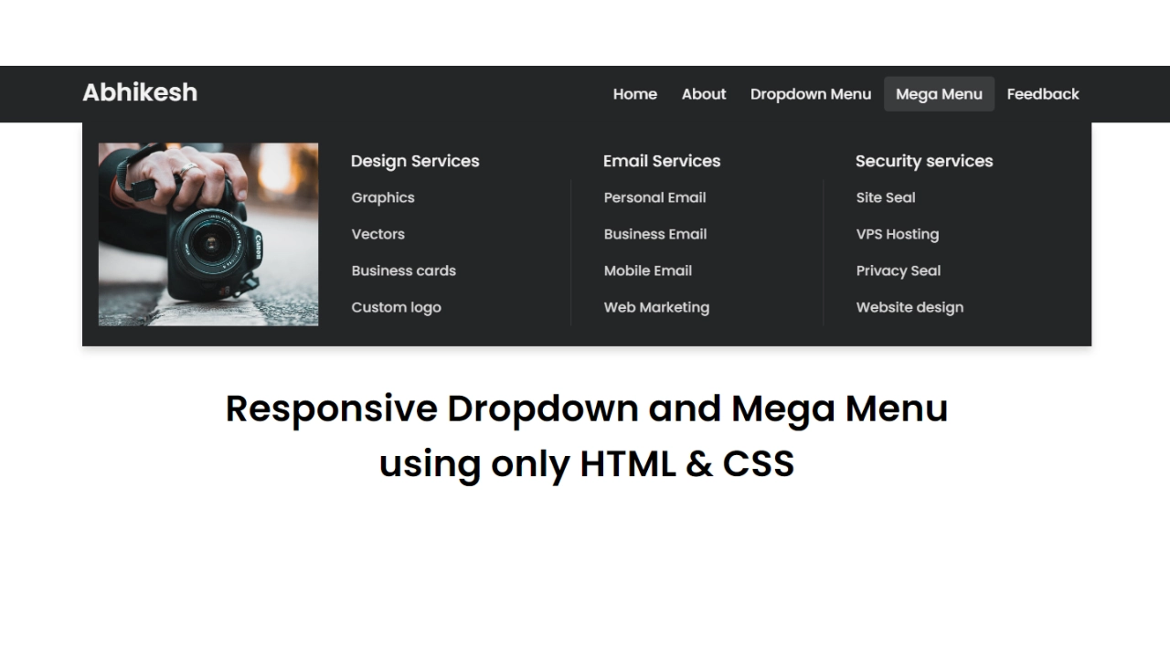
<!DOCTYPE html><!-- Created By abhikesh - www.abhikesh.com --><html lang="en"><head><meta charset="UTF-8"><meta name="viewport" content="width=device-width, initial-scale=1.0"><title>Responsive Mega Menu | abhikesh</title><link rel="stylesheet" href="style.css"><link rel="stylesheet" href="https://cdnjs.cloudflare.com/ajax/libs/font-awesome/5.15.3/css/all.min.css"/></head><body><nav><div class="wrapper"><div class="logo"><a href="#">Abhikesh</a></div><input type="radio" name="slider" id="menu-btn"><input type="radio" name="slider" id="close-btn"><ul class="nav-links"><label for="close-btn" class="btn close-btn"><i class="fas fa-times"></i></label><li><a href="#">Home</a></li><li><a href="#">About</a></li><li><a href="#" class="desktop-item">Dropdown Menu</a><input type="checkbox" id="showDrop"><label for="showDrop" class="mobile-item">Dropdown Menu</label><ul class="drop-menu"><li><a href="#">Drop menu 1</a></li><li><a href="#">Drop menu 2</a></li><li><a href="#">Drop menu 3</a></li><li><a href="#">Drop menu 4</a></li></ul></li><li><a href="#" class="desktop-item">Mega Menu</a><input type="checkbox" id="showMega"><label for="showMega" class="mobile-item">Mega Menu</label><div class="mega-box"><div class="content"><div class="row"><img src="img.jpg" alt=""></div><div class="row"><header>Design Services</header><ul class="mega-links"><li><a href="#">Graphics</a></li><li><a href="#">Vectors</a></li><li><a href="#">Business cards</a></li><li><a href="#">Custom logo</a></li></ul></div><div class="row"><header>Email Services</header><ul class="mega-links"><li><a href="#">Personal Email</a></li><li><a href="#">Business Email</a></li><li><a href="#">Mobile Email</a></li><li><a href="#">Web Marketing</a></li></ul></div><div class="row"><header>Security services</header><ul class="mega-links"><li><a href="#">Site Seal</a></li><li><a href="#">VPS Hosting</a></li><li><a href="#">Privacy Seal</a></li><li><a href="#">Website design</a></li></ul></div></div></div></li><li><a href="#">Feedback</a></li></ul><label for="menu-btn" class="btn menu-btn"><i class="fas fa-bars"></i></label></div></nav><div class="body-text"><div class="title">Responsive Dropdown and Mega Menu</div><div class="sub-title">using only HTML & CSS</div></div></body></html>Step 2: Styling the Mega Menu with CSS
Next, we’ll style the navigation bar, dropdown menu, and mega menu using CSS. The menu will have a modern look with a clean design, suitable for any professional website. Below is an example of CSS styling:
@import url('https://fonts.googleapis.com/css2?family=Poppins:wght@200;300;400;500;600;700&display=swap');* {margin: 0;padding: 0;box-sizing: border-box;font-family: 'Poppins', sans-serif;}nav {position: fixed;z-index: 99;width: 100%;background: #242526;}nav .wrapper {position: relative;max-width: 1300px;padding: 0px 30px;height: 70px;line-height: 70px;margin: auto;display: flex;align-items: center;justify-content: space-between;}.wrapper .logo a {color: #f2f2f2;font-size: 30px;font-weight: 600;text-decoration: none;}.wrapper .nav-links {display: inline-flex;}.nav-links li {list-style: none;}.nav-links li a {color: #f2f2f2;text-decoration: none;font-size: 18px;font-weight: 500;padding: 9px 15px;border-radius: 5px;transition: all 0.3s ease;}.nav-links li a:hover {background: #3A3B3C;}.nav-links .mobile-item {display: none;}.nav-links .drop-menu {position: absolute;background: #242526;width: 180px;line-height: 45px;top: 85px;opacity: 0;visibility: hidden;box-shadow: 0 6px 10px rgba(0, 0, 0, 0.15);}.nav-links li:hover .drop-menu,.nav-links li:hover .mega-box {transition: all 0.3s ease;top: 70px;opacity: 1;visibility: visible;}.drop-menu li a {width: 100%;display: block;padding: 0 0 0 15px;font-weight: 400;border-radius: 0px;}.mega-box {position: absolute;left: 0;width: 100%;padding: 0 30px;top: 85px;opacity: 0;visibility: hidden;}.mega-box .content {background: #242526;padding: 25px 20px;display: flex;width: 100%;justify-content: space-between;box-shadow: 0 6px 10px rgba(0, 0, 0, 0.15);}.mega-box .content .row {width: calc(25% - 30px);line-height: 45px;}.content .row img {width: 100%;height: 100%;object-fit: cover;}.content .row header {color: #f2f2f2;font-size: 20px;font-weight: 500;}.content .row .mega-links {margin-left: -40px;border-left: 1px solid rgba(255, 255, 255, 0.09);}.row .mega-links li {padding: 0 20px;}.row .mega-links li a {padding: 0px;padding: 0 20px;color: #d9d9d9;font-size: 17px;display: block;}.row .mega-links li a:hover {color: #f2f2f2;}.wrapper .btn {color: #fff;font-size: 20px;cursor: pointer;display: none;}.wrapper .btn.close-btn {position: absolute;right: 30px;top: 10px;}nav input {display: none;}.body-text {position: absolute;top: 50%;left: 50%;transform: translate(-50%, -50%);width: 100%;text-align: center;padding: 0 30px;}.body-text div {font-size: 45px;font-weight: 600;}Step 3: Adding ResponsivenessTo make our Responsive Mega and Dropdown Menu adapt to different screen sizes, we’ll use CSS media queries. This ensures the menu looks good on both desktop and mobile devices. Here’s how to do it:@media screen and (max-width: 970px) {.wrapper .btn {display: block;}.wrapper .nav-links {position: fixed;height: 100vh;width: 100%;max-width: 350px;top: 0;left: -100%;background: #242526;display: block;padding: 50px 10px;line-height: 50px;overflow-y: auto;box-shadow: 0px 15px 15px rgba(0, 0, 0, 0.18);transition: all 0.3s ease;}/* custom scroll bar */::-webkit-scrollbar {width: 10px;}::-webkit-scrollbar-track {background: #242526;}::-webkit-scrollbar-thumb {background: #3A3B3C;}#menu-btn:checked~.nav-links {left: 0%;}#menu-btn:checked~.btn.menu-btn {display: none;}#close-btn:checked~.btn.menu-btn {display: block;}.nav-links li {margin: 15px 10px;}.nav-links li a {padding: 0 20px;display: block;font-size: 20px;}.nav-links .drop-menu {position: static;opacity: 1;top: 65px;visibility: visible;padding-left: 20px;width: 100%;max-height: 0px;overflow: hidden;box-shadow: none;transition: all 0.3s ease;}#showDrop:checked~.drop-menu,#showMega:checked~.mega-box {max-height: 100%;}.nav-links .desktop-item {display: none;}.nav-links .mobile-item {display: block;color: #f2f2f2;font-size: 20px;font-weight: 500;padding-left: 20px;cursor: pointer;border-radius: 5px;transition: all 0.3s ease;}.nav-links .mobile-item:hover {background: #3A3B3C;}.drop-menu li {margin: 0;}.drop-menu li a {border-radius: 5px;font-size: 18px;}.mega-box {position: static;top: 65px;opacity: 1;visibility: visible;padding: 0 20px;max-height: 0px;overflow: hidden;transition: all 0.3s ease;}.mega-box .content {box-shadow: none;flex-direction: column;padding: 20px 20px 0 20px;}.mega-box .content .row {width: 100%;margin-bottom: 15px;border-top: 1px solid rgba(255, 255, 255, 0.08);}.mega-box .content .row:nth-child(1),.mega-box .content .row:nth-child(2) {border-top: 0px;}.content .row .mega-links {border-left: 0px;padding-left: 15px;}.row .mega-links li {margin: 0;}.content .row header {font-size: 19px;}}With these media queries, the navigation menu will stack vertically on smaller screens, and the mega menu will adjust to fit the width of the screen.
Want to Check Username Availability on Social Media?If you’re looking to check username availability on various social media platforms, visit NameChkr to find out!
Read Also
- Glassmorphism Login Form in HTML and CSS
Explore the stylish world of glassmorphism as you create a modern login form using HTML and CSS. This guide breaks down the design process step by step.- Toggle Button using HTML, CSS, and JavaScript
Discover how to enhance user interaction by creating a sleek toggle button with HTML, CSS, and JavaScript. This tutorial covers everything from structure to styling.- Responsive Cards in HTML and CSS
Learn how to design eye-catching responsive cards that adapt seamlessly to any device. This guide offers practical tips for achieving stunning layouts.- Build a Google Gemini Chatbot Using HTML, CSS, and JS
Dive into chatbot development by creating a Google Gemini chatbot with HTML, CSS, and JavaScript. This tutorial will help you understand the basics of interactive forms.Conclusion
Building a Responsive Mega and Dropdown Menu using only HTML and CSS is a great way to enhance your website’s navigation without relying on JavaScript. This approach provides a lightweight, fast-loading solution that is both accessible and SEO-friendly. You now have a responsive, clean, and professional menu that adapts seamlessly across different screen sizes.
If you run into any issues while coding or need further guidance, feel free to download the source code below.
Download Source Code
To get the full source code for this Responsive Mega and Dropdown Menu using only HTML & CSS, click the button below: