Create a Beautiful Product Card with Smooth Animations
Today we are back again with another tutorial showing the process of creating an animated product card using just HTML and CSS. This is perfect for anyone looking to add interactive product cards to their website, providing users with a modern and engaging experience without needing JavaScript.
This tutorial is useful for both an experienced developer or even if you’re not a pro in web development. So, let’s create our animated product card that works across devices.
What is a Product Card?
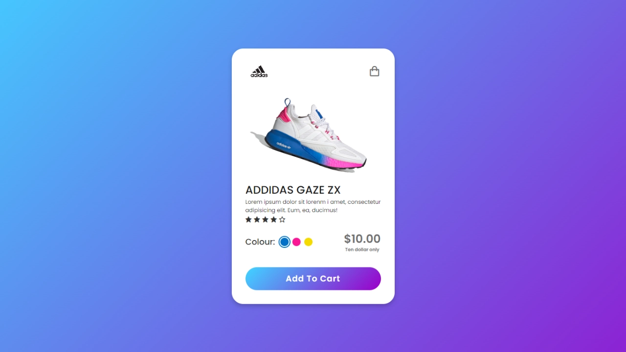
A product card is a small visual element on a webpage that showcases essential product details. Typically, a product card includes:
- High-Resolution Product Image
- Product Name and Logo
- Product Price
- The “Add to Cart” Button
- Color and Size Options
Adding an animated product card to your site can boost user interaction, helping visitors visualize product attributes like color, size, or variations. With CSS animations, you can create sleek transitions and effects that enhance the user experience.
Why Use Only HTML & CSS for Product Card Animation?
Using just HTML and CSS for your product card animations offers several advantages:
- No JavaScript Required: This keeps the website lightweight and ensures faster page load times.
- Responsive Design: CSS media queries allow you to make your product card design mobile-friendly and adaptable to any screen size.
- SEO-Friendly: By sticking to HTML and CSS, you optimize page performance, improving your site’s SEO ranking.
How to Create an Animated Product Card Using HTML & CSS
Follow the steps below to create a product card with smooth animations. We’ll focus on a simple and clean design while applying some beautiful CSS transitions to make the card visually appealing.
1. Set Up Your HTML Structure
The first step is to create the structure for the product card using semantic HTML. You’ll create an HTML file where you define the layout for your product card.
Here’s an example:
<!DOCTYPE html><!-- Designed by abhikesh | www.abhikesh.com/ --><html lang="en" dir="ltr"><head><meta charset="UTF-8"><title> Responsive Animated Product Card | abhikesh </title><link rel="stylesheet" href="style.css"><!-- Boxicons CDN Link --><link href='https://unpkg.com/boxicons@2.0.7/css/boxicons.min.css' rel='stylesheet'><meta name="viewport" content="width=device-width, initial-scale=1.0"></head><body><div class="product-card"><div class="logo-cart"><img src="images/logo.jpg" alt="logo"><i class='bx bx-shopping-bag'></i></div><div class="main-images"><img id="blue" class="blue active" src="images/blue.png" alt="blue"><img id="pink" class="pink" src="images/pink.png" alt="blue"><img id="yellow" class="yellow" src="images/yellow.png" alt="blue"></div><div class="shoe-details"><span class="shoe_name">ADDIDAS GAZE ZX</span><p>Lorem ipsum dolor sit lorenm i amet, consectetur adipisicing elit. Eum, ea, ducimus!</p><div class="stars"><i class='bx bxs-star'></i><i class='bx bxs-star'></i><i class='bx bxs-star'></i><i class='bx bxs-star'></i><i class='bx bx-star'></i></div></div><div class="color-price"><div class="color-option"><span class="color">Colour:</span><div class="circles"><span class="circle blue active" id="blue"></span><span class="circle pink " id="pink"></span><span class="circle yellow " id="yellow"></span></div></div><div class="price"><span class="price_num">$10.00</span><span class="price_letter">Ten dollar only</span></div></div><div class="button"><div class="button-layer"></div><button>Add To Cart</button></div></div><script>let circle = document.querySelector(".color-option");circle.addEventListener("click", (e) => {let target = e.target;if (target.classList.contains("circle")) {circle.querySelector(".active").classList.remove("active");target.classList.add("active");document.querySelector(".main-images .active").classList.remove("active");document.querySelector(`.main-images .${target.id}`).classList.add("active");}});</script></body></html>
In this example:
- The product card container holds the product image and the product details.
- Product image contains the image element for your product.
- Product info includes the product name, price, and an “Add to Cart” button.
2. Style the Product Card with CSS
Now, we’ll use CSS to style the product card and add animations. You’ll need to create a separate CSS file or include the CSS within a <style> tag.
Here’s the basic CSS for styling and animations:
/* Google Fonts Poppins */@import url('https://fonts.googleapis.com/css2?family=Poppins:wght@400;500;600&display=swap');*{margin: 0;padding: 0;box-sizing: border-box;font-family: 'Poppins', sans-serif;}body{height: 100vh;display: flex;align-items: center;justify-content: center;background-image: linear-gradient(135deg, #43CBFF 10%, #9708CC 100%);}.product-card {position: relative;max-width: 355px;width: 100%;border-radius: 25px;padding: 20px 30px 30px 30px;background: #fff;box-shadow: 0 5px 10px rgba(0, 0, 0, 0.2);z-index: 3;overflow: hidden;}.product-card .logo-cart{display: flex;align-items: center;justify-content: space-between;}.product-card .logo-cart img{height: 60px;width: 60px;object-fit: cover;}.product-card .logo-cart i{font-size: 27px;color: #707070;cursor: pointer;transition: color 0.3s ease;}.product-card .logo-cart i:hover{color: #333;}.product-card .main-images{position: relative;height: 210px;}.product-card .main-images img{position: absolute;height: 300px;width: 300px;object-fit: cover;transform: rotate(18deg);left: 12px;top: -40px;z-index: -1;opacity: 0;transition: opacity 0.5s ease;}.product-card .main-images img.active{opacity: 1;}.product-card .shoe-details .shoe_name{font-size: 24px;font-weight: 500;color: #161616;}.product-card .shoe-details p{font-size: 12px;font-weight: 400;color: #333;text-align: justify;}.product-card .shoe-details .stars i{margin: 0 -1px;color: #333;}.product-card .color-price .color-option{display: flex;align-items: center;}.color-price{display: flex;justify-content: space-between;align-items: center;margin-top: 10px;}.color-price .color-option .color{font-size: 18px;font-weight: 500;color: #333;margin-right: 8px;}.color-option .circles{display: flex;}.color-option .circles .circle{height: 18px;width: 18px;background: #0071C7;border-radius: 50%;margin: 0 4px;cursor: pointer;transition: all 0.4s ease;}.color-option .circles .circle.blue.active{box-shadow: 0 0 0 2px #fff,0 0 0 4px #0071C7;}.color-option .circles .circle.pink{background: #FA1795;}.color-option .circles .circle.pink.active{box-shadow: 0 0 0 2px #fff,0 0 0 4px #FA1795;}.color-option .circles .circle.yellow{background: #F5DA00;}.color-option .circles .circle.yellow.active{box-shadow: 0 0 0 2px #fff,0 0 0 4px #F5DA00;}.color-price .price{display: flex;flex-direction: column;justify-content: center;align-items: center;}.color-price .price .price_num{font-size: 25px;font-weight: 600;color: #707070;}.color-price .price .price_letter{font-size: 10px;font-weight: 600;margin-top: -4px;color: #707070;}.product-card .button{position: relative;height: 50px;width: 100%;border-radius: 25px;margin-top: 30px;overflow: hidden;}.product-card .button .button-layer{position: absolute;height: 100%;width: 300%;left: -100%;background-image: linear-gradient(135deg,#9708CC, #43CBFF,#9708CC, #43CBFF );transition: all 0.4s ease;border-radius: 25PX;}.product-card .button:hover .button-layer{left: 0;}.product-card .button button{position: relative;height: 100%;width: 100%;background: none;outline: none;border: none;font-size: 18px;font-weight: 600;letter-spacing: 1px;color: #fff;}
In this CSS code:
- The product card defines the overall card styling, including a border and a hover effect that scales the card when hovered.
- Product image ensures the image is responsive, filling the card’s width.
- Price styles the price in a standout color.
- The button adds a hover effect to the “Add to Cart” button.
3. Make Your Product Card Responsive
To ensure the product card works well across different devices, you’ll want to include media queries. Here’s a simple way to adjust the product card for smaller screens:
@media screen and (max-width: 600px) {.product-card .button button{color: pink;}}This media query adjusts the card width on screens smaller than 600px, ensuring it remains user-friendly on mobile devices.
Best Practices for SEO and Performance
When building a website, especially one that features animations and interactivity, it’s crucial to optimize for SEO and page performance. Here are a few crucial tips to remember:
- Use Semantic HTML: Properly structure your HTML using appropriate tags like <h2>, <p>, and <button>. This helps search engines understand your content.
- Optimize Images: Use high-quality images, but make sure they’re compressed to improve page loading speed.
- Alt Text for Images: Ensure each image includes descriptive alt text to improve accessibility and SEO.
- Responsive Design: Make sure your product cards look great on all devices by using media queries.
- Fast Load Times: Clean and simple CSS ensures faster loading times, which is beneficial for SEO.
Want to Check Username Availability on Social Media?If you’re looking to check username availability on various social media platforms, visit NameChkr to find out!
Read Also
- Glassmorphism Login Form in HTML and CSS
Explore the stylish world of glassmorphism as you create a modern login form using HTML and CSS. This guide breaks down the design process step by step.- Toggle Button using HTML, CSS, and JavaScript
Discover how to enhance user interaction by creating a sleek toggle button with HTML, CSS, and JavaScript. This tutorial covers everything from structure to styling.- Responsive Cards in HTML and CSS
Learn how to design eye-catching responsive cards that adapt seamlessly to any device. This guide offers practical tips for achieving stunning layouts.- Build a Google Gemini Chatbot Using HTML, CSS, and JS
Dive into chatbot development by creating a Google Gemini chatbot with HTML, CSS, and JavaScript. This tutorial will help you understand the basics of interactive forms.Conclusion
By following this guide, you’ve learned how to create a fully responsive, animated product card using only HTML and CSS. The simple but elegant design showcases how CSS transitions can bring life to a product display, without the need for JavaScript.
If you’re ready to start building your animated product card, you can download the source code below.