Creating a responsive coffee website in HTML, CSS, and JavaScript is a rewarding and creative journey, especially for those new to web development. This project allows you to dive into essential coding skills while building a professional and stylish site to showcase your work.
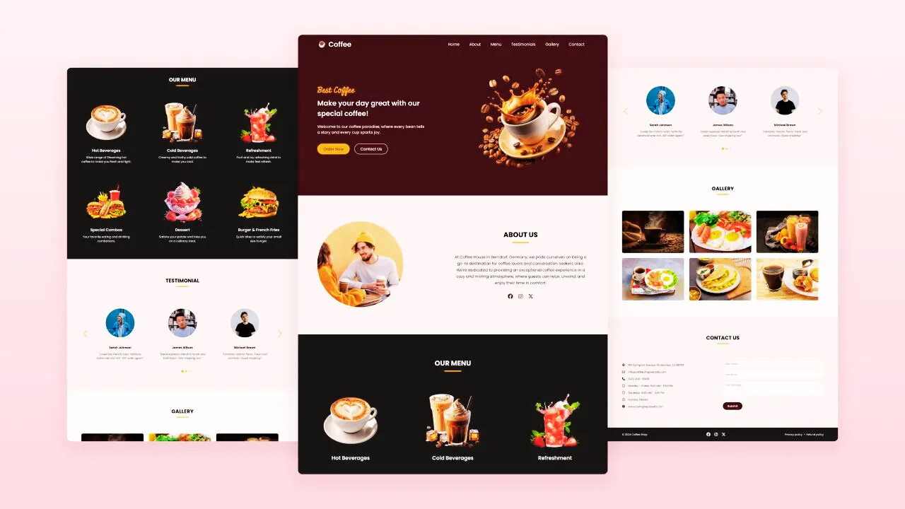
In this blog post, we’ll guide you through constructing a fully responsive, coffee-themed website using only HTML, CSS, and JavaScript. The site will feature key sections such as Home, About, Menu, Testimonials, Gallery, Contact, and a Footer. It will not only be visually appealing but also function seamlessly across all devices, from mobile to desktop.
One standout feature we’ll implement is a slider for the Testimonials section, adding a dynamic touch to customer reviews. We’ll also include a hamburger menu on mobile devices to enhance navigation.
This project is perfect for beginners in web development looking to sharpen their front-end coding skills. Let’s get started!
Key Sections of the Coffee Website
Here’s a breakdown of the sections you’ll be creating for your responsive coffee website:
- Hero Section: The homepage welcoming visitors with an eye-catching introduction to your coffee shop and navigation menu.
- About Section: Share your coffee shop’s history, values, and mission.
- Menu Section: Display the coffee and food options available, enticing your visitors with your offerings.
- Testimonials Section: A slider showcasing customer reviews, adding credibility to your coffee shop.
- Gallery Section: Feature images of your coffee shop’s ambiance and delicious offerings.
- Contact Section: Include a form or contact details for visitors to get in touch with you easily.
- Footer Section: Provide additional information like social media links and extra navigation options.
Steps to Create a Responsive Coffee Website
Follow these steps to create a responsive coffee website using HTML, CSS, and JavaScript:
1. Set up your project folder: Create a folder for your website, naming it something like coffee-website.
2. Create the necessary files: Inside your project folder, create the following files:
- index.html: Your main HTML file.
- style.css: Your CSS file for styling.
- script.js: Your JavaScript file for interactivity.
3. Download images: Add an “Images” folder to your project directory, containing all the necessary photos for your website.
4. Write the HTML code: Begin by adding the necessary HTML structure to your index.html file. Use semantic HTML tags like <header>, <nav>, <ul>, <li>, <a>, <section>, and <footer> to create a clean and structured layout.
<!DOCTYPE html><!-- Coding by abhikesh - www.abhikesh.com --><html lang="en"><head><meta charset="UTF-8" /><meta name="viewport" content="width=device-width, initial-scale=1.0" /><title>Coffee Website | abhikesh</title><!-- Linking Font Awesome for icons --><link rel="stylesheet" href="https://cdnjs.cloudflare.com/ajax/libs/font-awesome/6.6.0/css/all.min.css" /><!-- Linking Swiper CSS --><link rel="stylesheet" href="https://cdn.jsdelivr.net/npm/swiper@11/swiper-bundle.min.css" /><link rel="stylesheet" href="style.css" /></head><body><!-- Header / Navbar --><header><nav class="navbar"><a href="#" class="nav-logo"><h2 class="logo-text">☕ Coffee</h2></a><ul class="nav-menu"><button id="menu-close-button" class="fas fa-times"></button><li class="nav-item"><a href="#" class="nav-link">Home</a></li><li class="nav-item"><a href="#about" class="nav-link">About</a></li><li class="nav-item"><a href="#menu" class="nav-link">Menu</a></li><li class="nav-item"><a href="#testimonials" class="nav-link">Testimonials</a></li><li class="nav-item"><a href="#gallery" class="nav-link">Gallery</a></li><li class="nav-item"><a href="#contact" class="nav-link">Contact</a></li></ul><button id="menu-open-button" class="fas fa-bars"></button></nav></header><main><!-- Hero section --><section class="hero-section"><div class="section-content"><div class="hero-details"><h2 class="title">Best Coffee</h2><h3 class="subtitle">Make your day great with our special coffee!</h3><p class="description">Welcome to our coffee paradise, where every bean tells a story and every cup sparks joy.</p><div class="buttons"><a href="#" class="button order-now">Order Now</a><a href="#contact" class="button contact-us">Contact Us</a></div></div><div class="hero-image-wrapper"><img src="images/coffee-hero-section.png" alt="Coffee" class="hero-image" /></div></div></section><!-- About section --><section class="about-section" id="about"><div class="section-content"><div class="about-image-wrapper"><img src="images/about-image.jpg" alt="About" class="about-image" /></div><div class="about-details"><h2 class="section-title">About Us</h2><p class="text">At Coffee House in Berndorf, Germany, we pride ourselves on being a go-to destination for coffee lovers and conversation seekers alike. We're dedicated to providing an exceptional coffee experience in a cozy and inviting atmosphere, where guests can relax, unwind, and enjoy their time in comfort.</p><div class="social-link-list"><a href="#" class="social-link"><i class="fa-brands fa-facebook"></i></a><a href="#" class="social-link"><i class="fa-brands fa-instagram"></i></a><a href="#" class="social-link"><i class="fa-brands fa-x-twitter"></i></a></div></div></div></section><!-- Menu section --><section class="menu-section" id="menu"><h2 class="section-title">Our Menu</h2><div class="section-content"><ul class="menu-list"><li class="menu-item"><img src="images/hot-beverages.png" alt="Hot Beverages" class="menu-image" /><div class="menu-details"><h3 class="name">Hot Beverages</h3><p class="text">Wide range of Steaming hot coffee to make you fresh and light.</p></div></li><li class="menu-item"><img src="images/cold-beverages.png" alt="Cold Beverages" class="menu-image" /><div class="menu-details"><h3 class="name">Cold Beverages</h3><p class="text">Creamy and frothy cold coffee to make you cool.</p></div></li><li class="menu-item"><img src="images/refreshment.png" alt="Refreshment" class="menu-image" /><div class="menu-details"><h3 class="name">Refreshment</h3><p class="text">Fruit and icy refreshing drink to make feel refresh.</p></div></li><li class="menu-item"><img src="images/special-combo.png" alt="Special Combos" class="menu-image" /><div class="menu-details"><h3 class="name">Special Combos</h3><p class="text">Your favorite eating and drinking combations.</p></div></li><li class="menu-item"><img src="images/desserts.png" alt="Dessert" class="menu-image" /><div class="menu-details"><h3 class="name">Dessert</h3><p class="text">Satiate your palate and take you on a culinary treat.</p></div></li><li class="menu-item"><img src="images/burger-frenchfries.png" alt="burger & French Fries" class="menu-image" /><div class="menu-details"><h3 class="name">Burger & French Fries</h3><p class="text">Quick bites to satisfy your small size hunger.</p></div></li></ul></div></section><!-- Testimonials section --><section class="testimonials-section" id="testimonials"><h2 class="section-title">Testimonials</h2><div class="section-content"><div class="slider-container swiper"><div class="slider-wrapper"><ul class="testimonials-list swiper-wrapper"><li class="testimonial swiper-slide"><img src="images/user-1.jpg" alt="User" class="user-image" /><h3 class="name">Sarah Johnson</h3><i class="feedback">"Loved the French roast. Perfectly balanced and rich. Will order again!"</i></li><li class="testimonial swiper-slide"><img src="images/user-2.jpg" alt="User" class="user-image" /><h3 class="name">James Wilson</h3><i class="feedback">"Great espresso blend! Smooth and bold flavor. Fast shipping too!"</i></li><li class="testimonial swiper-slide"><img src="images/user-3.jpg" alt="User" class="user-image" /><h3 class="name">Michael Brown</h3><i class="feedback">"Fantastic mocha flavor. Fresh and aromatic. Quick shipping!"</i></li><li class="testimonial swiper-slide"><img src="images/user-4.jpg" alt="User" class="user-image" /><h3 class="name">Emily Harris</h3><i class="feedback">"Excellent quality! Fresh beans and quick delivery. Highly recommend."</i></li><li class="testimonial swiper-slide"><img src="images/user-5.jpg" alt="User" class="user-image" /><h3 class="name">Anthony Thompson</h3><i class="feedback">"Best decaf I've tried! Smooth and flavorful. Arrived promptly."</i></li></ul><div class="swiper-pagination"></div><div class="swiper-slide-button swiper-button-prev"></div><div class="swiper-slide-button swiper-button-next"></div></div></div></div></section><!-- Gallery section --><section class="gallery-section" id="gallery"><h2 class="section-title">Gallery</h2><div class="section-content"><ul class="gallery-list"><li class="gallery-item"><img src="images/gallery-1.jpg" alt="Gallery Image" class="gallery-image" /></li><li class="gallery-item"><img src="images/gallery-2.jpg" alt="Gallery Image" class="gallery-image" /></li><li class="gallery-item"><img src="images/gallery-3.jpg" alt="Gallery Image" class="gallery-image" /></li><li class="gallery-item"><img src="images/gallery-4.jpg" alt="Gallery Image" class="gallery-image" /></li><li class="gallery-item"><img src="images/gallery-5.jpg" alt="Gallery Image" class="gallery-image" /></li><li class="gallery-item"><img src="images/gallery-6.jpg" alt="Gallery Image" class="gallery-image" /></li></ul></div></section><!-- Contact section --><section class="contact-section" id="contact"><h2 class="section-title">Contact Us</h2><div class="section-content"><ul class="contact-info-list"><li class="contact-info"><i class="fa-solid fa-location-crosshairs"></i><p>123 Campsite Avenue, Wilderness, CA 98765</p></li><li class="contact-info"><i class="fa-regular fa-envelope"></i><p>info@coffeeshopwebsite.com</p></li><li class="contact-info"><i class="fa-solid fa-phone"></i><p>(123) 456-78909</p></li><li class="contact-info"><i class="fa-regular fa-clock"></i><p>Monday - Friday: 9:00 AM - 5:00 PM</p></li><li class="contact-info"><i class="fa-regular fa-clock"></i><p>Saturday: 10:00 AM - 3:00 PM</p></li><li class="contact-info"><i class="fa-regular fa-clock"></i><p>Sunday: Closed</p></li><li class="contact-info"><i class="fa-solid fa-globe"></i><p>www.abhikesh.com</p></li></ul><form action="#" class="contact-form"><input type="text" placeholder="Your name" class="form-input" required /><input type="email" placeholder="Your email" class="form-input" required /><textarea placeholder="Your message" class="form-input" required></textarea><button type="submit" class="button submit-button">Submit</button></form></div></section><!-- Footer section --><footer class="footer-section"><div class="section-content"><p class="copyright-text">© 2024 Coffee Shop</p><div class="social-link-list"><a href="#" class="social-link"><i class="fa-brands fa-facebook"></i></a><a href="#" class="social-link"><i class="fa-brands fa-instagram"></i></a><a href="#" class="social-link"><i class="fa-brands fa-x-twitter"></i></a></div><p class="policy-text"><a href="#" class="policy-link">Privacy policy</a><span class="separator">•</span><a href="#" class="policy-link">Refund policy</a></p></div></footer></main><!-- Linking Swiper script --><script src="https://cdn.jsdelivr.net/npm/swiper@11/swiper-bundle.min.js"></script><!-- Linking custom script --><script src="script.js"></script></body></html>
5. Style the website with CSS: In your style.css file, use modern CSS properties to design the website. Experiment with colors, typography, backgrounds, and layouts to make your coffee website visually appealing.
/* Google Fonts Link */
@import url('https://fonts.googleapis.com/css2?family=Miniver&family=Poppins:ital,wght@0,400;0,500;0,600;0,700;1,400&display=swap');

* {
padding: 0;
margin: 0;
box-sizing: border-box;
font-family: "Poppins", sans-serif;
}

:root {
/* Colors */
--white-color: #fff;
--dark-color: #252525;
--primary-color: #3b141c;
--secondary-color: #f3961c;
--light-pink-color: #faf4f5;
--medium-gray-color: #ccc;

/* Font size */
--font-size-s: 0.9rem;
--font-size-n: 1rem;
--font-size-m: 1.12rem;
--font-size-l: 1.5rem;
--font-size-xl: 2rem;
--font-size-xxl: 2.3rem;

/* Font weight */
--font-weight-normal: 400;
--font-weight-medium: 500;
--font-weight-semibold: 600;
--font-weight-bold: 700;

/* Border radius */
--border-radius-s: 8px;
--border-radius-m: 30px;
--border-radius-circle: 50%;

/* Site max width */
--site-max-width: 1300px;
}

html {
scroll-behavior: smooth;
}

/* Stylings for whole site */
ul {
list-style: none;
}

a {
text-decoration: none;
}

button {
cursor: pointer;
background: none;
border: none;
}

img {
width: 100%;
}

:where(section, footer) .section-content {
margin: 0 auto;
padding: 0 20px;
max-width: var(--site-max-width);
}

section .section-title {
text-align: center;
padding: 60px 0 100px;
text-transform: uppercase;
font-size: var(--font-size-xl);
}

section .section-title::after {
content: "";
width: 80px;
height: 5px;
display: block;
margin: 10px auto 0;
background: var(--secondary-color);
border-radius: var(--border-radius-s);
}

/* Navbar styling */
header {
z-index: 5;
width: 100%;
position: fixed;
background: var(--primary-color);
}

header .navbar {
display: flex;
padding: 20px;
align-items: center;
margin: 0 auto;
justify-content: space-between;
max-width: var(--site-max-width);
}

.navbar .nav-logo .logo-text {
color: var(--white-color);
font-size: var(--font-size-xl);
font-weight: var(--font-weight-semibold);
}

.navbar .nav-menu {
gap: 10px;
display: flex;
}

.navbar .nav-menu .nav-link {
padding: 10px 18px;
color: var(--white-color);
font-size: var(--font-size-m);
border-radius: var(--border-radius-m);
transition: 0.3s ease;
}

.navbar .nav-menu .nav-link:hover {
color: var(--primary-color);
background: var(--secondary-color);
}

.navbar :where(#menu-open-button, #menu-close-button) {
display: none;
}

/* Hero section styling */
.hero-section {
min-height: 100vh;
background: var(--primary-color);
}

.hero-section .section-content {
display: flex;
padding-top: 40px;
align-items: center;
min-height: 100vh;
justify-content: space-between;
}

.hero-section .hero-details {
color: var(--white-color);
}

.hero-section .hero-details .title {
font-size: var(--font-size-xxl);
color: var(--secondary-color);
font-family: "Miniver", sans-serif;
}

.hero-section .hero-details .subtitle {
margin-top: 8px;
max-width: 70%;
font-size: var(--font-size-xl);
font-weight: var(--font-weight-semibold);
}

.hero-section .hero-details .description {
max-width: 70%;
margin: 24px 0 40px;
font-size: var(--font-size-m);
}

.hero-section .hero-details .buttons {
display: flex;
gap: 23px;
}

.hero-section .hero-details .button {
padding: 10px 26px;
display: block;
border: 2px solid transparent;
border-radius: var(--border-radius-m);
background: var(--secondary-color);
color: var(--primary-color);
font-size: var(--font-size-m);
font-weight: var(--font-weight-medium);
transition: 0.3s ease;
}

.hero-section .hero-details .button:hover,
.hero-section .hero-details .button.contact-us {
color: var(--white-color);
border-color: var(--white-color);
background: transparent;
}

.hero-section .hero-details .button.contact-us:hover {
color: var(--primary-color);
background: var(--secondary-color);
border-color: var(--secondary-color);
}

.hero-section .hero-image-wrapper {
max-width: 500px;
margin-right: 30px;
}

/* About section styling */
.about-section {
padding: 120px 0;
background: var(--light-pink-color);
}

.about-section .section-content {
display: flex;
gap: 50px;
align-items: center;
justify-content: space-between;
}

.about-section .about-image-wrapper .about-image {
height: 400px;
width: 400px;
object-fit: cover;
border-radius: var(--border-radius-circle);
}

.about-section .about-details {
max-width: 50%;
}

.about-section .about-details .section-title {
padding: 0;
}

.about-section .about-details .text {
line-height: 30px;
margin: 50px 0 30px;
text-align: center;
font-size: var(--font-size-m);
}

.about-section .social-link-list {
display: flex;
gap: 25px;
justify-content: center;
}

.about-section .social-link-list .social-link {
color: var(--primary-color);
font-size: var(--font-size-l);
transition: 0.2s ease;
}

.about-section .social-link-list .social-link:hover {
color: var(--secondary-color);
}

/* Menu section styling */
.menu-section {
color: var(--white-color);
background: var(--dark-color);
padding: 50px 0 100px;
}

.menu-section .menu-list {
display: flex;
gap: 110px;
flex-wrap: wrap;
align-items: center;
justify-content: space-between;
}

.menu-section .menu-list .menu-item {
display: flex;
text-align: center;
flex-direction: column;
align-items: center;
justify-content: space-between;
width: calc(100% / 3 - 110px);
}

.menu-section .menu-list .menu-item .menu-image {
width: 83%;
aspect-ratio: 1;
margin-bottom: 15px;
object-fit: contain;
}

.menu-section .menu-list .menu-item .name {
margin: 12px 0;
font-size: var(--font-size-l);
font-weight: var(--font-weight-semibold);
}

.menu-section .menu-list .menu-item .text {
font-size: var(--font-size-m);
}

/* Testimonials section styling */
.testimonials-section {
padding: 50px 0 100px;
background: var(--light-pink-color);
}

.testimonials-section .slider-wrapper {
overflow: hidden;
margin: 0 60px 50px;
}

.testimonials-section .testimonial {
user-select: none;
padding: 35px;
display: flex;
flex-direction: column;
justify-content: center;
align-items: center;
text-align: center;
}

.testimonials-section .testimonial .user-image {
width: 180px;
height: 180px;
margin-bottom: 50px;
object-fit: cover;
border-radius: var(--border-radius-circle);
}

.testimonials-section .testimonial .name {
margin-bottom: 16px;
font-size: var(--font-size-m);
}

.testimonials-section .testimonial .feedback {
line-height: 25px;
}

.testimonials-section .swiper-pagination-bullet {
width: 15px;
height: 15px;
opacity: 1;
background: var(--secondary-color);
}

.testimonials-section .swiper-slide-button {
color: var(--secondary-color);
margin-top: -50px;
transition: 0.3s ease;
}

.testimonials-section .swiper-slide-button:hover {
color: var(--primary-color);
}

/* Gallery section styling */
.gallery-section {
padding: 50px 0 100px;
}

.gallery-section .gallery-list {
display: flex;
gap: 32px;
flex-wrap: wrap;
}

.gallery-section .gallery-list .gallery-item {
overflow: hidden;
border-radius: var(--border-radius-s);
width: calc(100% / 3 - 32px);
}

.gallery-section .gallery-item .gallery-image {
width: 100%;
height: 100%;
cursor: zoom-in;
transition: 0.3s ease;
}

.gallery-section .gallery-item:hover .gallery-image {
transform: scale(1.3);
}

/* Contact section styling */
.contact-section {
padding: 50px 0 100px;
background: var(--light-pink-color);
}

.contact-section .section-content {
display: flex;
gap: 48px;
align-items: center;
justify-content: space-between;
}

.contact-section .contact-info-list .contact-info {
display: flex;
gap: 20px;
margin: 20px 0;
align-items: center;
}

.contact-section .contact-info-list .contact-info i {
font-size: var(--font-size-m);
}

.contact-section .contact-form .form-input {
width: 100%;
height: 50px;
padding: 0 12px;
outline: none;
margin-bottom: 16px;
font-size: var(--font-size-s);
border-radius: var(--border-radius-s);
border: 1px solid var(--medium-gray-color);
}

.contact-section .contact-form {
max-width: 50%;
}

.contact-section .contact-form textarea.form-input {
height: 100px;
padding: 12px;
resize: vertical;
}

.contact-section .contact-form .form-input:focus {
border-color: var(--secondary-color);
}

.contact-section .contact-form .submit-button {
padding: 10px 28px;
outline: none;
margin-top: 10px;
border: 1px solid var(--primary-color);
border-radius: var(--border-radius-m);
background: var(--primary-color);
color: var(--white-color);
font-size: var(--font-size-m);
font-weight: var(--font-weight-medium);
transition: 0.3s ease;
}

.contact-section .contact-form .submit-button:hover {
color: var(--primary-color);
background: transparent;
}

/* Footer section styling */
.footer-section {
padding: 20px 0;
background: var(--dark-color);
}

.footer-section .section-content {
display: flex;
align-items: center;
justify-content: space-between;
}

.footer-section :where(.copyright-text, .social-link, .policy-link) {
color: var(--white-color);
transition: 0.2s ease;
}

.footer-section .social-link-list {
display: flex;
gap: 25px;
}

.footer-section .social-link-list .social-link {
font-size: var(--font-size-l);
}

.footer-section .social-link-list .social-link:hover,
.footer-section .policy-text .policy-link:hover {
color: var(--secondary-color);
}

.footer-section .policy-text .separator {
color: #fff;
margin: 0 5px;
}

/* Responsive media query code for max width 1024px */
@media screen and (max-width: 1024px) {
.menu-section .menu-list {
gap: 60px;
}

.menu-section .menu-list .menu-item {
width: calc(100% / 3 - 60px);
}

}

/* Responsive media query code for max width 900px */
@media screen and (max-width: 900px) {
:root {
--font-size-m: 1rem;
--font-size-l: 1.3rem;
--font-size-xl: 1.5rem;
--font-size-xxl: 1.8rem;
}

body.show-mobile-menu {
overflow: hidden;
}

body.show-mobile-menu header::before {
content: "";
content: '';
position: fixed;
top: 0;
left: 0;
height: 100%;
width: 100%;
backdrop-filter: blur(5px);
background: rgba(0, 0, 0, 0.2);
}

.navbar :is(#menu-open-button, #menu-close-button) {
font-size: var(--font-size-l);

display: block;
}

.navbar :is(#menu-open-button, #menu-close-button):hover {
color: var(--secondary-color) !important;
}

.navbar #menu-open-button {
color: #fff;
}

.navbar .nav-menu #menu-close-button {
position: absolute;
right: 30px;
top: 30px;
}

.navbar .nav-menu {
display: block;
background: #fff;
position: fixed;
top: 0;
left: -300px;
height: 100%;
width: 300px;
display: flex;
align-items: center;
flex-direction: column;
padding-top: 100px;
transition: left 0.2s ease;
}

body.show-mobile-menu .nav-menu {
left: 0;
}

.navbar .nav-menu .nav-link {
display: block;
margin-top: 17px;
padding: 10px 22px;
color: var(--dark-color);
font-size: var(--font-size-l);
}

.hero-section .section-content {
text-align: center;
gap: 50px;
padding: 30px 20px 20px;
justify-content: center;
flex-direction: column-reverse;
}

.hero-section .hero-details :is(.subtitle, .description),
.about-section .about-details,
.contact-section .contact-form {
max-width: 100%;
}

.hero-section .hero-details .buttons {
justify-content: center;
}

.hero-section .hero-image-wrapper {
max-width: 270px;
margin-right: 0;
}

.about-section .section-content {
gap: 70px;
flex-direction: column-reverse;
}

.about-section .about-image-wrapper .about-image {
width: 100%;
height: 100%;
aspect-ratio: 1;
max-width: 250px;
}

.menu-section .menu-list {
gap: 30px;
}

.menu-section .menu-list .menu-item {
width: calc(100% / 2 - 30px);
}

.menu-section .menu-list .menu-item .menu-image {
max-width: 200px;
}

.gallery-section .gallery-list {
gap: 30px;
}

.gallery-section .gallery-list .gallery-item {
width: calc(100% / 2 - 30px);
}

.contact-section .section-content {
align-items: center;
flex-direction: column-reverse;
}
}

/* Responsive media query code for max width 640px */
@media screen and (max-width: 640px) {

.menu-section .menu-list .menu-item,
.gallery-section .gallery-list .gallery-item {
width: 100%;
}

.menu-section .menu-list {
gap: 60px;
}

.testimonials-section .slider-wrapper {
margin: 0 0 30px;
}

.testimonials-section .swiper-slide-button {
display: none;
}

.footer-section .section-content {
flex-direction: column;
gap: 20px;
}
}
6. Add functionality with JavaScript: In your script.js file, write JavaScript code to add interactive features. This includes:
- Initializing the Swiper slider for the Testimonials section.
- Creating a hamburger menu for mobile navigation that enhances the user experience.
const navbarLinks = document.querySelectorAll(".nav-menu .nav-link");
const menuOpenButton = document.querySelector("#menu-open-button");
const menuCloseButton = document.querySelector("#menu-close-button");

menuOpenButton.addEventListener("click", () => {
// Toggle mobile menu visibility
document.body.classList.toggle("show-mobile-menu");
});

// Close menu when the close button is clicked
menuCloseButton.addEventListener("click", () => menuOpenButton.click());

// Close menu when nav link is clicked
navbarLinks.forEach((link) => {
link.addEventListener("click", () => menuOpenButton.click());
});

/* Initializing Swiper */
let swiper = new Swiper(".slider-wrapper", {
loop: true,
grabCursor: true,
spaceBetween: 25,

// Pagination bullets
pagination: {
el: ".swiper-pagination",
clickable: true,
dynamicBullets: true,
},

// Navigation arrows
navigation: {
nextEl: ".swiper-button-next",
prevEl: ".swiper-button-prev",
},

/* Responsive breakpoints */
breakpoints: {
0: {
slidesPerView: 1,
},
768: {
slidesPerView: 2,
},
1024: {
slidesPerView: 3,
},
},
});
Once you’ve completed these steps, open the index.html file in your browser to preview your coffee website. You’ll see how responsive it looks across different screen sizes, from mobile to desktop.
Why Build a Responsive Coffee Website?
Creating a responsive coffee website offers several benefits:
- Mobile Optimization: As more users access websites on their phones, ensuring your site looks great on any device is crucial.
- Interactive Features: By adding dynamic elements like sliders and animated menus, you can provide a richer experience for visitors.
- Portfolio Boost: If you’re a beginner, this project is a great way to show off your web development skills and can be a perfect addition to your portfolio.
Read Also
- Glassmorphism Login Form in HTML and CSS
Explore the stylish world of glassmorphism as you create a modern login form using HTML and CSS. This guide breaks down the design process step by step. - Toggle Button using HTML, CSS, and JavaScript
Discover how to enhance user interaction by creating a sleek toggle button with HTML, CSS, and JavaScript. This tutorial covers everything from structure to styling. - Responsive Cards in HTML and CSS
Learn how to design eye-catching responsive cards that adapt seamlessly to any device. This guide offers practical tips for achieving stunning layouts. - Build a Google Gemini Chatbot Using HTML, CSS, and JS
Dive into chatbot development by creating a Google Gemini chatbot with HTML, CSS, and JavaScript. This tutorial will help you understand the basics of interactive forms.
Conclusion
In conclusion, building a responsive coffee website using HTML, CSS, and JavaScript is a fantastic way to enhance your web development skills. Through this project, you’ve learned how to structure a website, style it with CSS, and add dynamic functionality with JavaScript. Each section, from the homepage to the footer, offers valuable hands-on experience to help you grow as a front-end developer.
Take this opportunity to explore other website projects and further develop your HTML, CSS, and JavaScript expertise. You can experiment with different features like sliders, animations, and responsive layouts, which are in high demand in today’s web design world.
If you need the full source code for this coffee website, you can download it below and use it as a reference for your projects.
Download the Source Code
Click the button below to download the complete source code for the Responsive Coffee Website project.